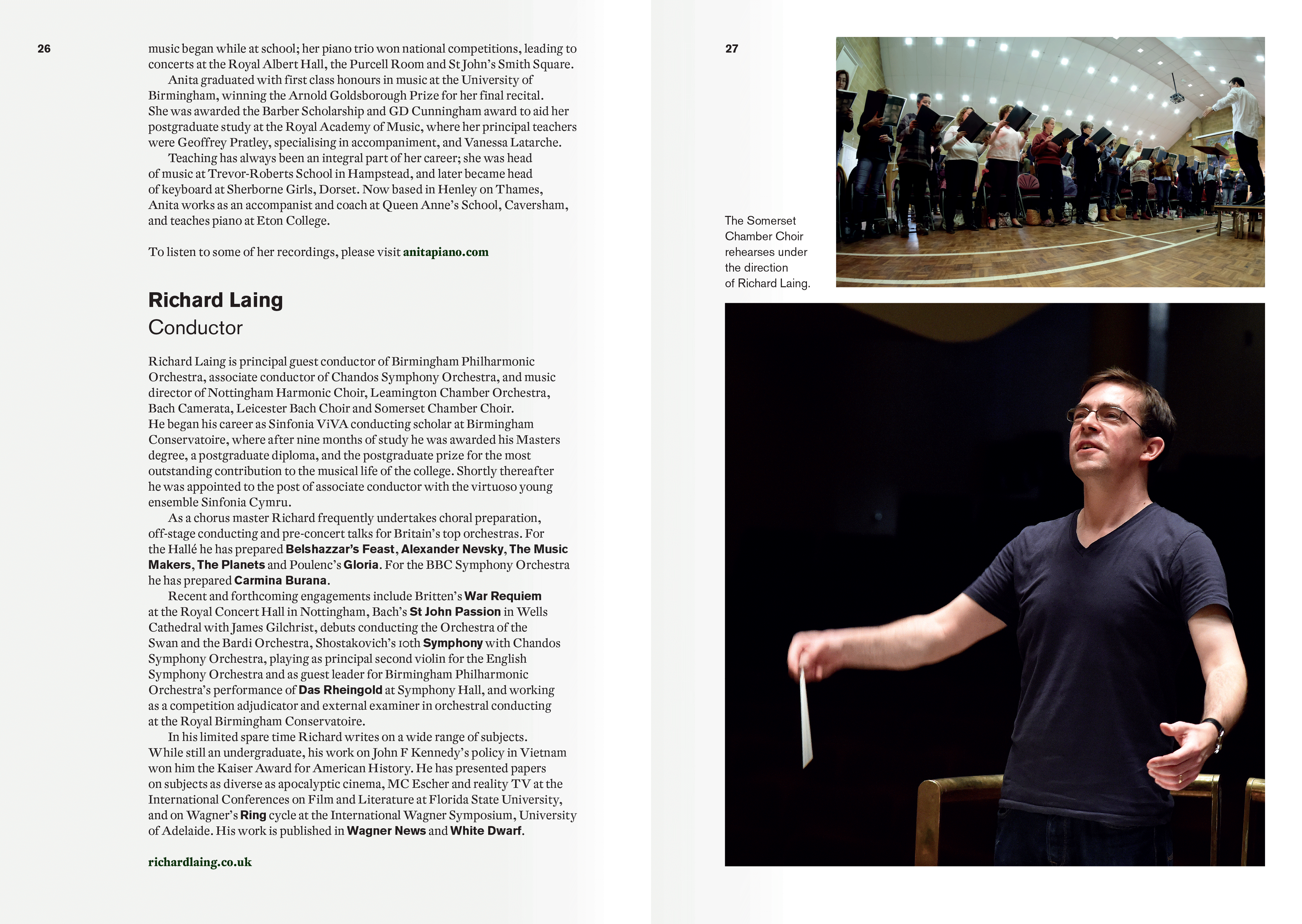
Regularly performing with some of the country’s finest instrumentalists and vocalists, Somerset Chamber Choir (patron, Dame Emma Kirkby) has established itself as one the finest choirs in the UK’s south west.
Aside from a low-resolution logo, the choir had no recognisable identity—nor an aesthetic commensurate to its musical calibre. I therefore gave the choir’s annual calendar of performances a consistent visual language to inject personality, increase recognition, and gradually raise its profile.
Whilst the concept, imagery and typography for each concert reflected its unique musical theme, every poster campaign and concert programme would build on that of the previous event, appealing to new concert goers and regular devotees alike.
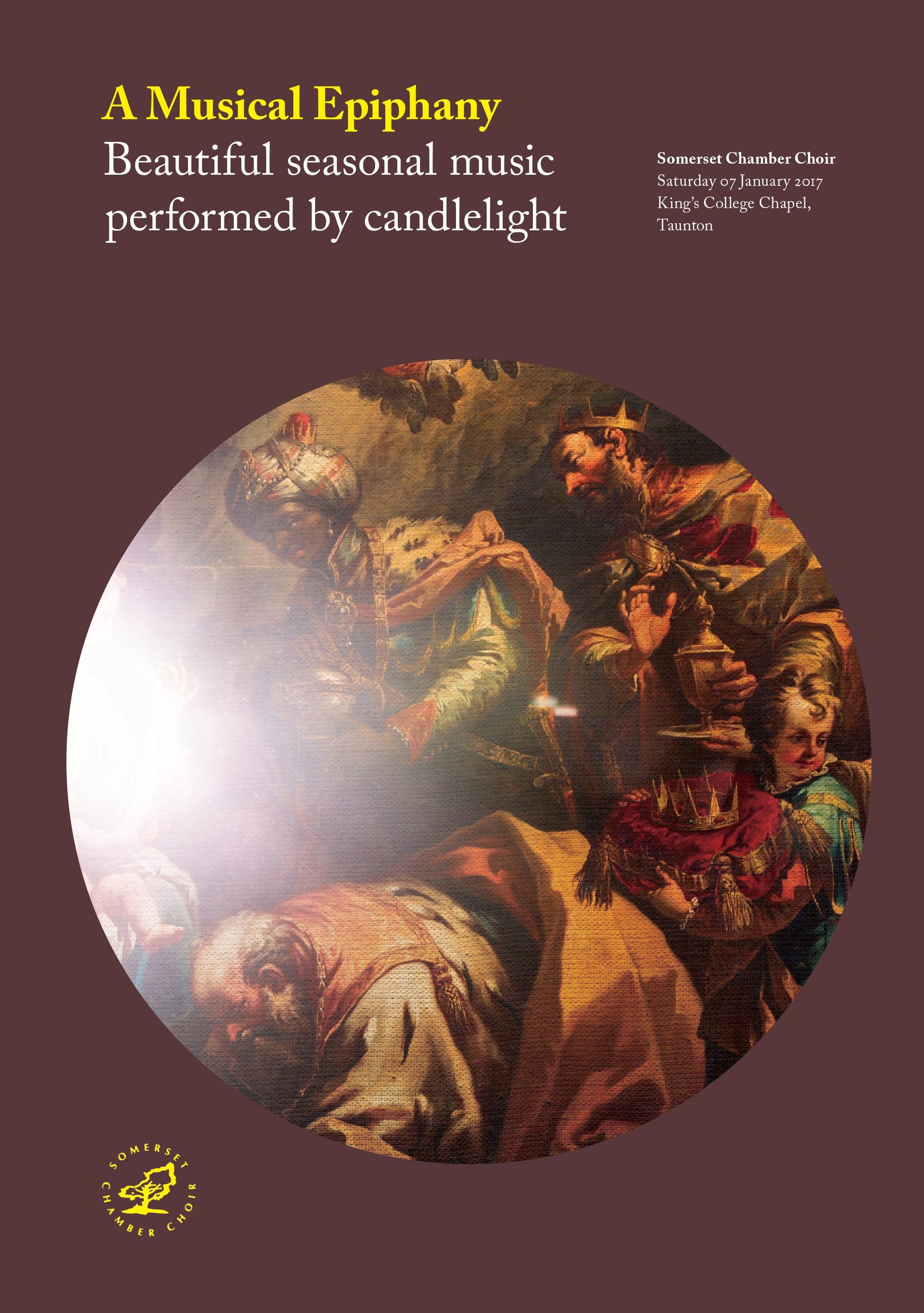
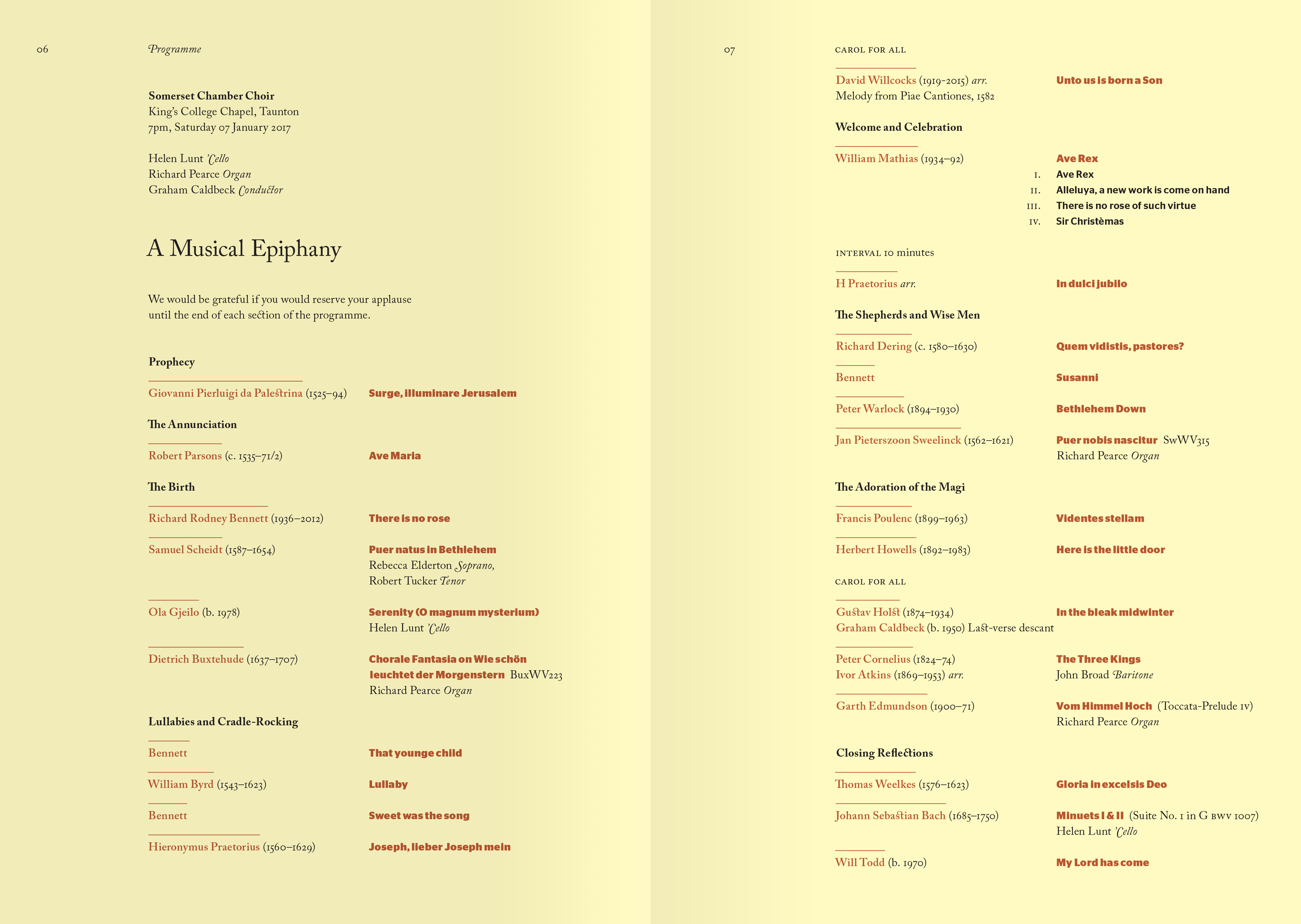
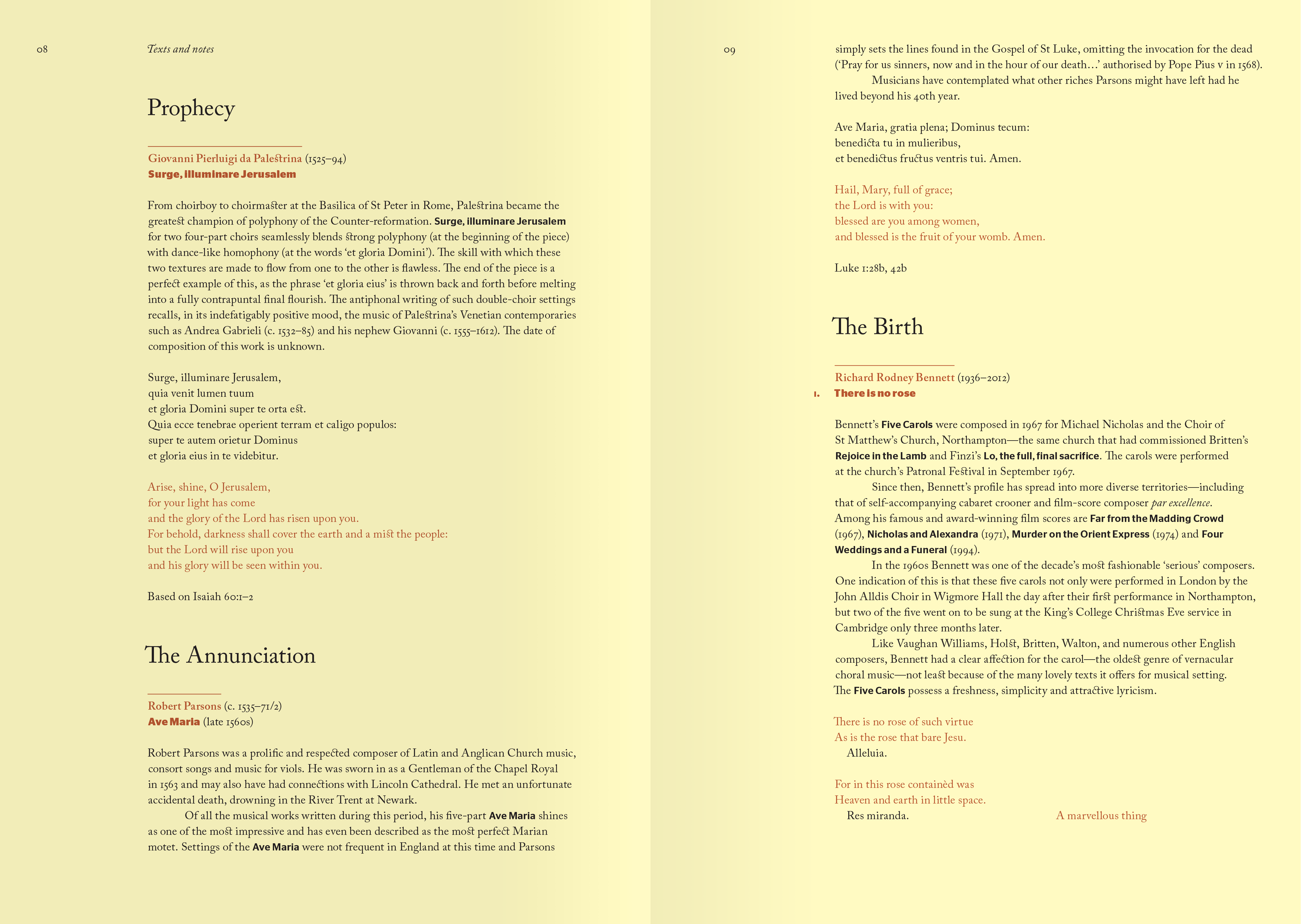
A Musical Epiphany
The Christian feast day of Epiphany commemorates the visit of the Magi—the word being used in classical Greek for the manifestation of a deity to a worshiper. A flare of beatific light applied to Diziani’s Adoration of Magi evokes something of the concert’s ethereal theme and sacred venue.
Guest typeface Adobe Caslon. For her modern revival, designer Carol Twombly studied specimen pages of William Caslon’s first typefaces printed in the period immediately following Diziani’s completion of Adoration of Magi.
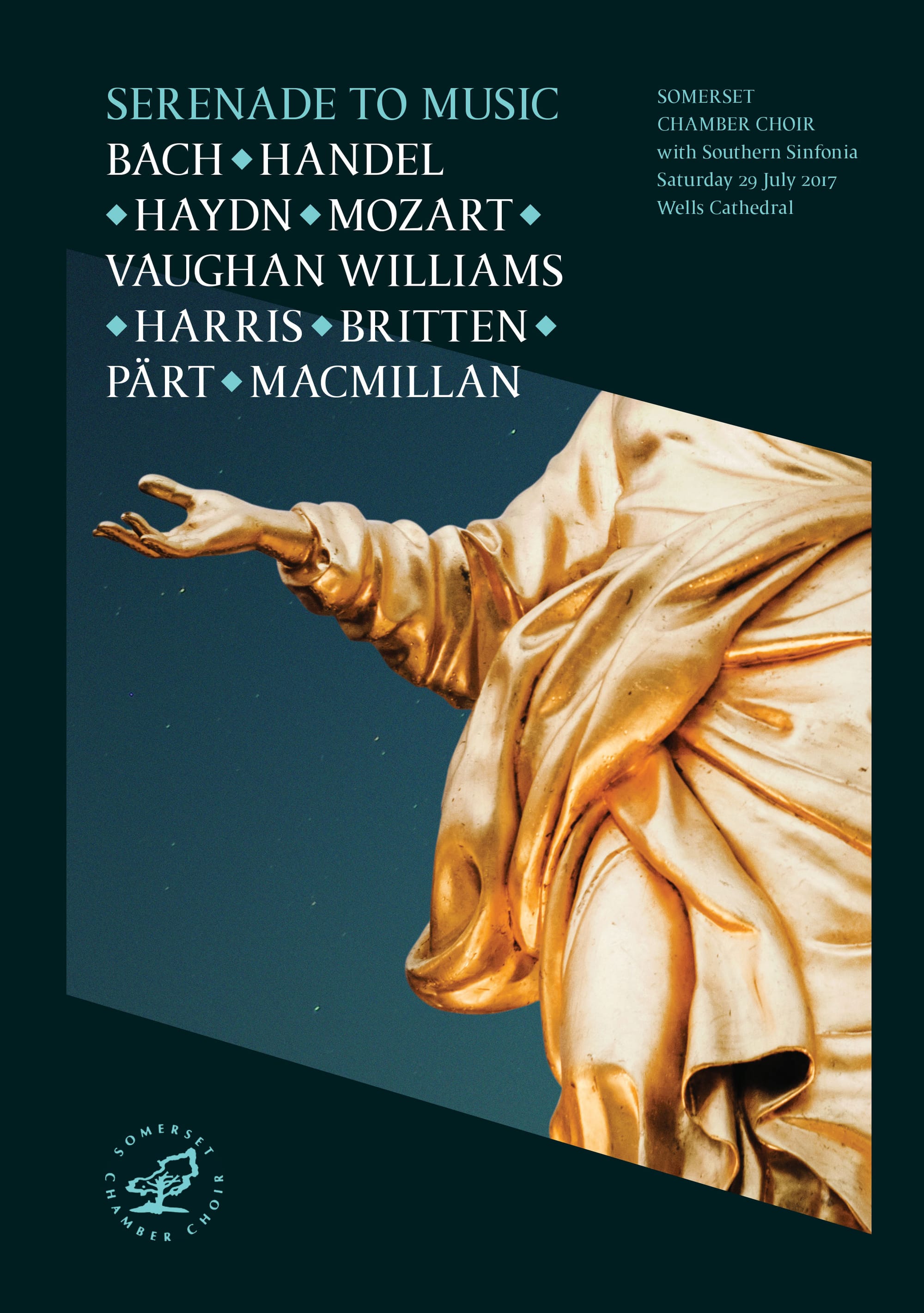
Serenade to Music
To mark the retirement of Graham Caldbeck as the choir’s longstanding Musical Director, ‘Serenade to Music’ featured a selection of Caldbeck’s favourite works. Singular visual inspiration came not from the diversity of music, but from the venue of Wells Cathedral—in the form of golden sculpture, carved stone and lofty splendour.
Guest typeface Fea. Designed by Víctor Guerrero Vila, Fea captures something of the form and physicality of engraved letterforms found throughout the cathedral.
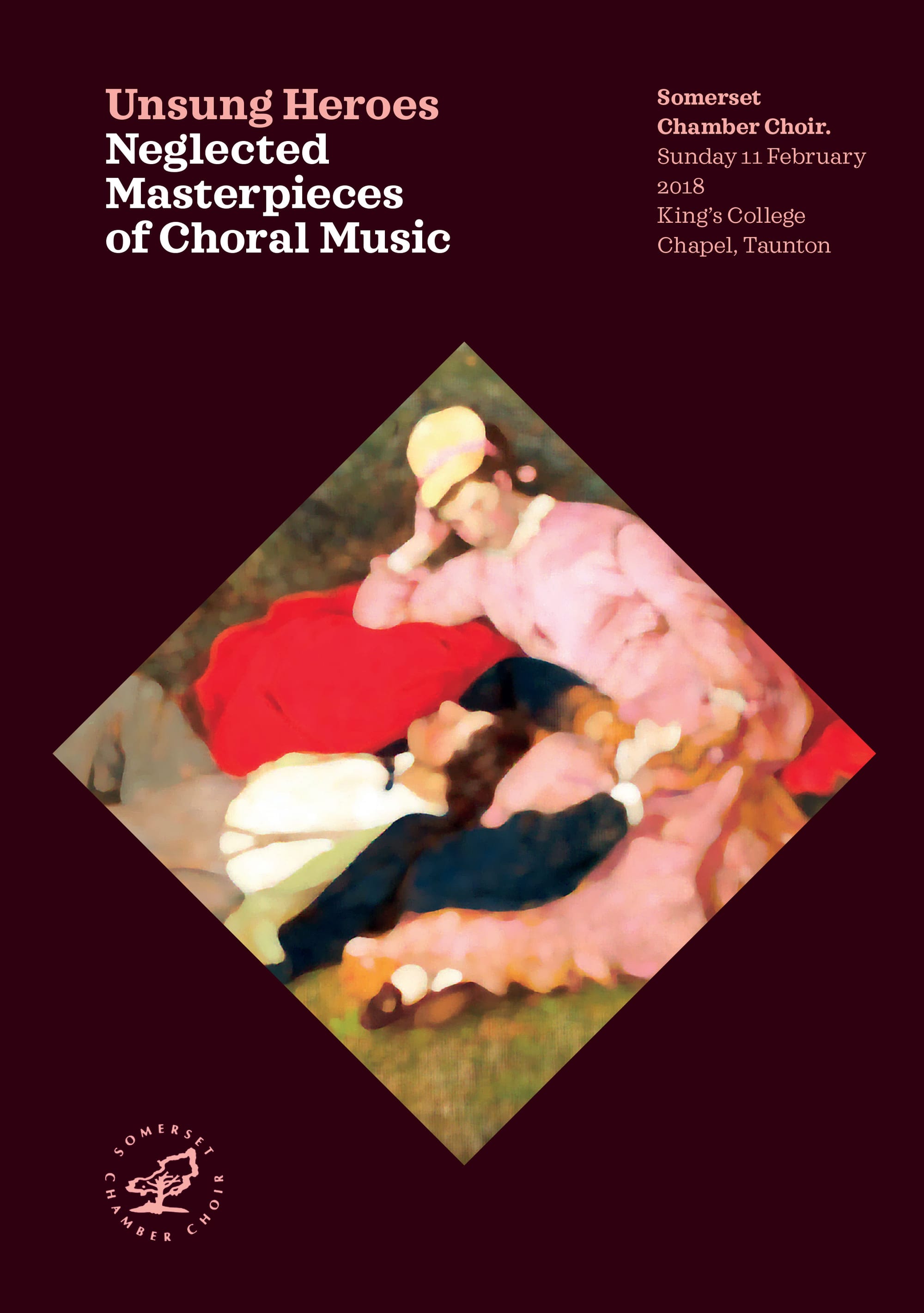
Unsung Heroes
Nostalgically distorting the Hungarian painting Lovers, to fall just beyond focus and almost out of memory, gives form to a celebration of the less familiar (and often haunting) music of Liechtenstein’s Rheinberger and Hungary’s Kodály.
Guest typeface Sagona. A contemporary slab serif building on the Clarendon/Ionic model dating back to the 19th century. René Bieder’s Sagona shuns a more typical industrial and strict appearance, focusing instead on warmth and subtle elegance.
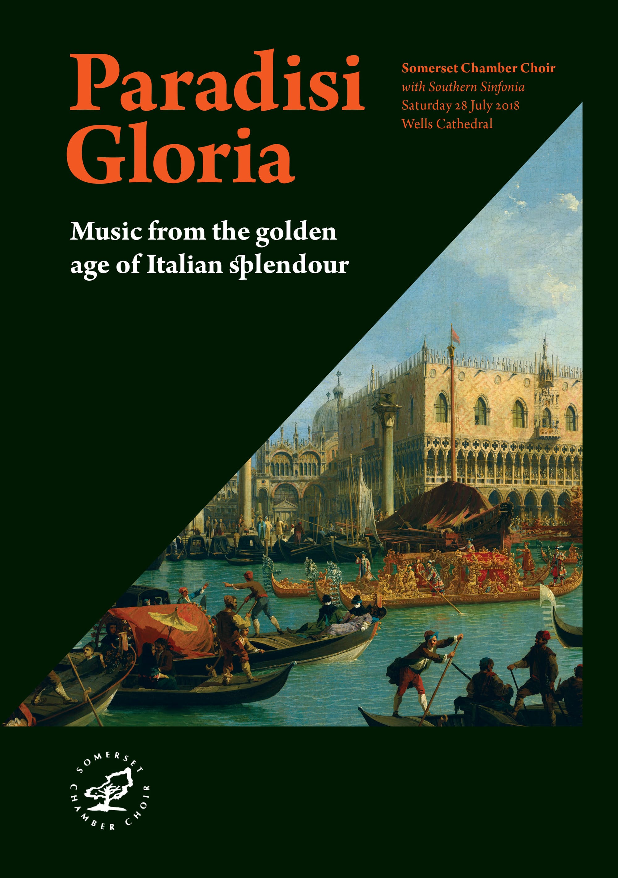
Paradisi Gloria
To epitomize the choir’s summer performance of works all written within a ten-year period, by Italian composers at the height of their expressive powers, little more was needed than a peek of Canaletto’s bustling, colourful and near-imaginary Venice of the same golden era.
Guest typeface Arno. Created by Robert Slimbach, Arno is named after the river running through Florence, the city at the heart of the Italian Renaissance, and inspired by the humanistic types of the 15th and 16th century.
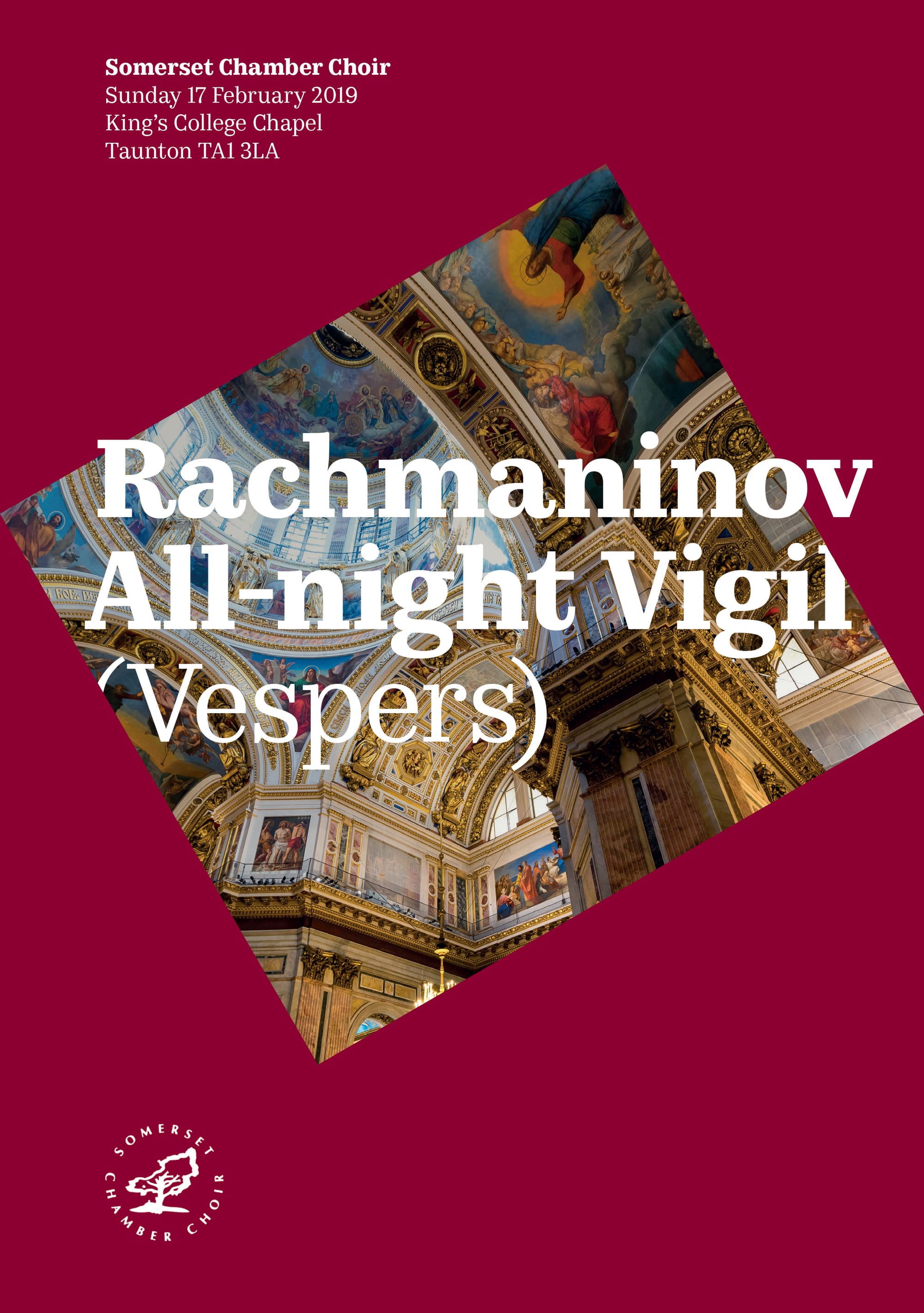
All-night Vigil
Penning the concert’s introduction, the Chair of Trustees recalls his first experience of Rachmaninov’s great choral work. “I can still vividly remember,” he writes, “that sumptuous, beautiful and multi-layered music, reverberating around”. The visual response? An interplay of voluminous typography and Orthodox opulence.
Guest typeface Kazimir Text. A reworking of the typeface used in the 1900 book, History of Russian Literature, and a contemporary take on pre-revolutionary Russian typography.
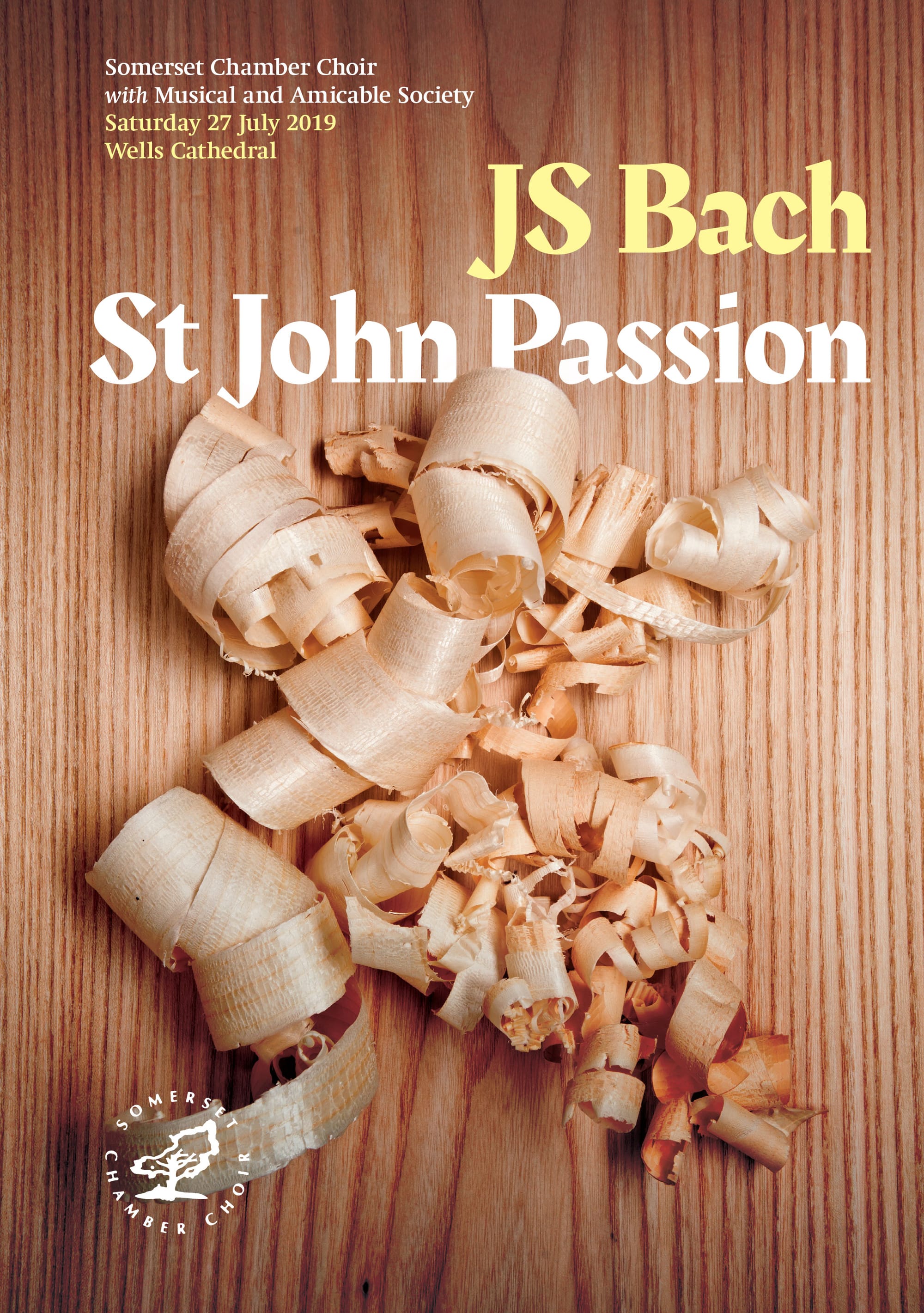
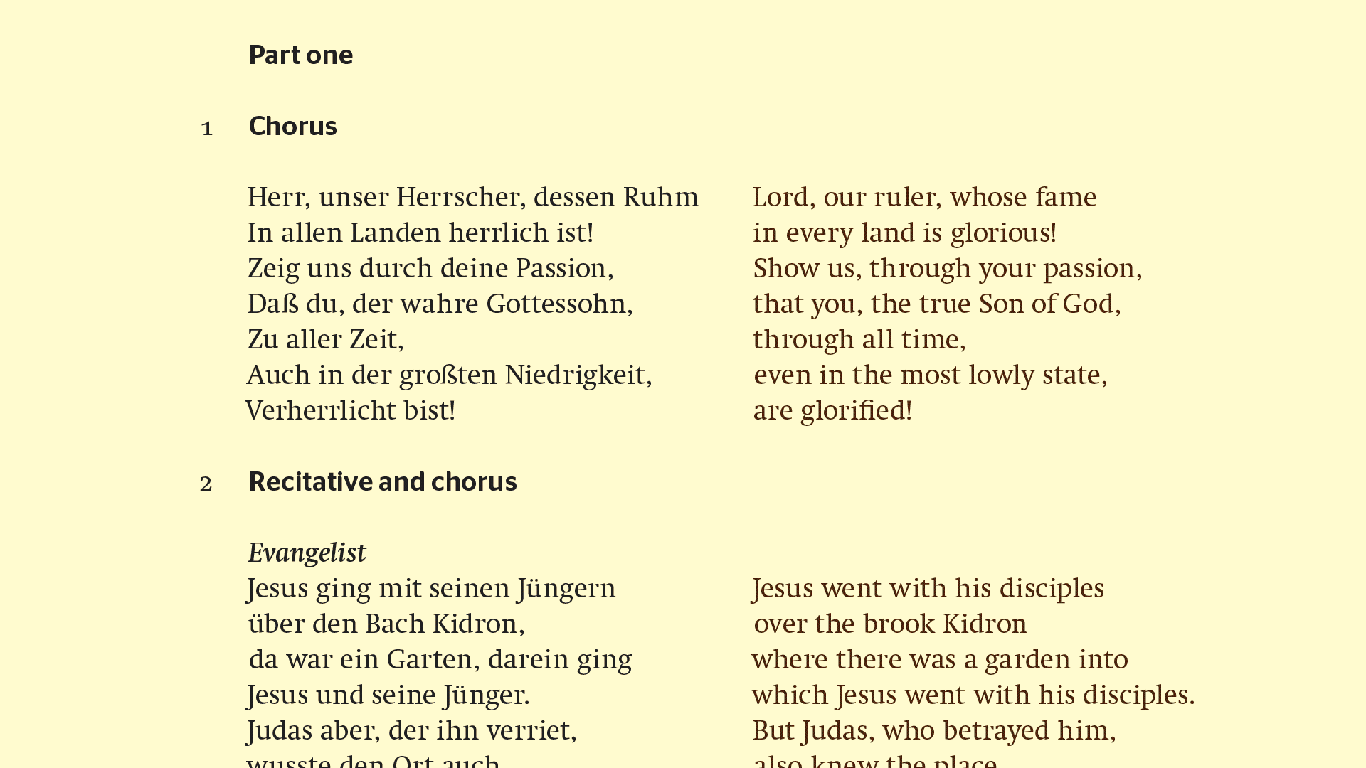
St John Passion
JS Bach’s sacred masterpiece needs little introduction. How then to present it afresh? Taken literally, curled shavings from the carpenter’s workshop convey Jesus’ earthly vocation—and the wooden cross that awaits. Figuratively, they are the tangled chaos into which Christ has come.
Guest typeface Swift. An austere and concise typeface by Gerard Unger, Swift’s robust physicality is a fitting expression of the vocation, trial and death of Jesus.
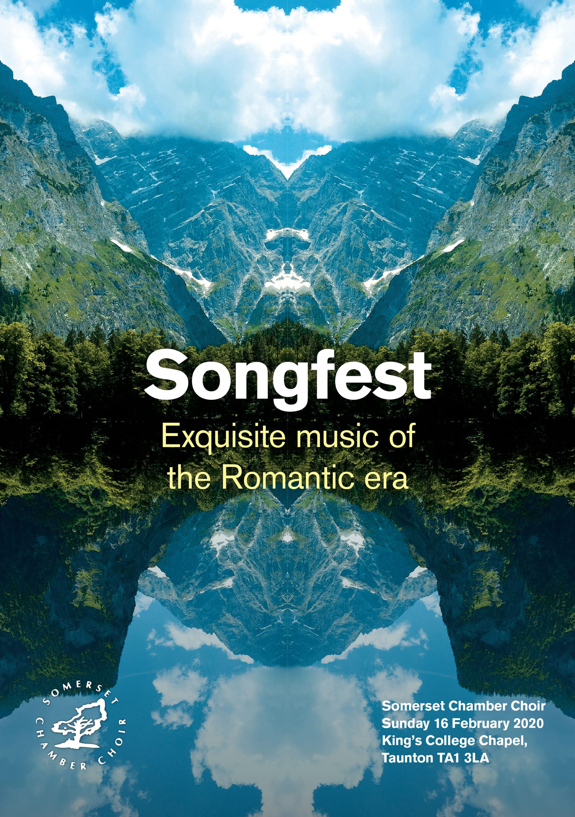
Songfest
The Romantic movement originated in Europe and was characterized by its emphasis on emotion, psychology and the glorification of nature. A four-way mirror image of a pastoral mountainscape, not immediately obvious in its manipulation, suggests something of Romanticism’s subjective, transcendental individualism.
Guest typefaces Berthold Akzidenz-Grotesk, belonging to a tradition of unadorned sans serif types, contrasts with DTL Fleischmann, a revival of JM Fleischmann’s eccentric Baroque typefaces from the 18th century.
Project credits
Programme editor Wendy Baskett