Table of Contents
Background
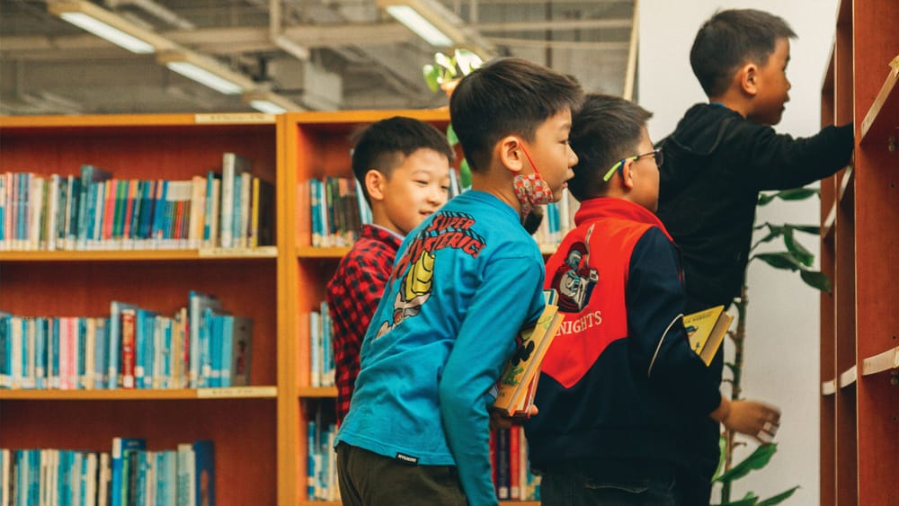
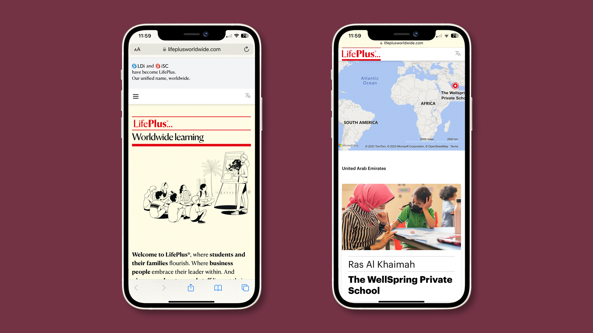
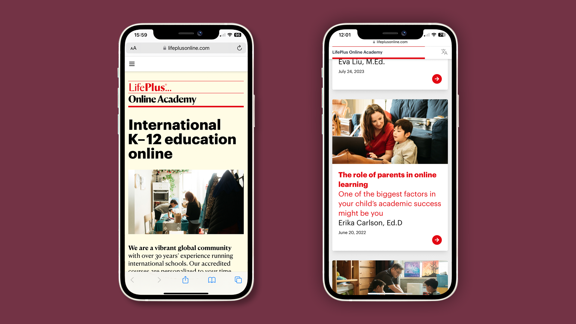
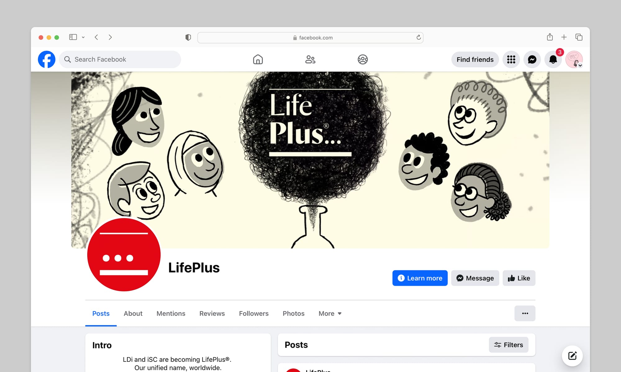
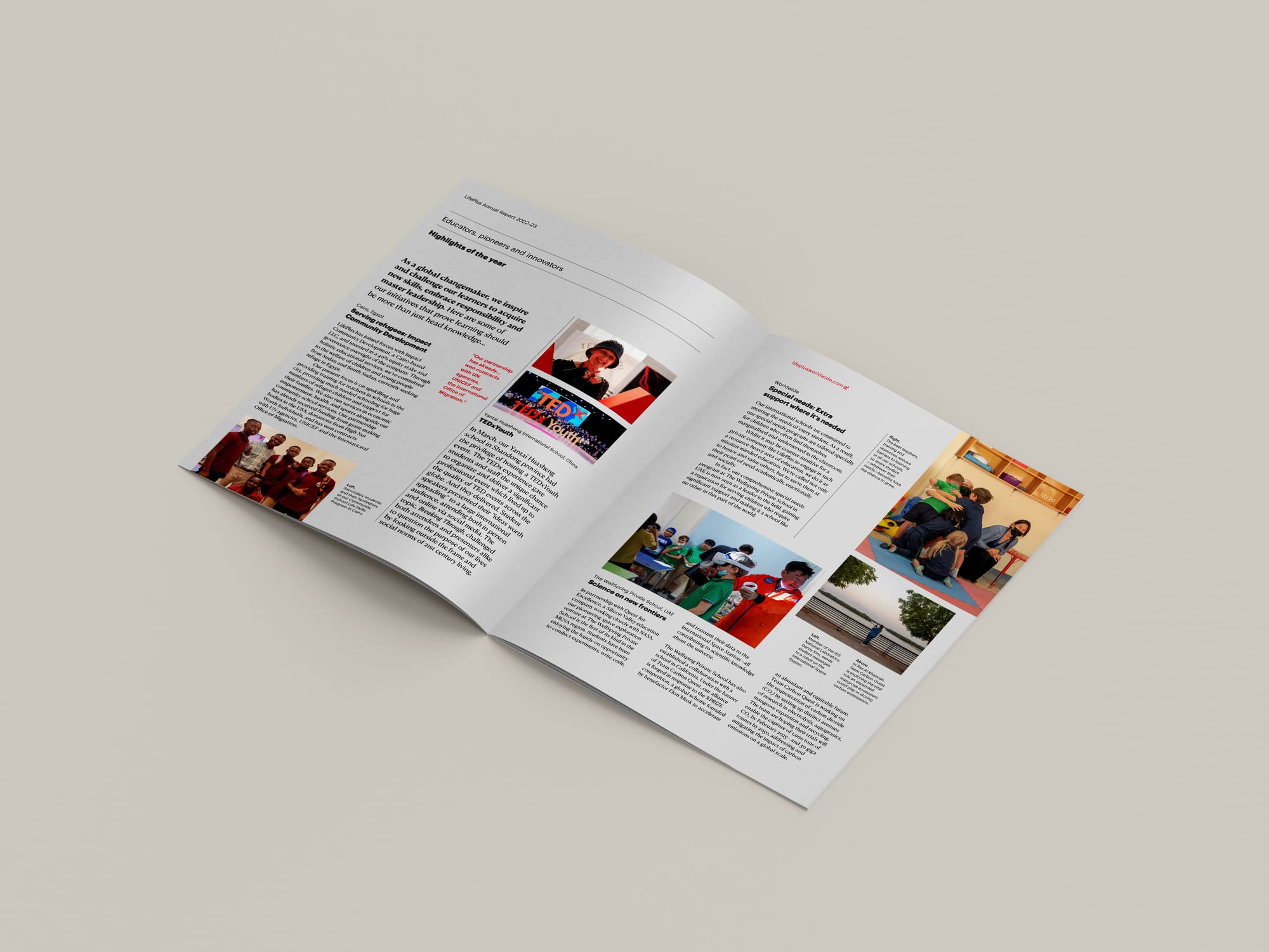
LifePlus is a global company of world-class educators, pioneers and innovators. Through eight international schools across China, MENA and online, it inspires learners of all ages to go and make a life-changing difference for the common good.
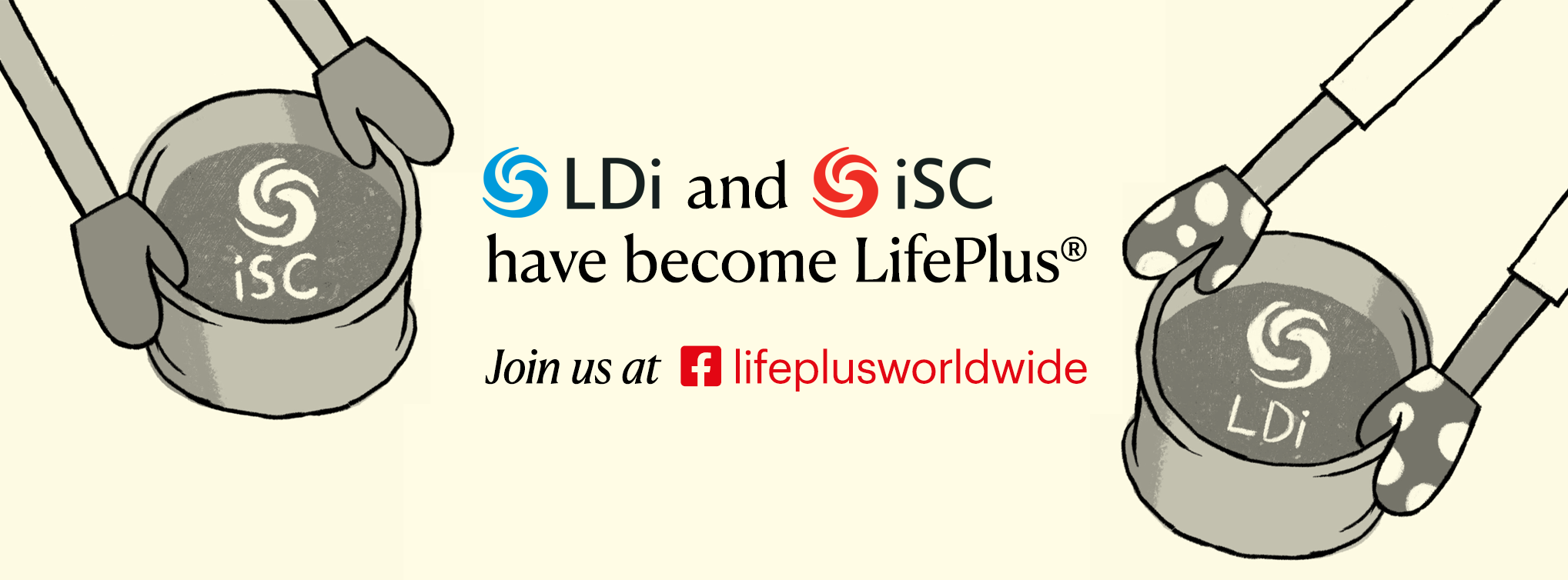
For nearly 40 years, the company had grown organically under a variety of names and brands. With growth came complexity, to the point where it was confusing families, partners and even staff worldwide. The company was missing a clear and compelling organizational idea.
With its new company name in place, I initially consulted with LifePlus to create the business’ new visual identity (how it looks)—also bringing in long-term collaborators The Brand Language Studio to help craft its verbal identity (how it sounds).
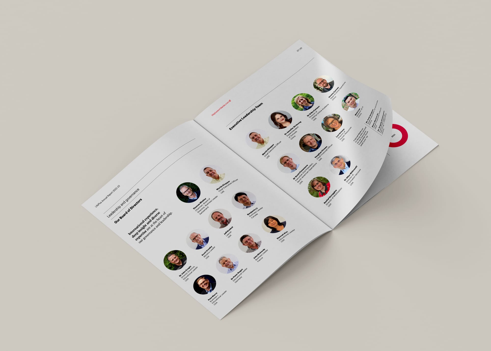
Since 2021 I’ve been working in-house for LifePlus, in a newly-formed Head of Design role, to help it become a design-driven, audience-centred, systems-thinking brand. Today I lead an interdisciplinary Corporate Marketing team of seven members, plus a network of freelancers, based across China, the US and the UK.
Brand identity
How does LifePlus zig when competitors zag? How does it radically embody transformation to avoid the clichés of historical crests, formulaic claims, generic (ever-smiling) children and imposing buildings? These were questions we asked ourselves when developing a new brand for LifePlus.
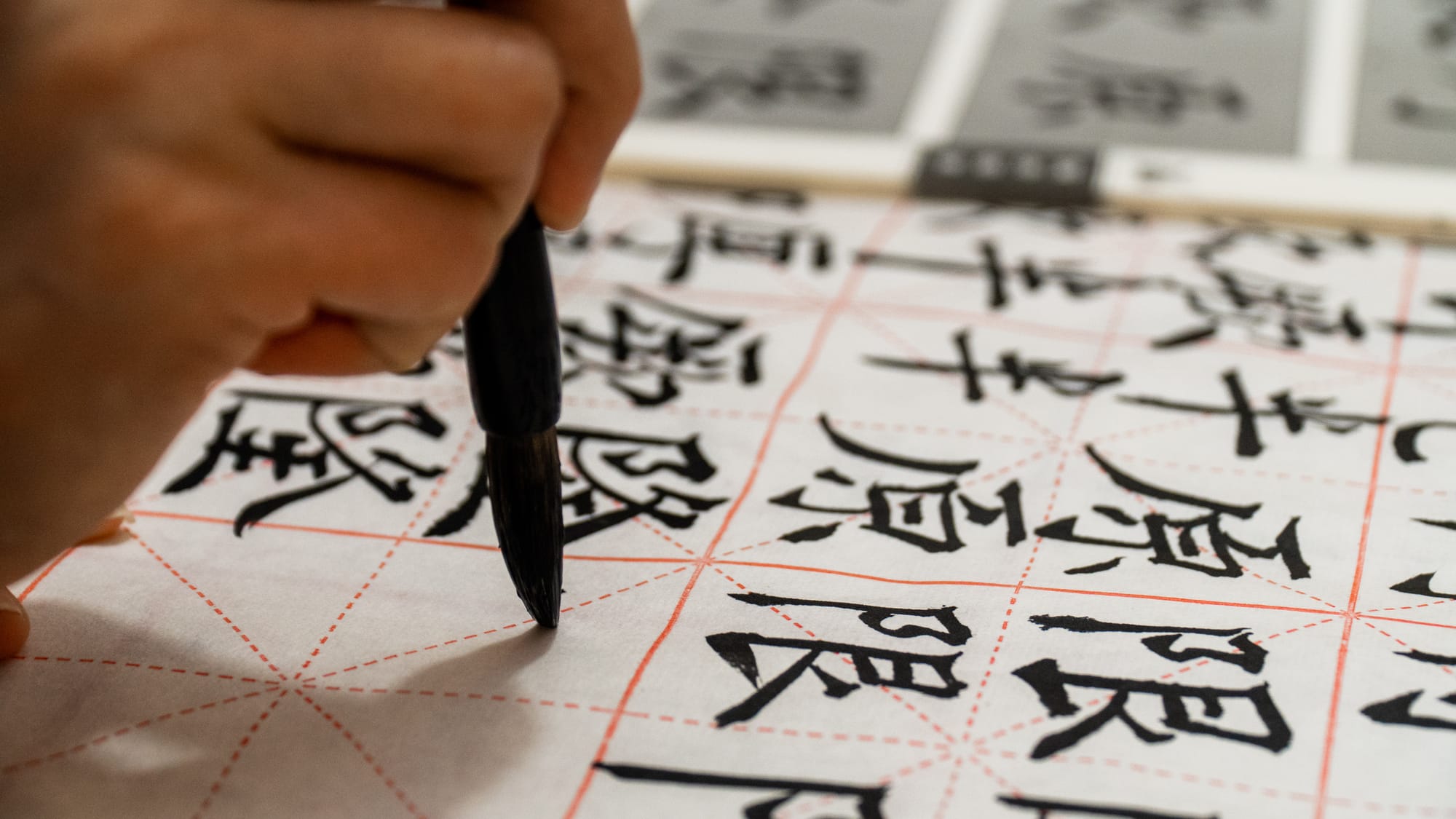
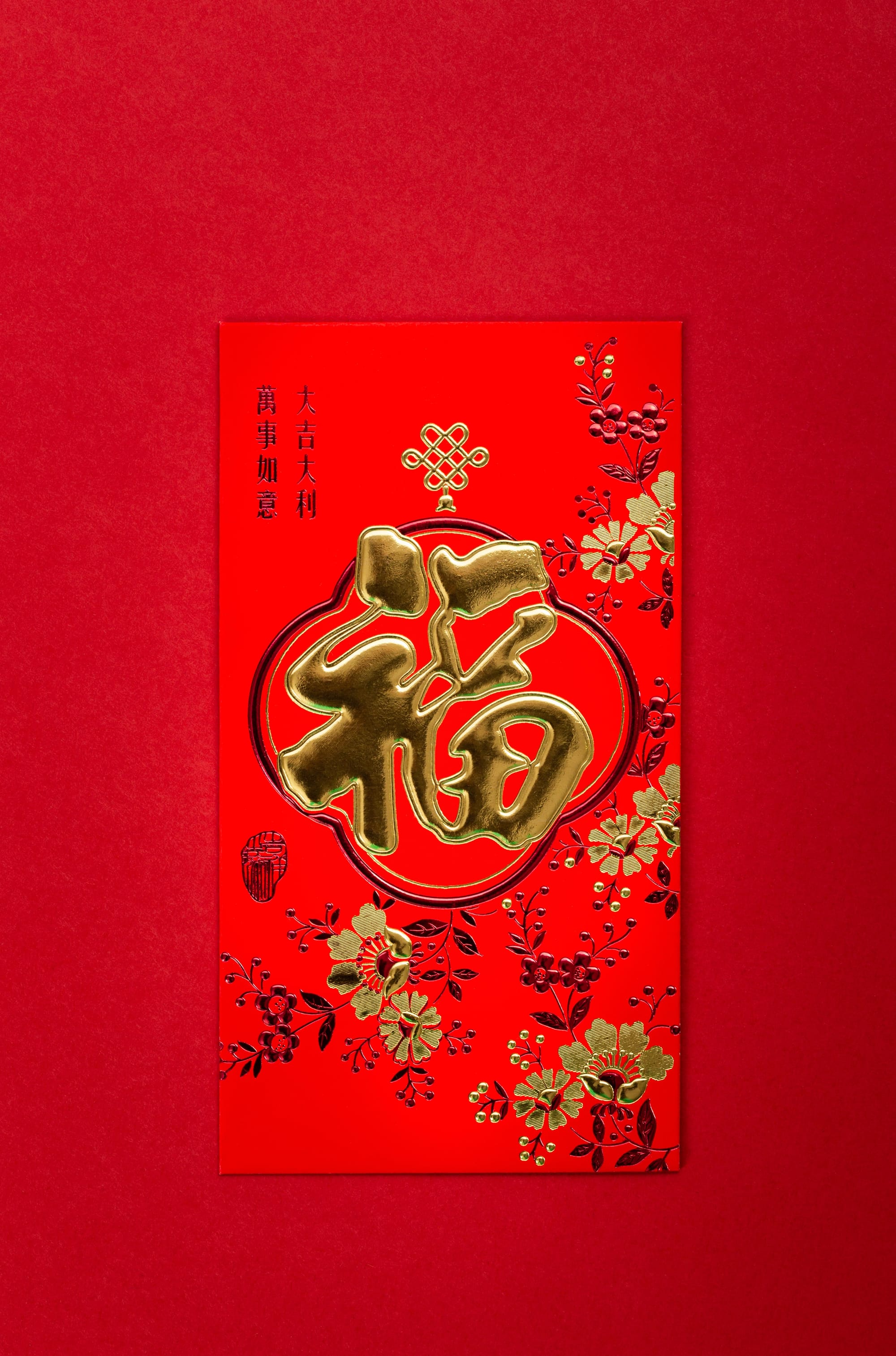
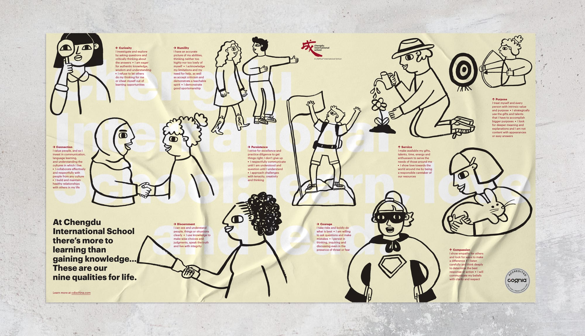
The LifePlus identity is informed and inspired by its deep roots in both Chinese and Arabic cultures. Everything from typography to colour, materials to imagery, honors two distinct—yet complementary—threads of global cultural heritage.


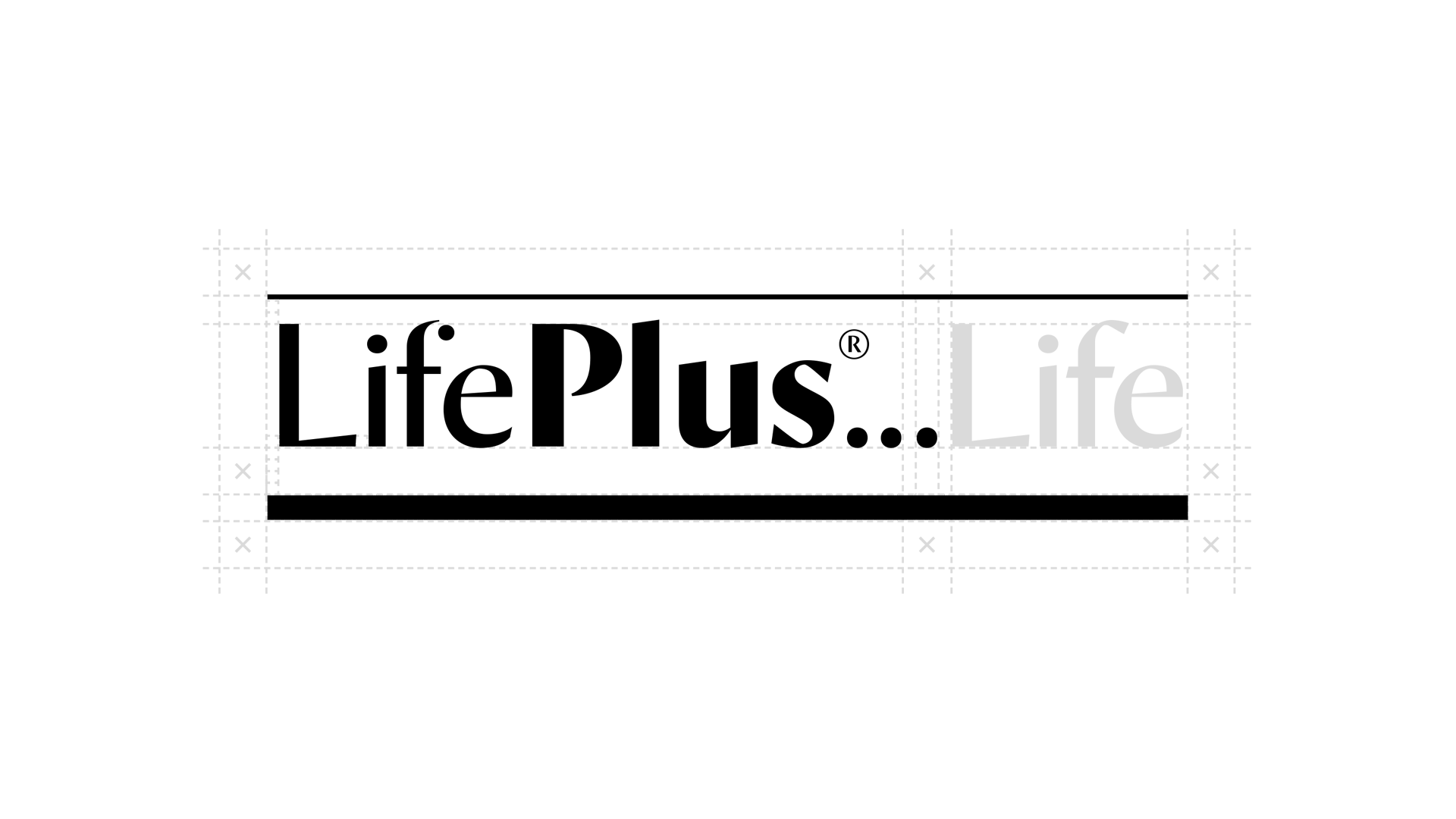
We worked closely with Commercial Type to craft the logotype, which is based on Paul Barnes’ typeface, ‘Orleans’. Designed in 2016 and further developed in 2021, Orleans is a crisp sans serif display face that explores the handmade traditions of letterforms created with broad nibs and the rich tradition of calligraphic sans.
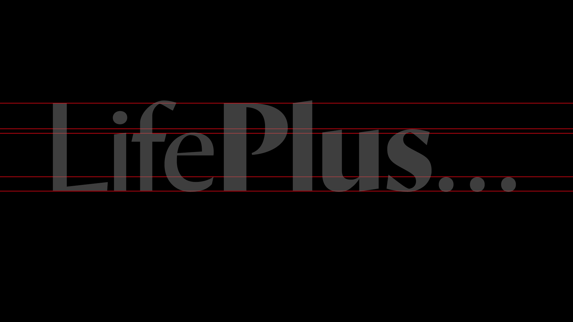
Building the logotype as an editable font, named LifePlus Orleans, takes full advantage of OpenType’s Contextual Alternates feature. By simply typing -lifeplus and setting it in LifePlus Orleans, the logotype instantly and automatically appears—with everything in exactly the right place. Modifying the size and colour of the logotype is now as easy as changing a line of text.

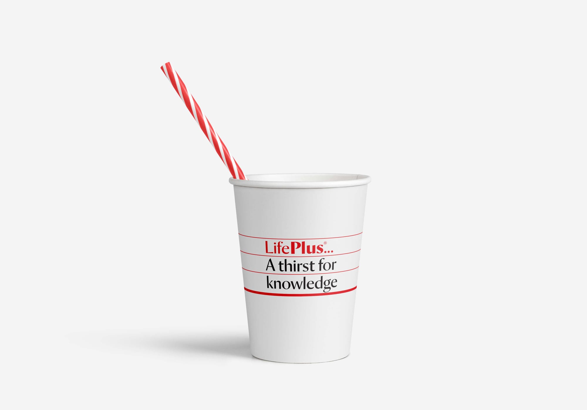
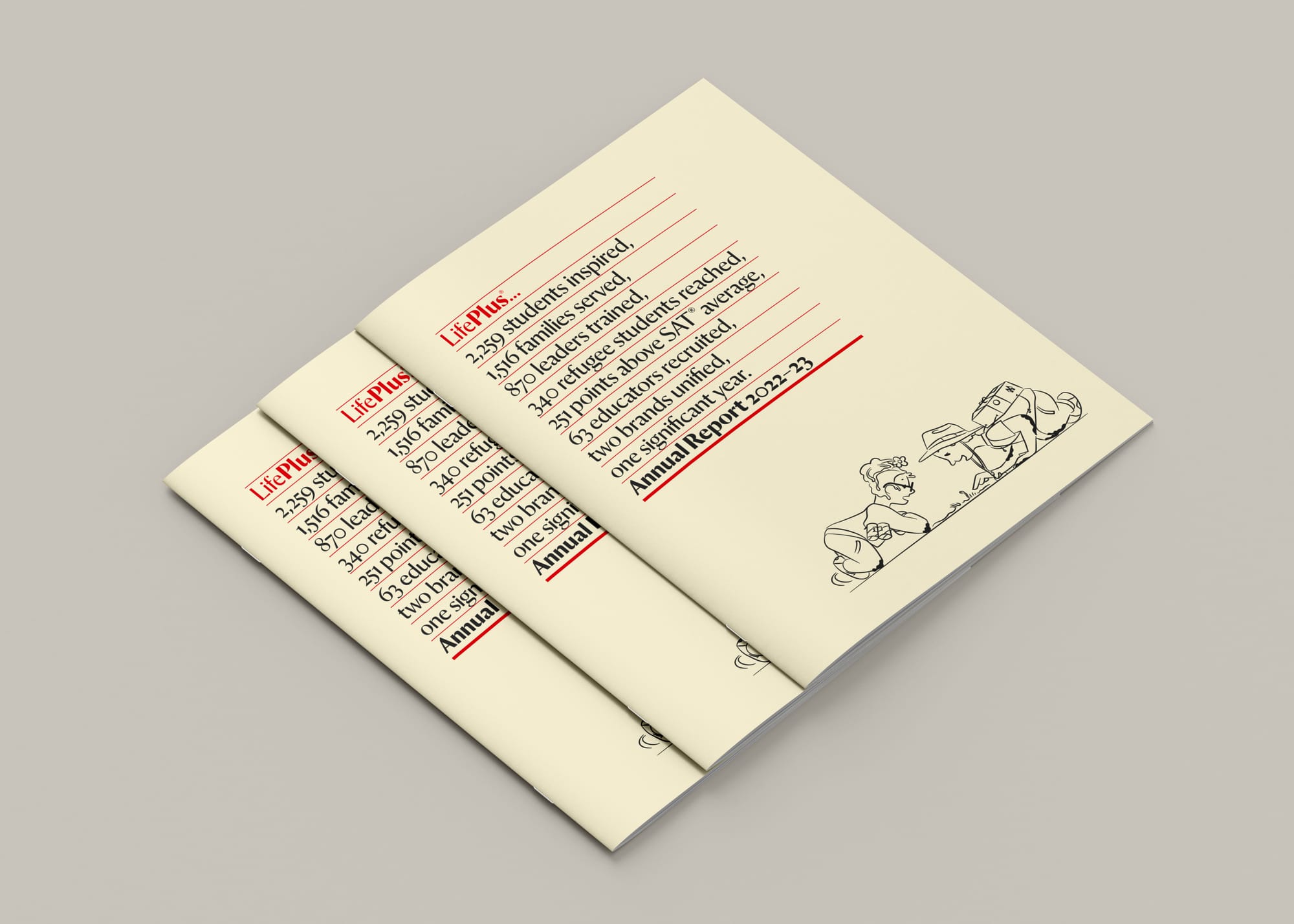
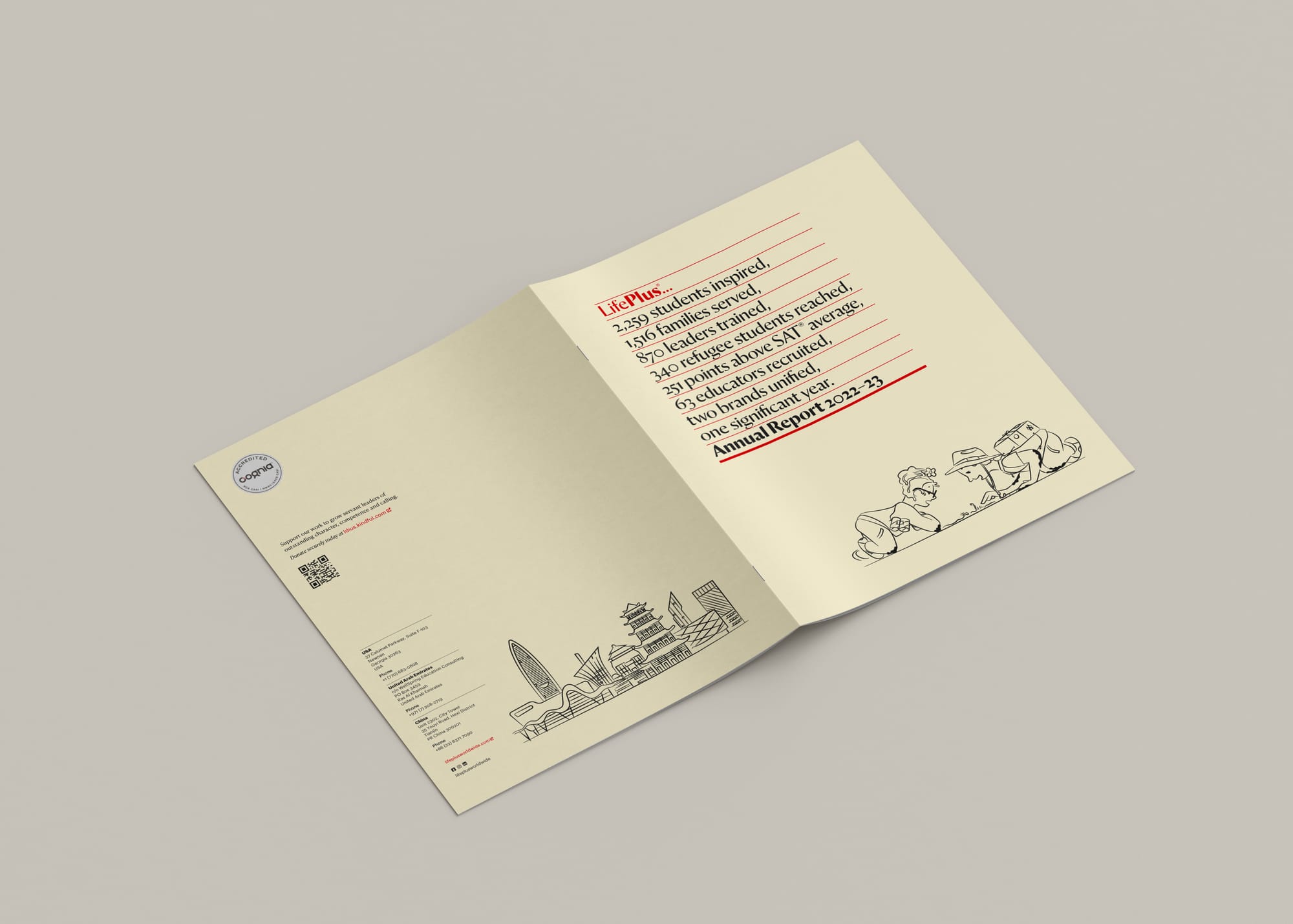
In and of itself, ‘LifePlus…’ is incomplete. The ellipses (three dots) at the end of the name build anticipation that there’s more—there’s something else to add. And there is. LifePlus’ work only means something with the involvement of staff, students, families and partners. The logotype therefore encourages the addition of names, messages or logos, in order to describe a product or service, create a headline, make a statement, ask a compelling question, or show a partnership.
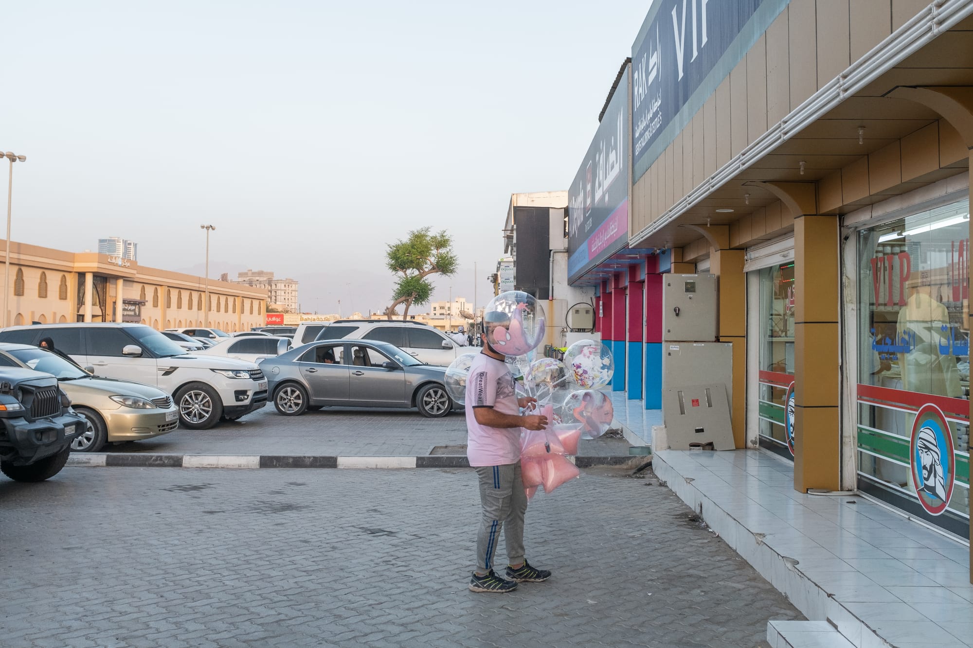
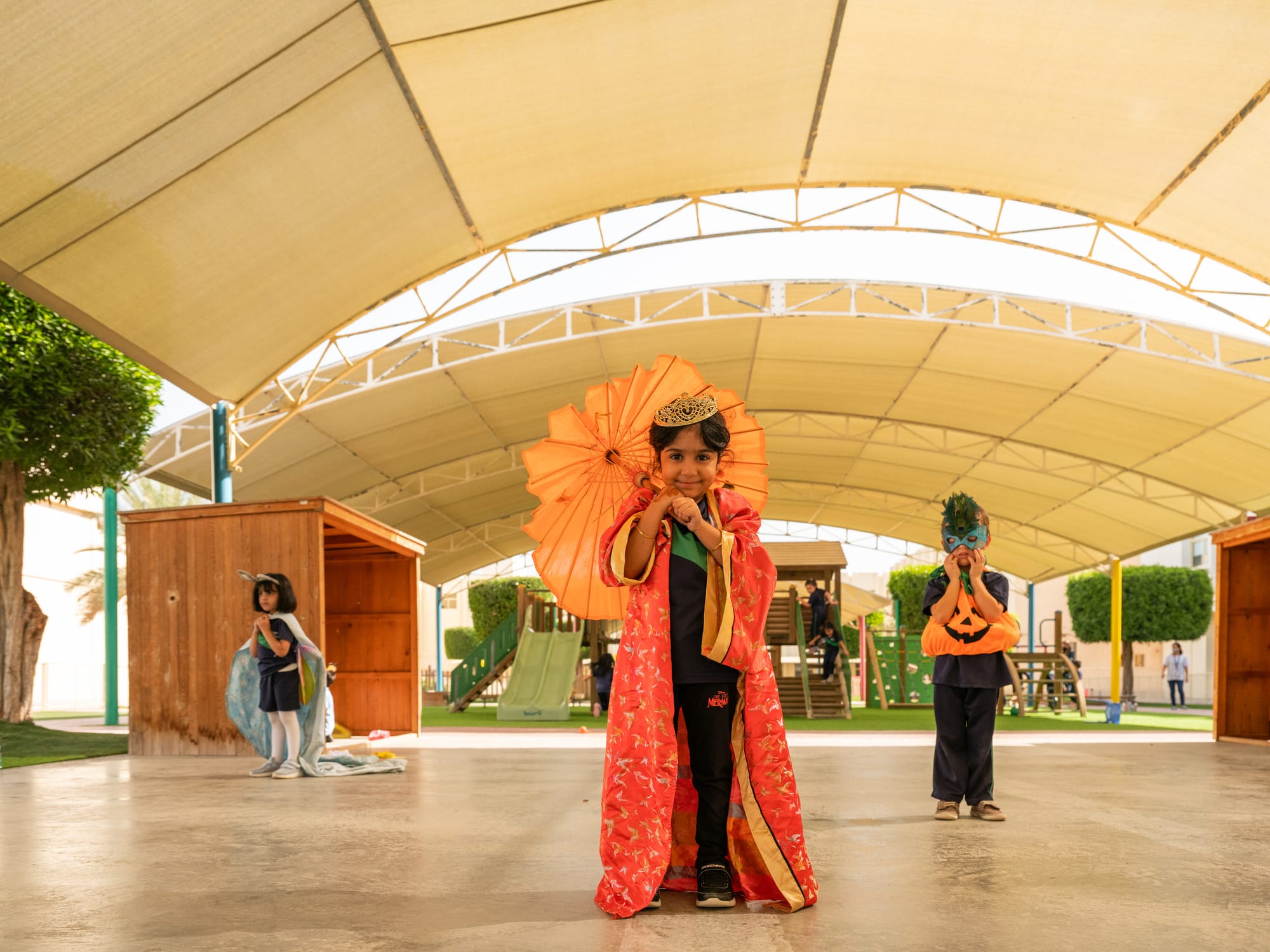
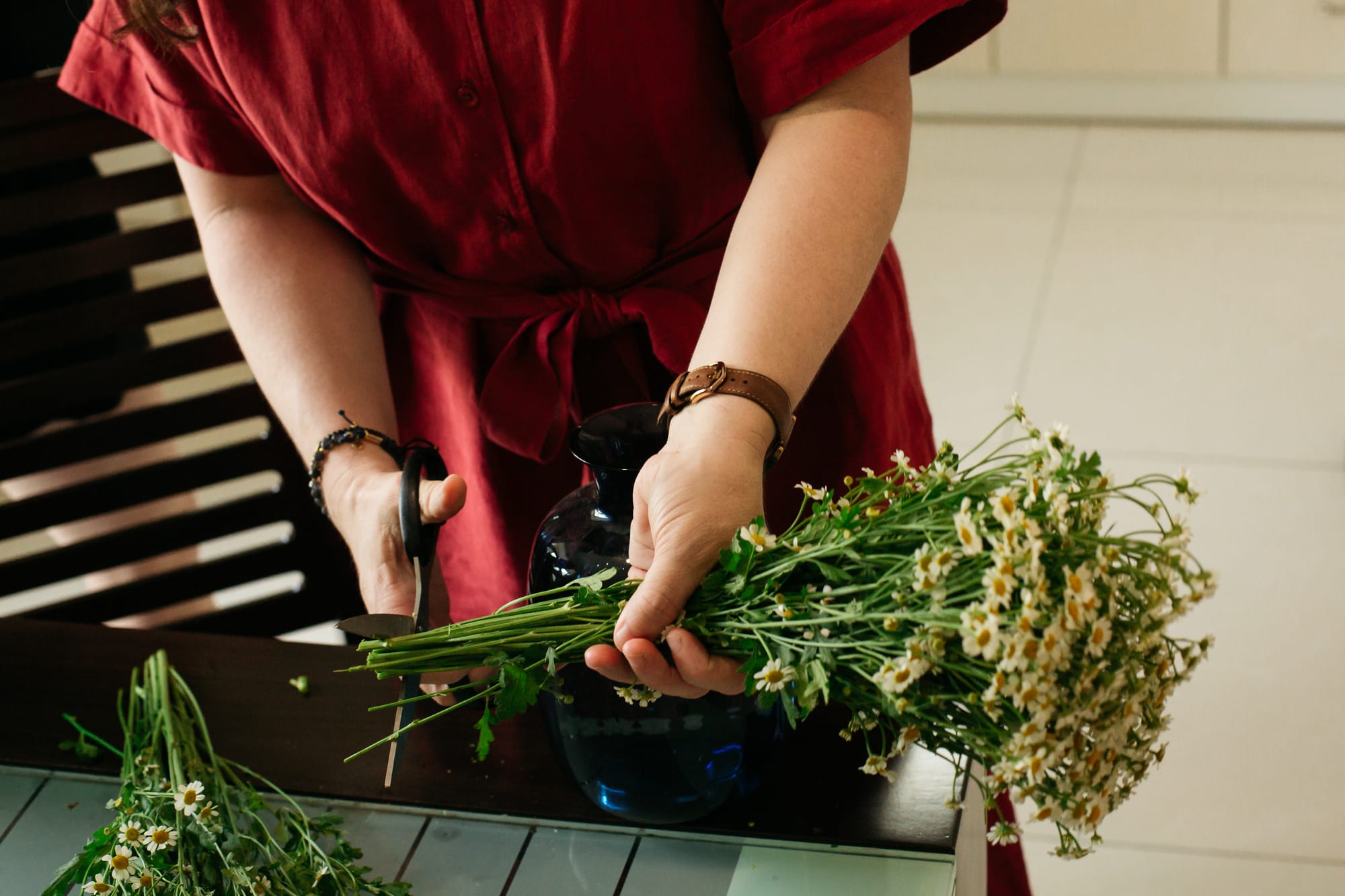
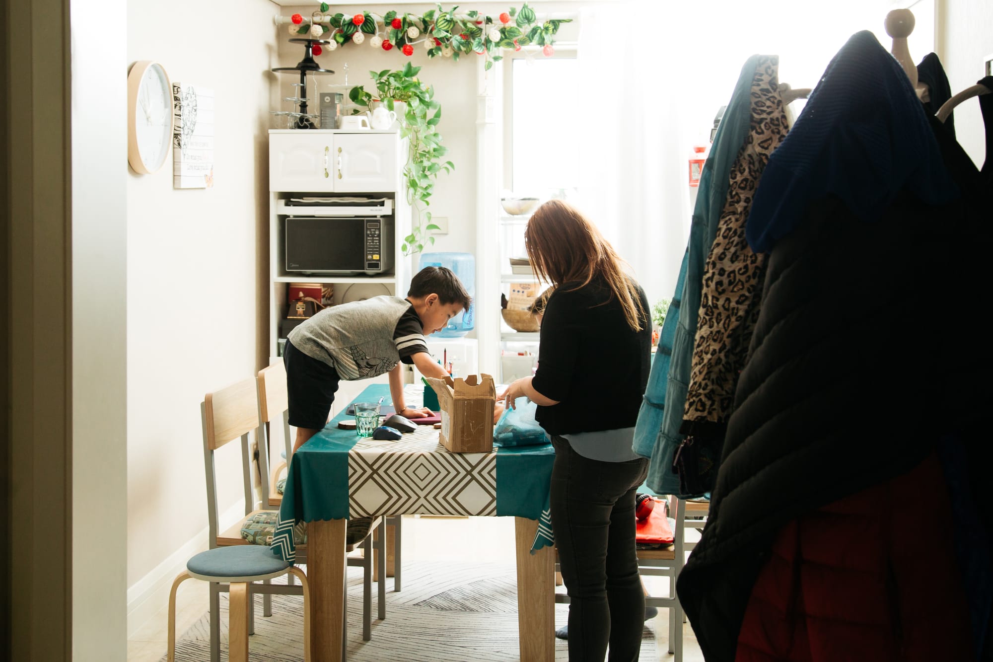
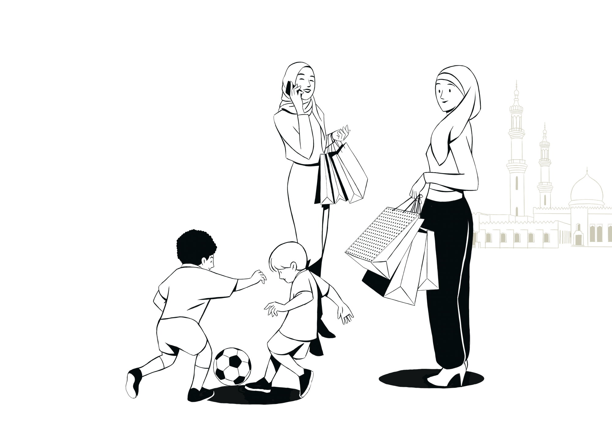
Photography
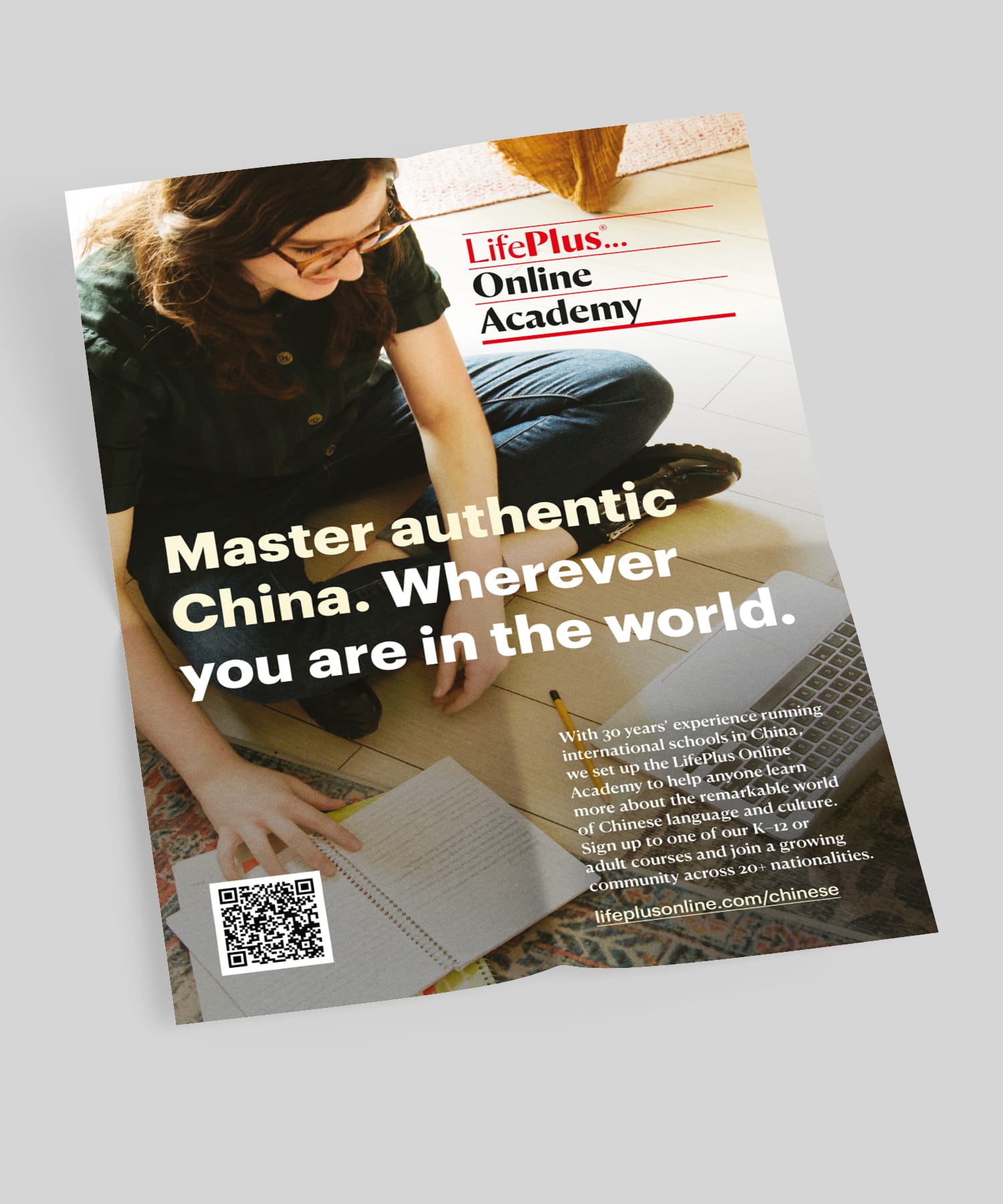
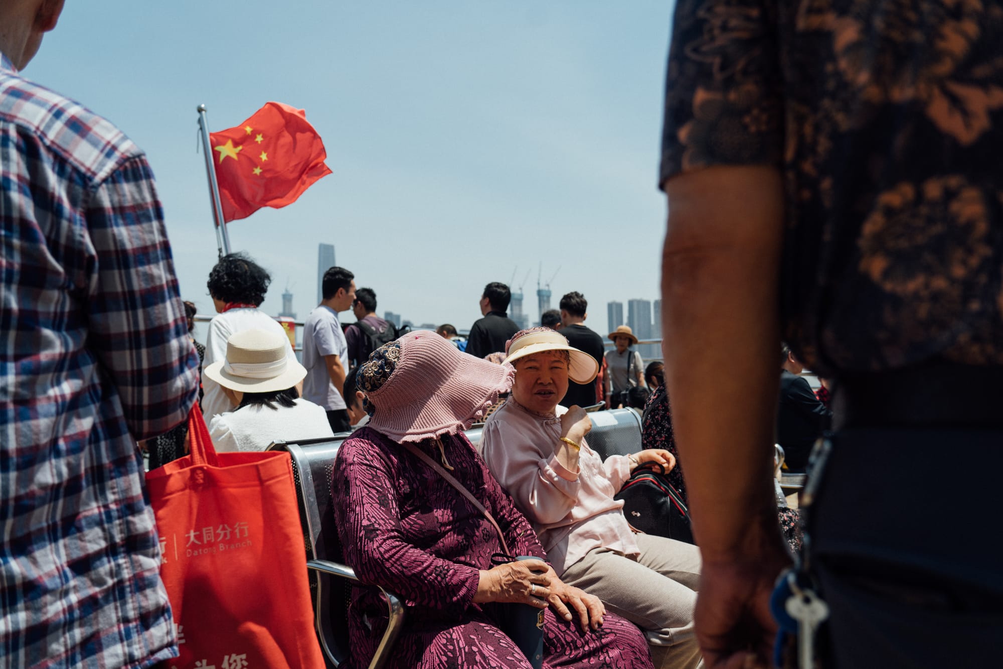
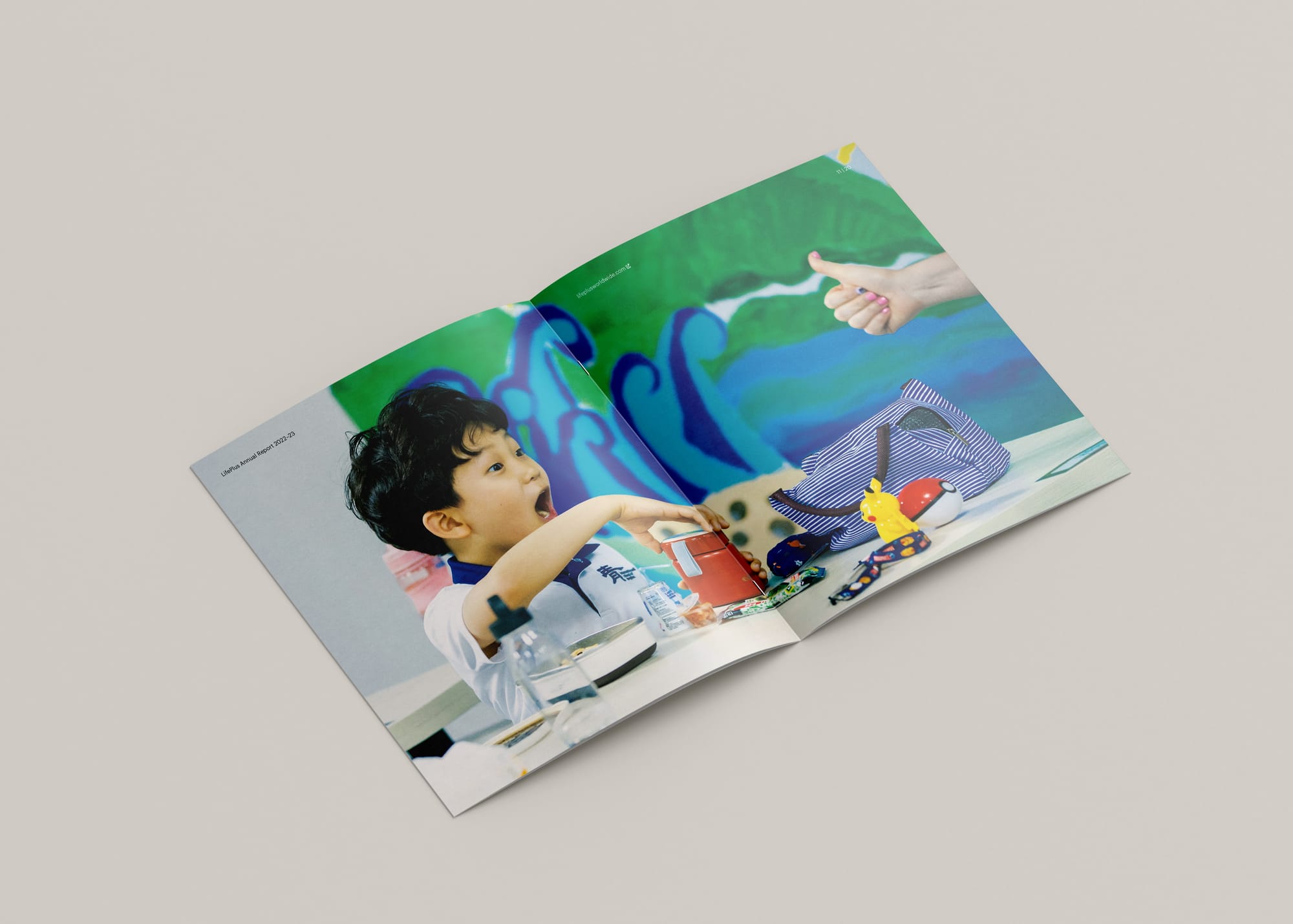
LifePlus photography celebrates people and places; providing an honest but optimistic view of the world and their role in it. These images are never about merely documenting things, or serving as visual ‘wallpaper’. Instead, LifePlus photographs remember moments, capture and trigger emotions, and tell compelling stories.
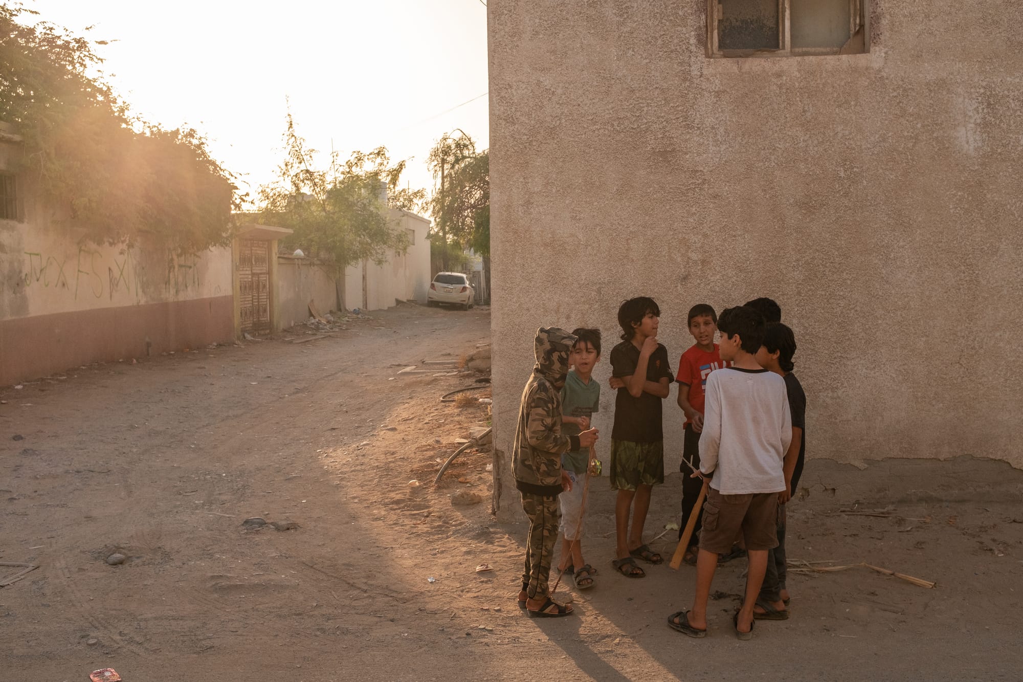
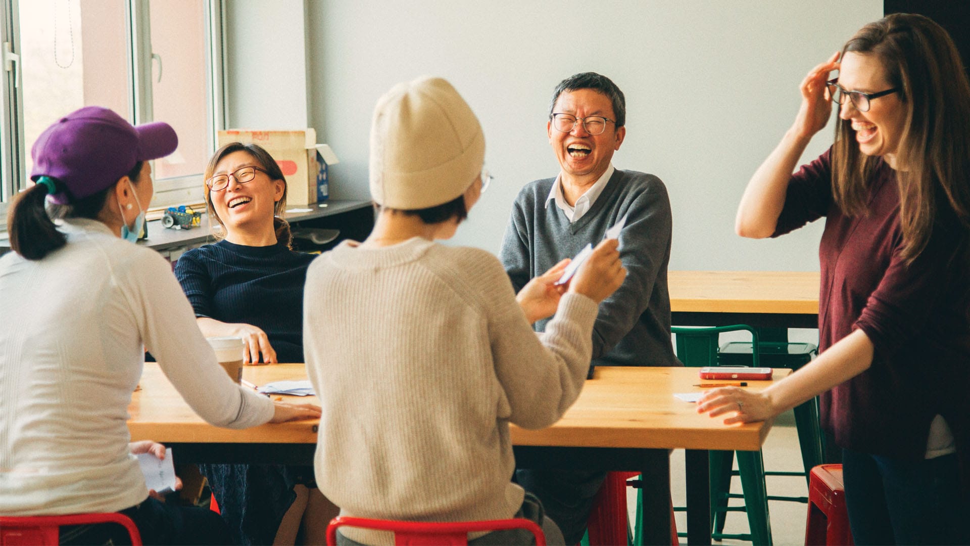
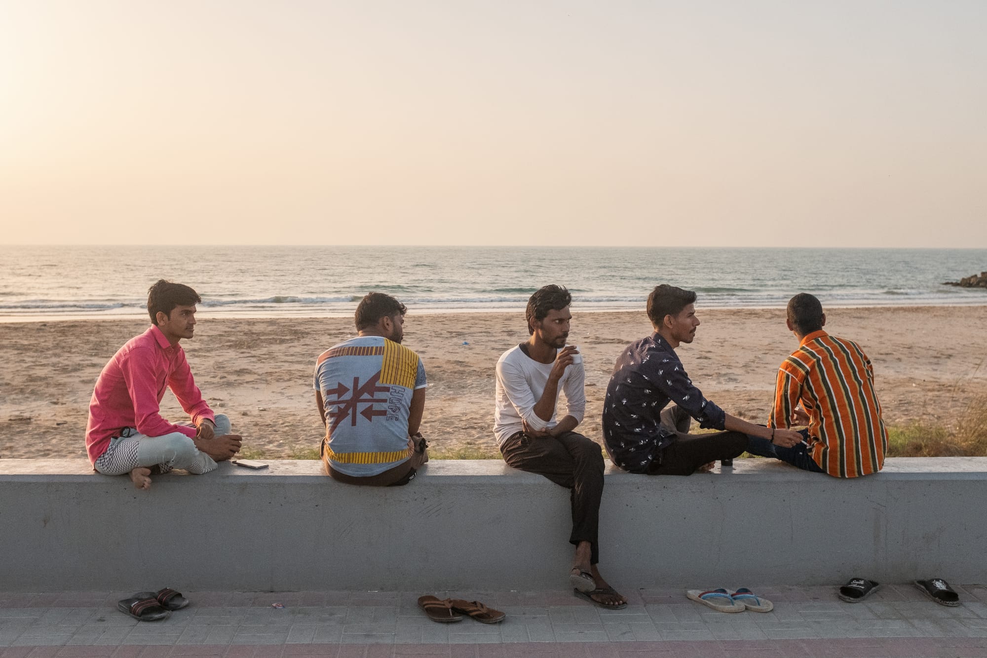
Our growing international network of photographers who contribute to LifePlus’ brand library include…
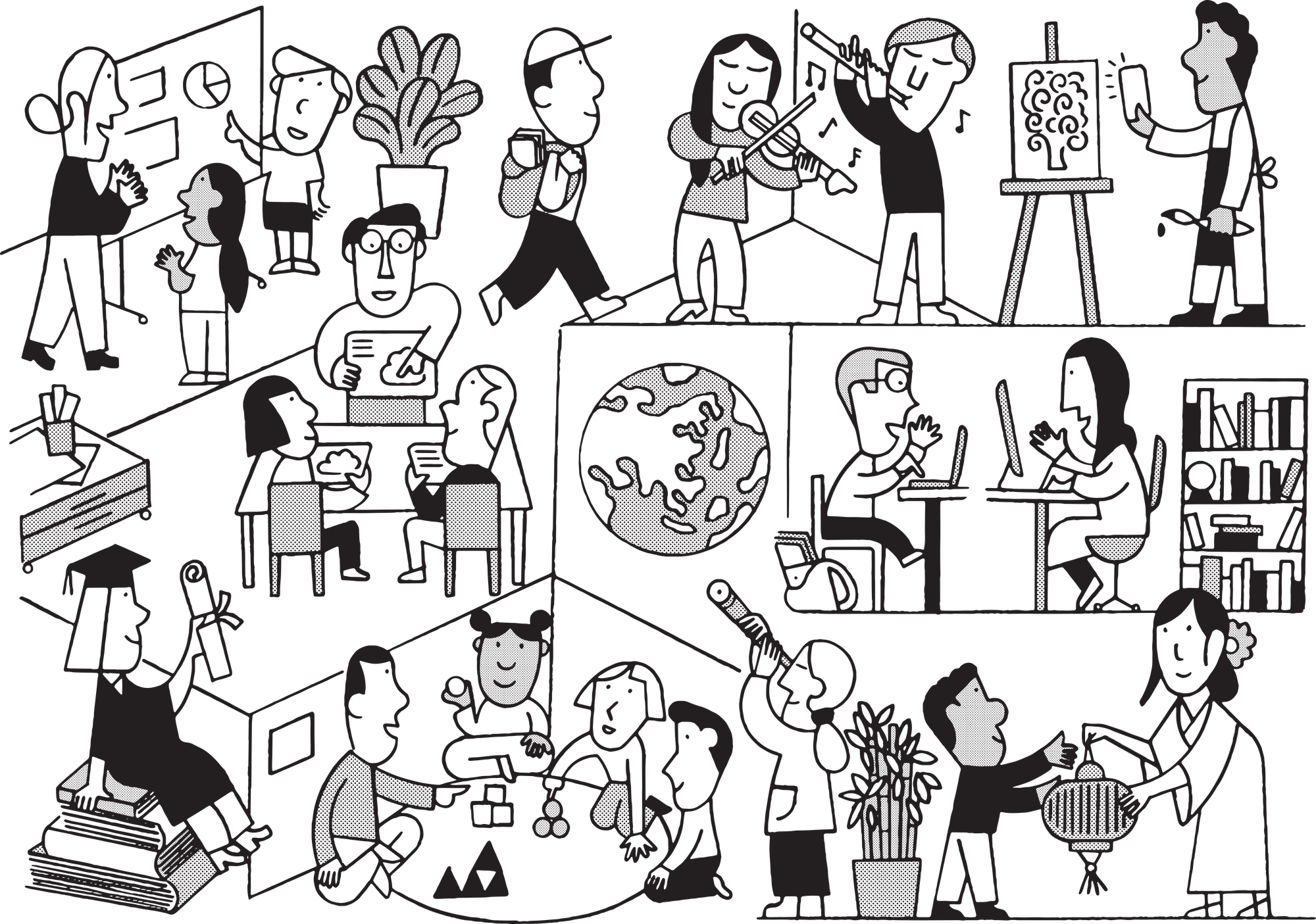
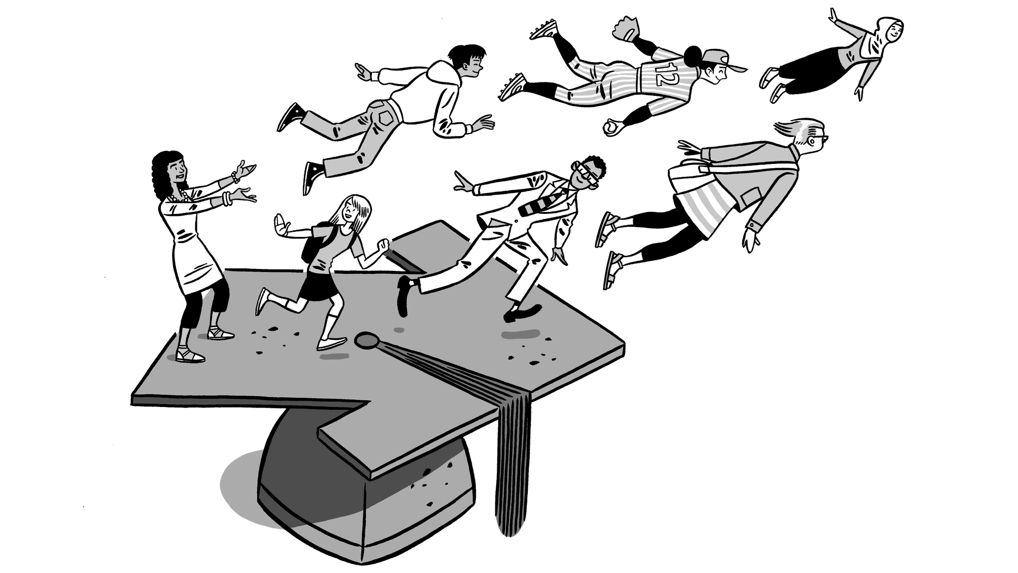
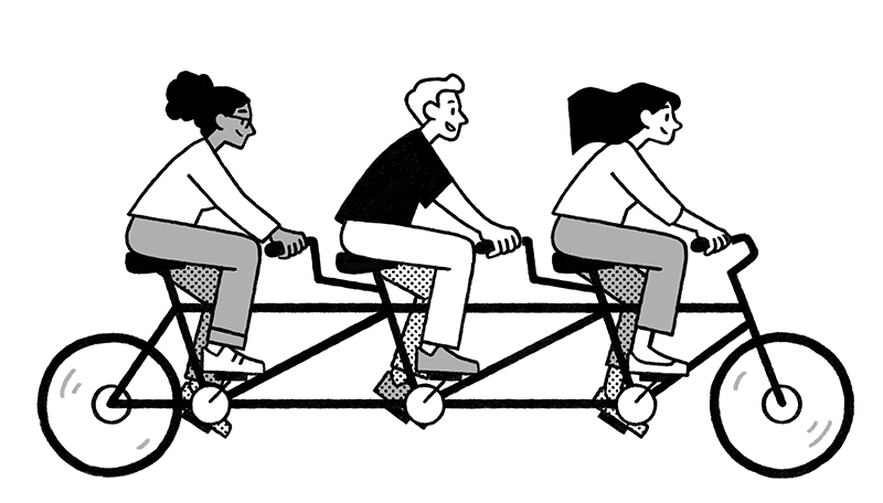
Illustration
The use of illustration is something that really sets LifePlus apart in the world of education. And the benefits are clear. First, illustration is a universal language, and the perfect way to communicate abstract or complex messages with simplicity. Second, illustration is stylistic—and something LifePlus can make its own.

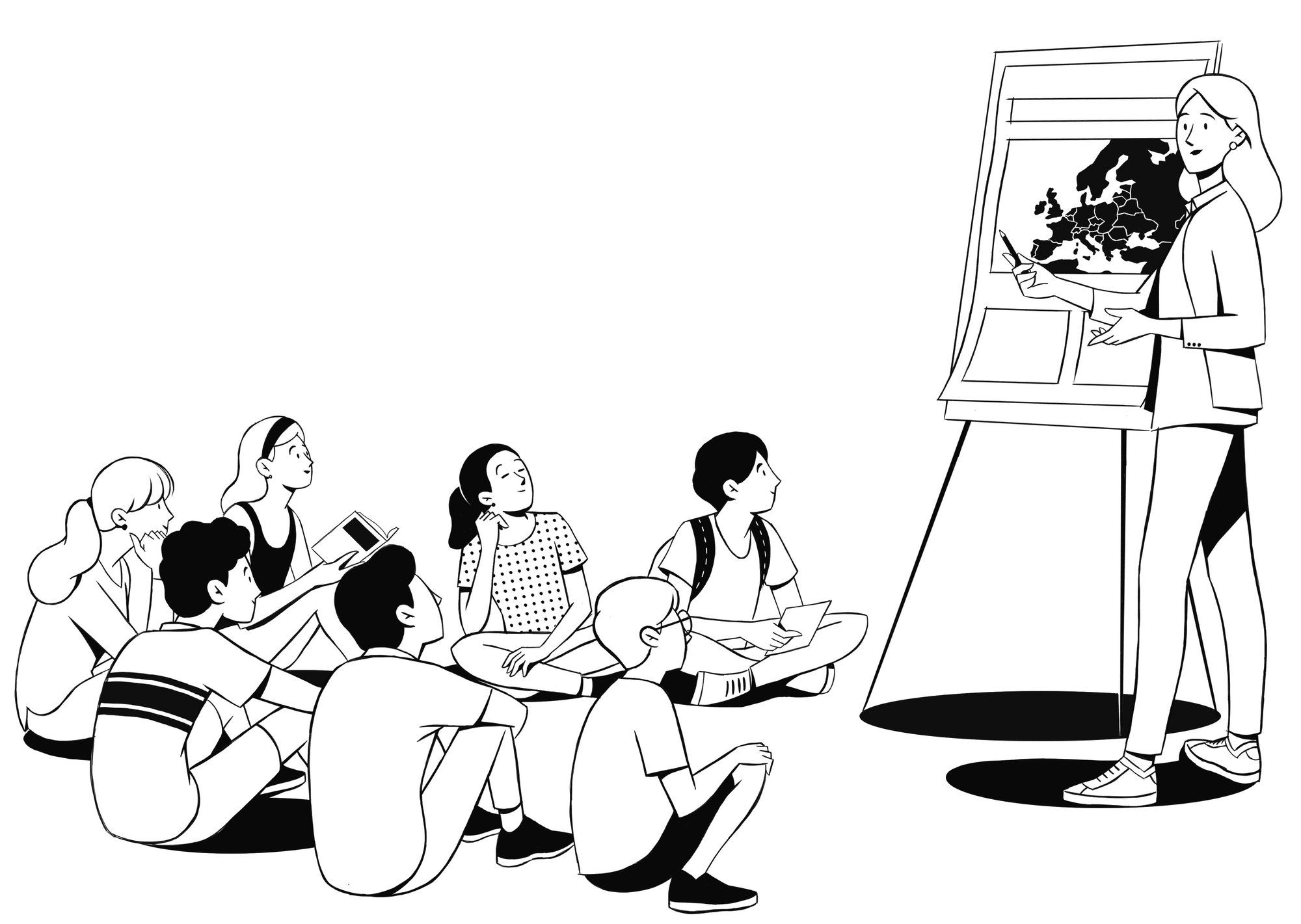
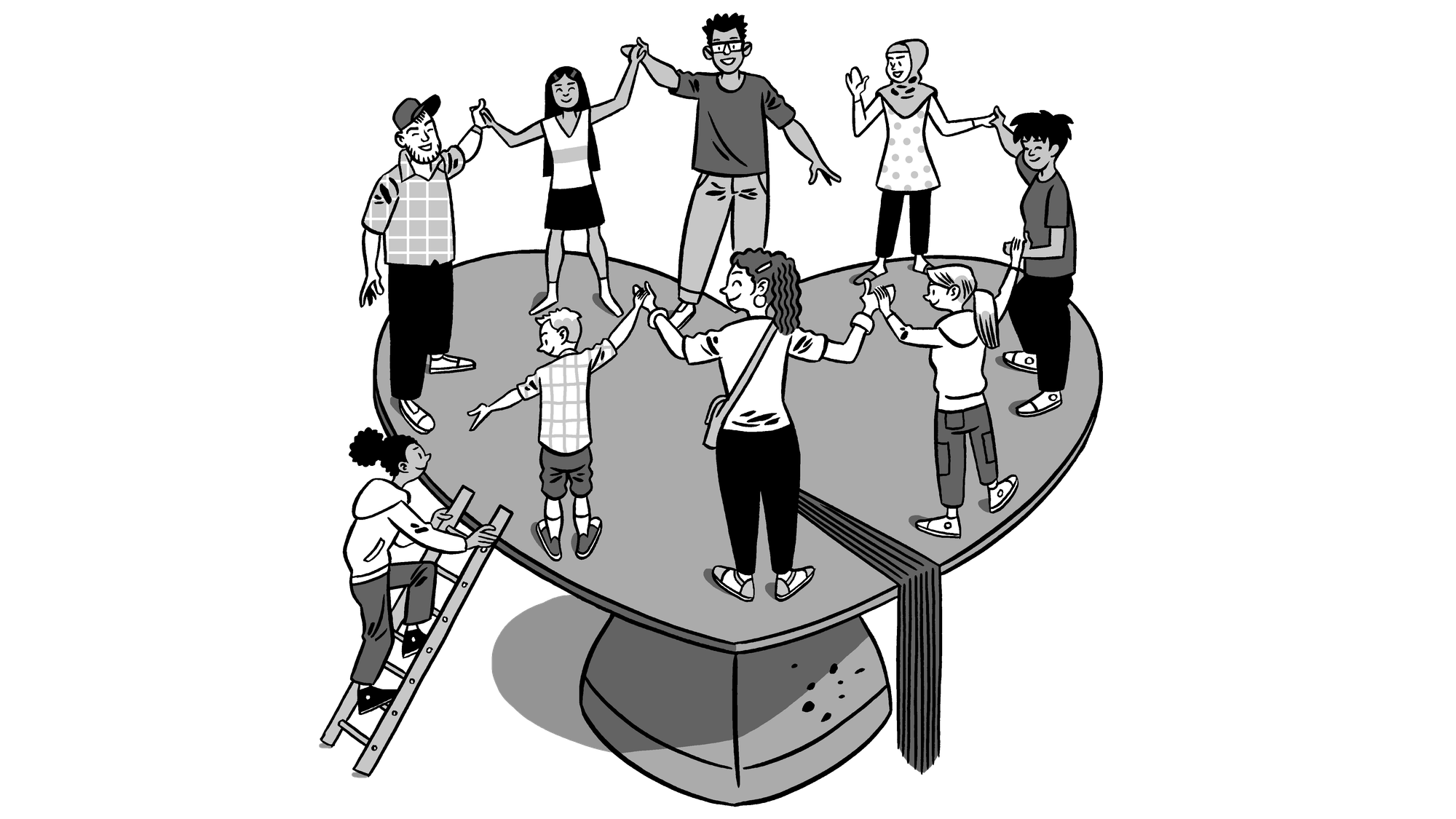
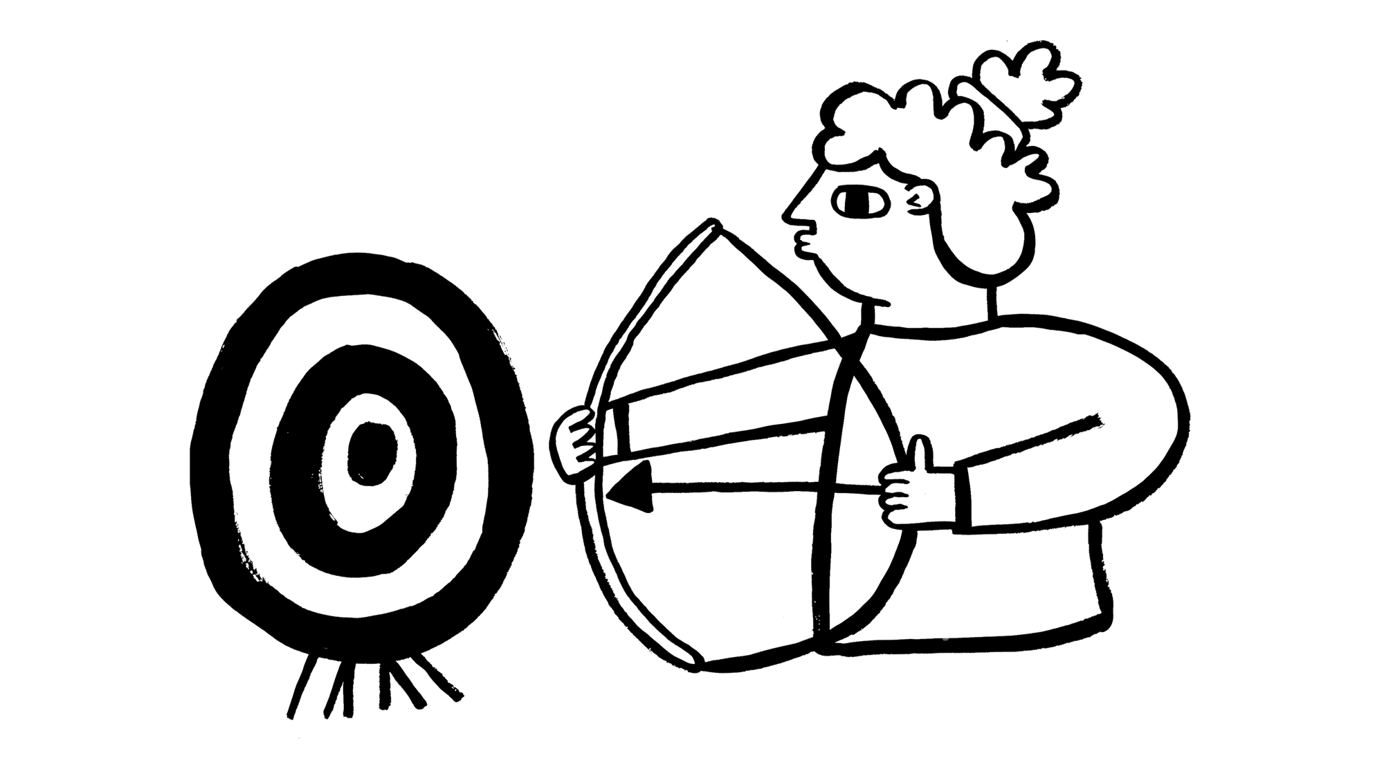
Our growing international network of illustrators who contribute to LifePlus’ brand library include…


Brand Hub
Encouraging nearly 1,000 staff and partners to be ambassadors of a new brand takes more than a guidelines PDF. So we built a dedicated, one-stop hub full of practical advice, downloadable assets and sources of inspiration. And for anything else, there’s an online form that sends requests directly to our centralised team.
Name Change campaign
Whilst our schools in each city handled news of the rebrand with their parents and partners—armed with messaging and assets provided by my Corporate Marketing team—we took a campaign-based approach for US-based supporters and international followers.
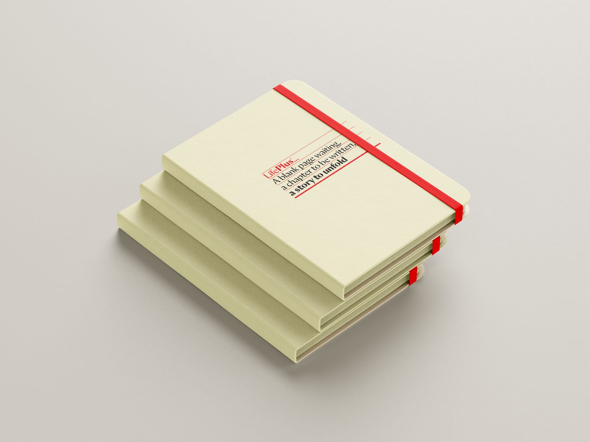
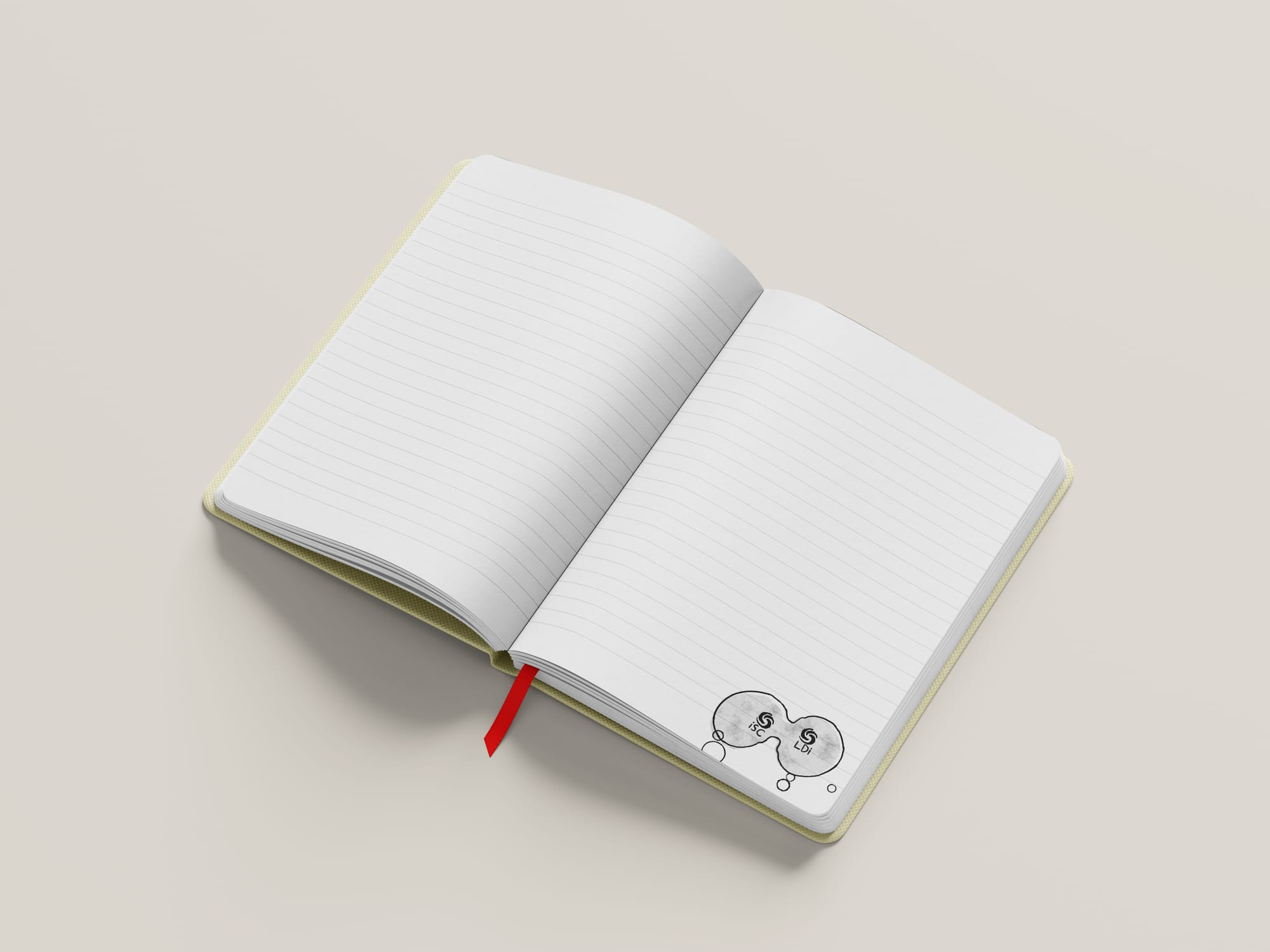
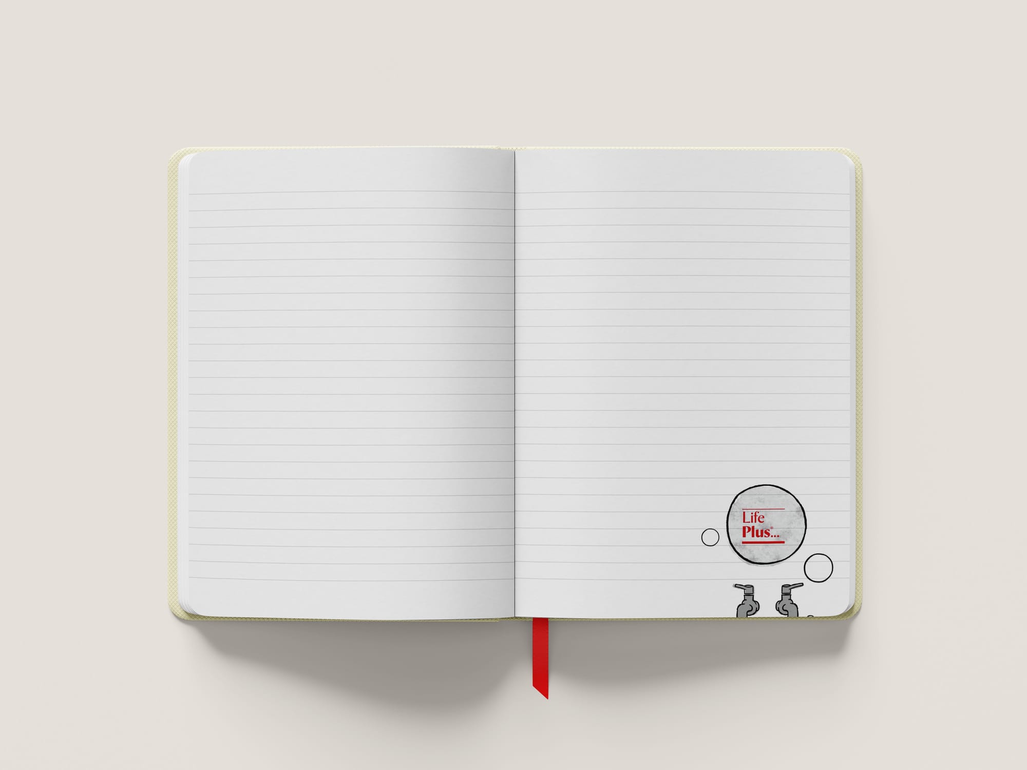
A series of playful animations by Robert Grieves, inspired by both classroom and playground, brought our comms to life on social platforms, in emails, and even via a DM notebook that doubled as a flipbook.
Annual Report 2022–23
A global pandemic, a new company name and extensive rebrand, the launch of education services for refugee communities in Egypt… All of these events, and more, certainly made LifePlus’ first year a memorable (and somewhat complex) one. Conversely, our Annual Report was succinct and to-the-point.
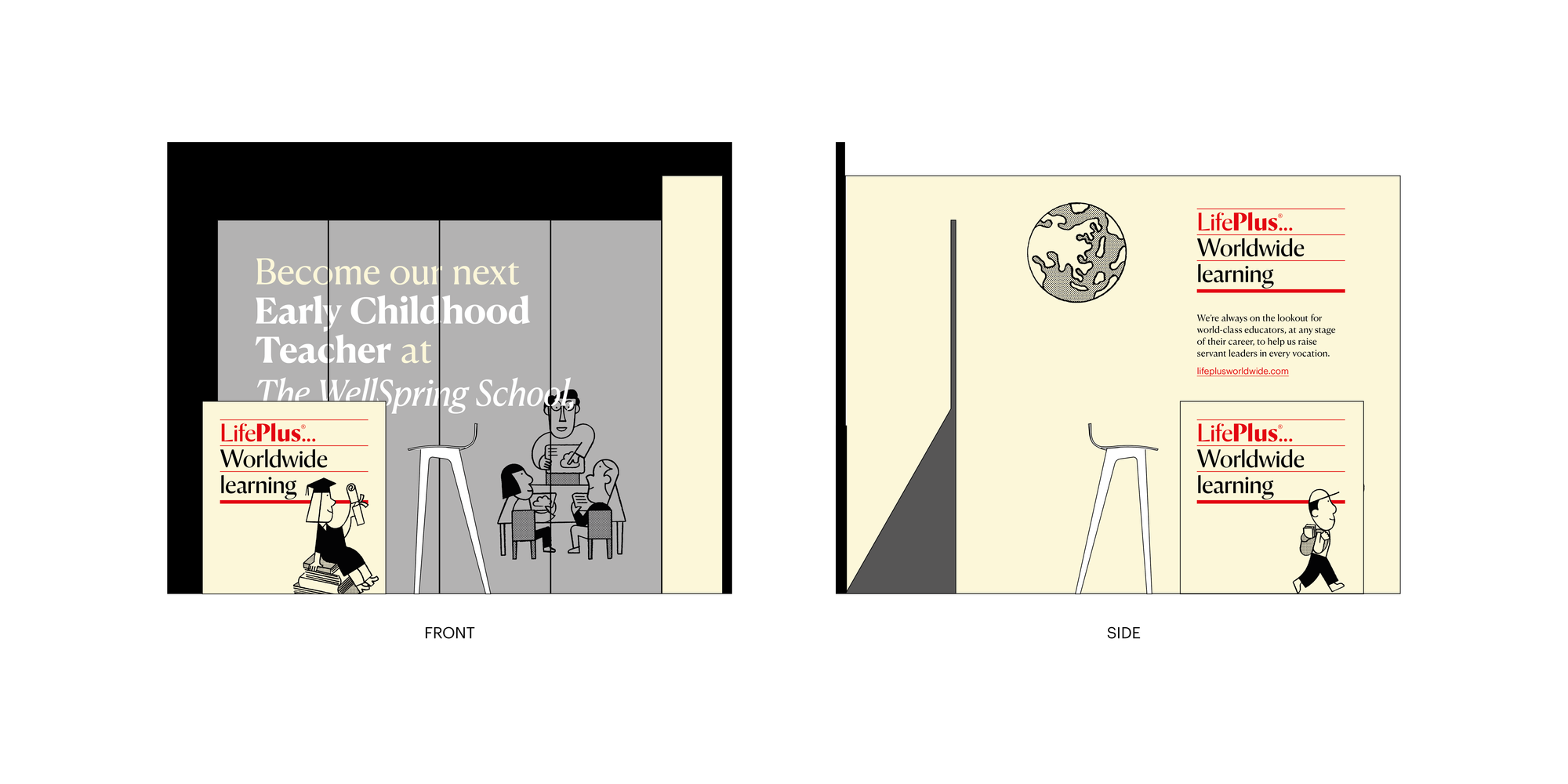
In-person recruitment
Our US-based Mobilization + Recruitment team keeps our international schools staffed with quality educators from around the world. For many, joining LifePlus isn’t just a step into a new job—but a leap into an overseas adventure. This concept of travel and excitement gently inspired the redesign of our exhibition setup, literature and giveaways.
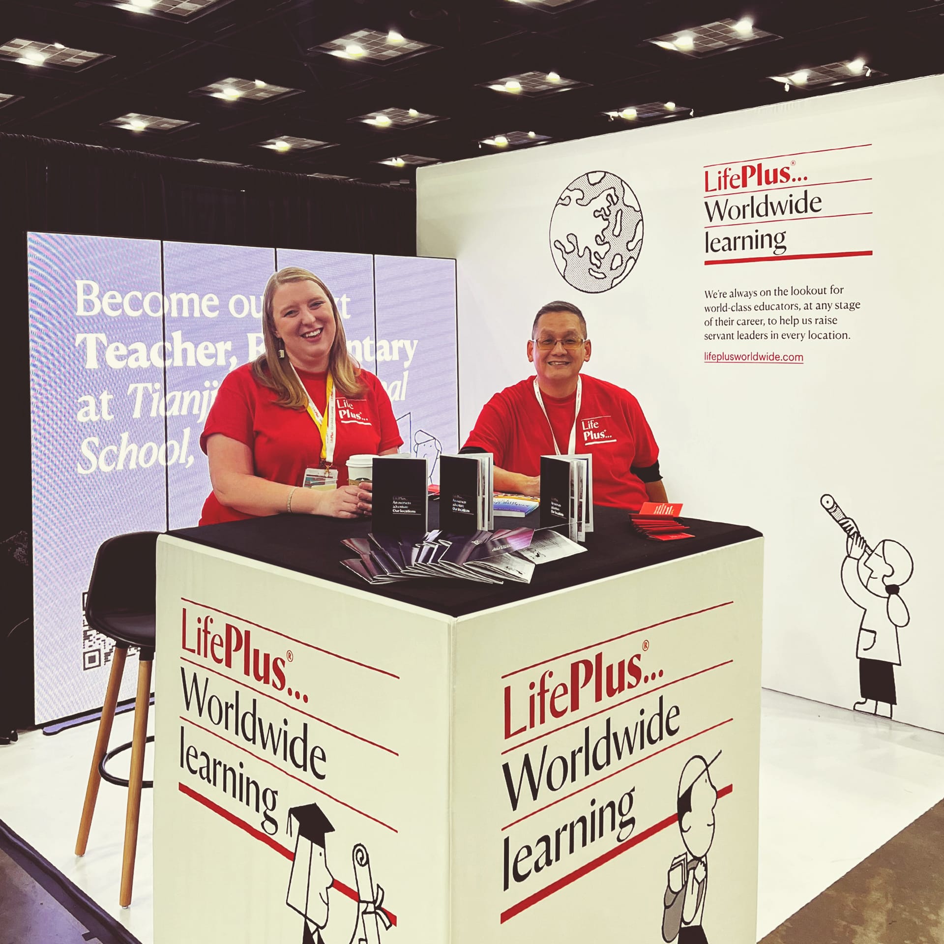
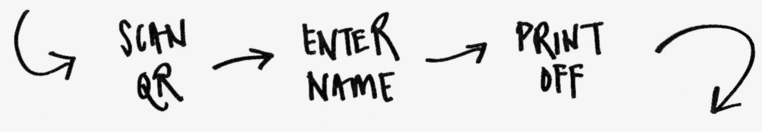
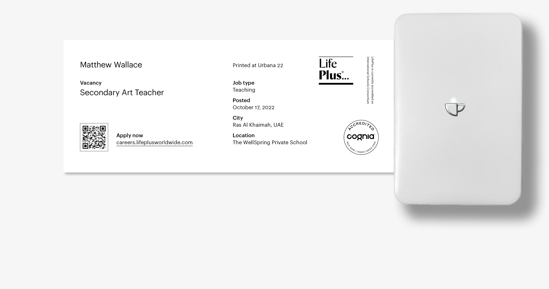
A nod to mechanical departure boards, the digital backdrop presents open vacancies across all our locations—dynamically updated in real time. Full details on our careers portal can be accessed via a QR code, also generated for each vacancy on-the-fly.
Armed with these QR codes, a smartphone and a portable thermoprinter, LifePlus recruiters print off customised job slips—inspired by airline boarding passes—for booth visitors to take away and explore later.
Project credits
Verbal identity lead Rob Self-Pierson
Design team Iris Bao, Alex Brazier, Ada Hong, Matthew Lowe, Paul Worthy, Yalin Zhou
Wider Corporate Marketing team Paul Graves, Daniel Konold, Abi Roy, Jenny Swecker
Motion graphics Ada Hong
Animation Robert Grieves
Font development Mark Record (Commercial Type)
Web development Grant Holle, Mark Thomas
Template build Joanna Doyle
Illustration Massimiliano Aurelio, Alice Bowsher, Ben O’Brien, Jay Cover, Jason Ford, Jesse Jenkins, Sarah Mari Shaboyan, Holly Wales
Photography Sun Jie, Xing Jingjie, Zheng Peng, Mohamed Somji, Joseph Xiao, Zhang Yang

