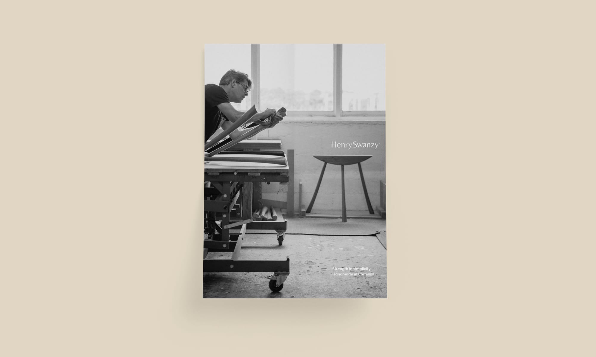
A high-end furniture startup named after its founder, I helped Henry Swanzy define and express the heart of the brand: a belief in the joy derived from seeing familiar things in a new light.
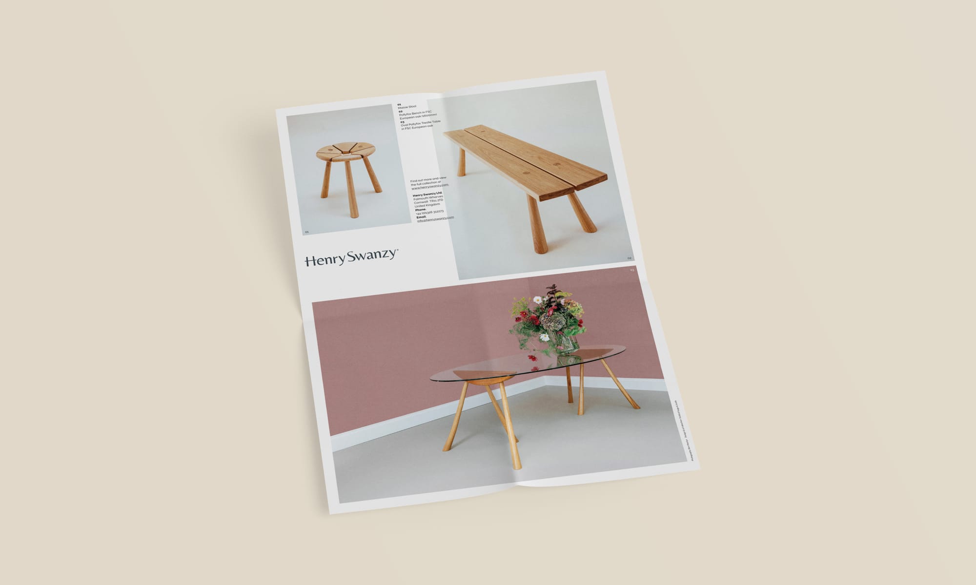
Within just three months of launching, prestigious furniture store Heal’s snapped up the rights to exclusively sell three out of five pieces in the range.
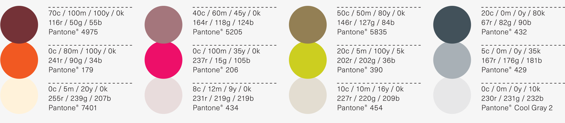
Brand identity
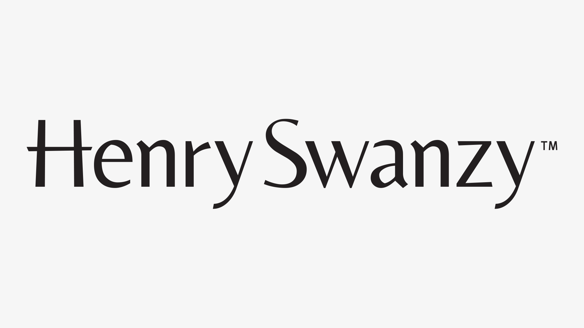
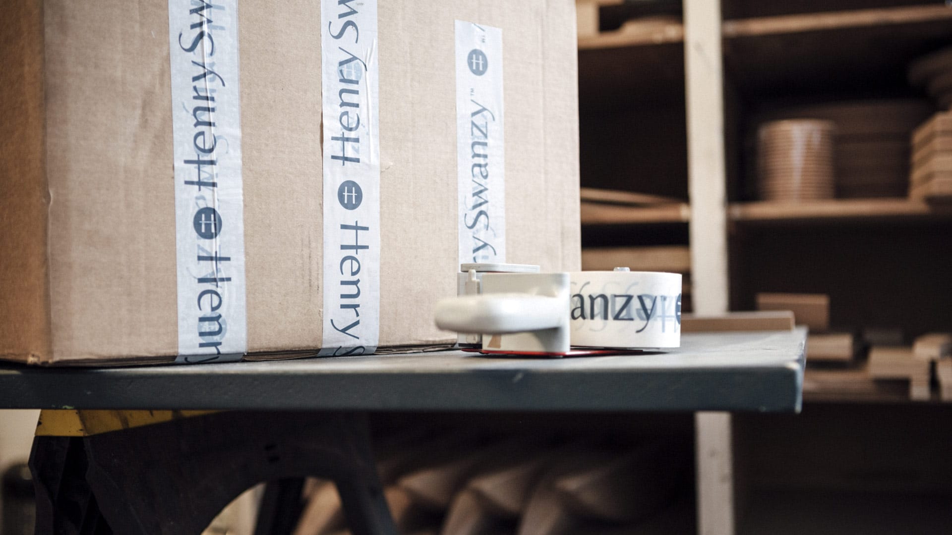
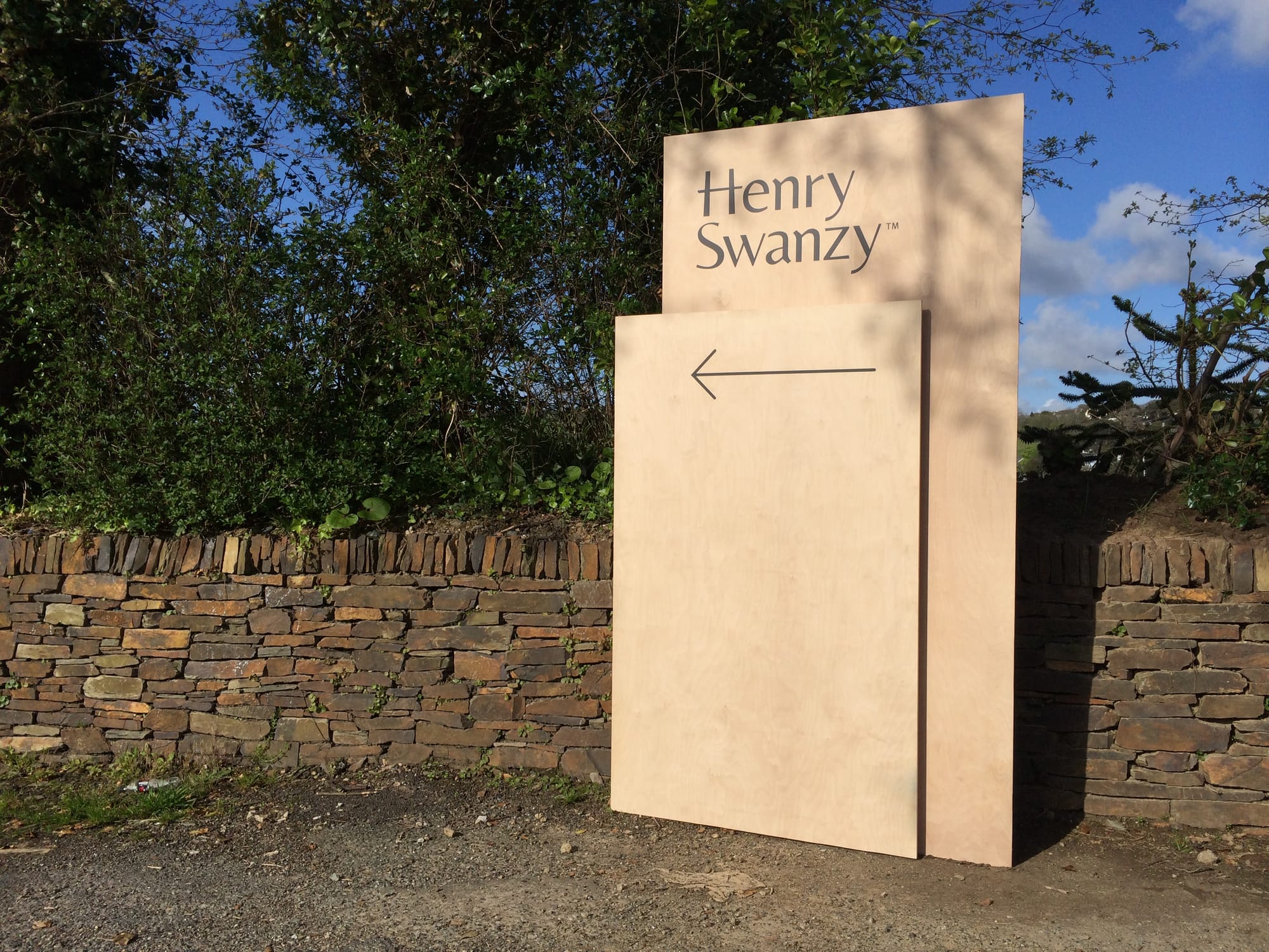
A customised typeface creates a unique logotype that references the furniture itself: gentle tapers and elegant curves that can only be achieved by an artisan’s hand—not a machine.
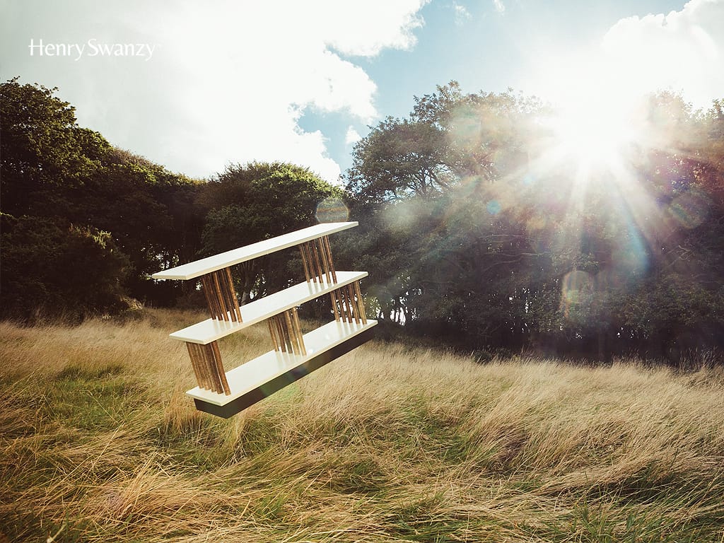
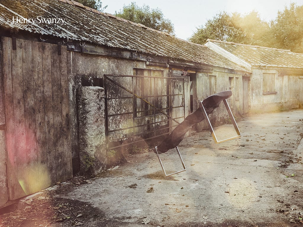
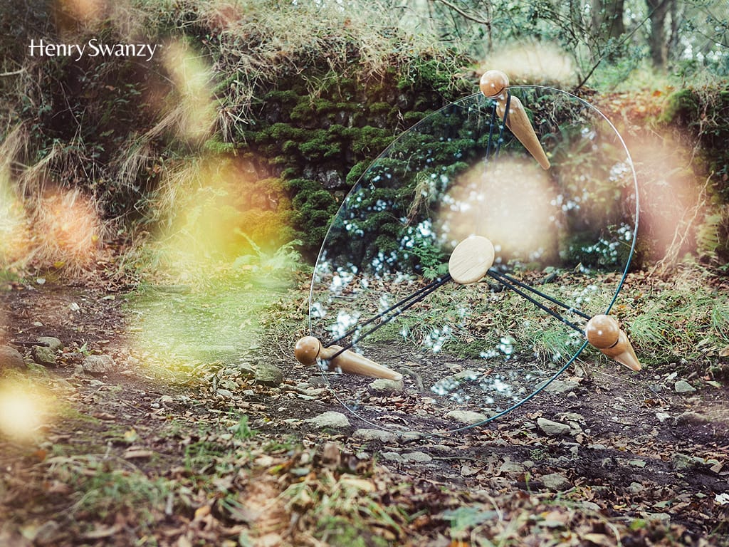
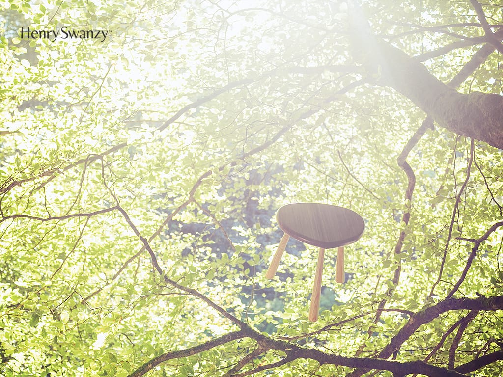
Hero imagery
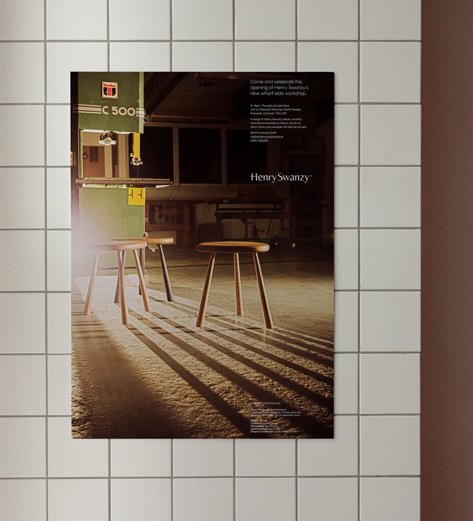
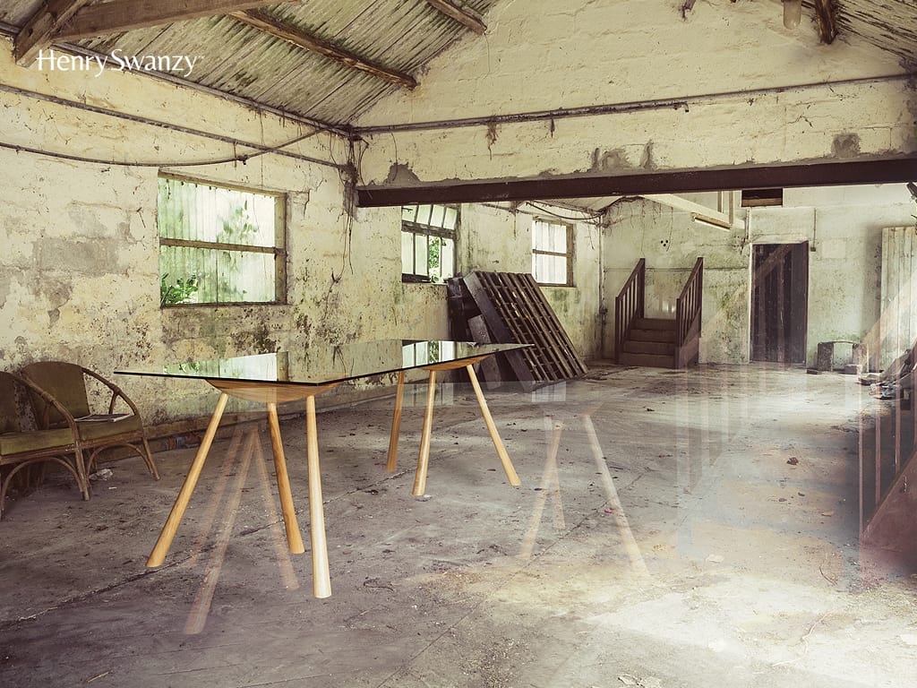
Carefully constructed (and retouched) hero imagery depicts each iconic piece in the Cornish landscape of its origin. Defying gravity and captured in an ethereal—almost illusory—light, these images embody the brand’s ethos.
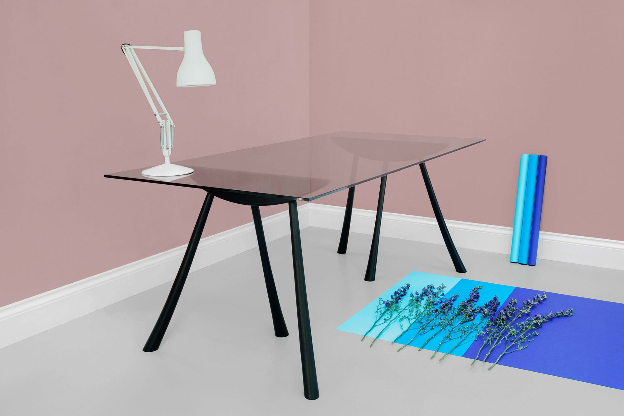
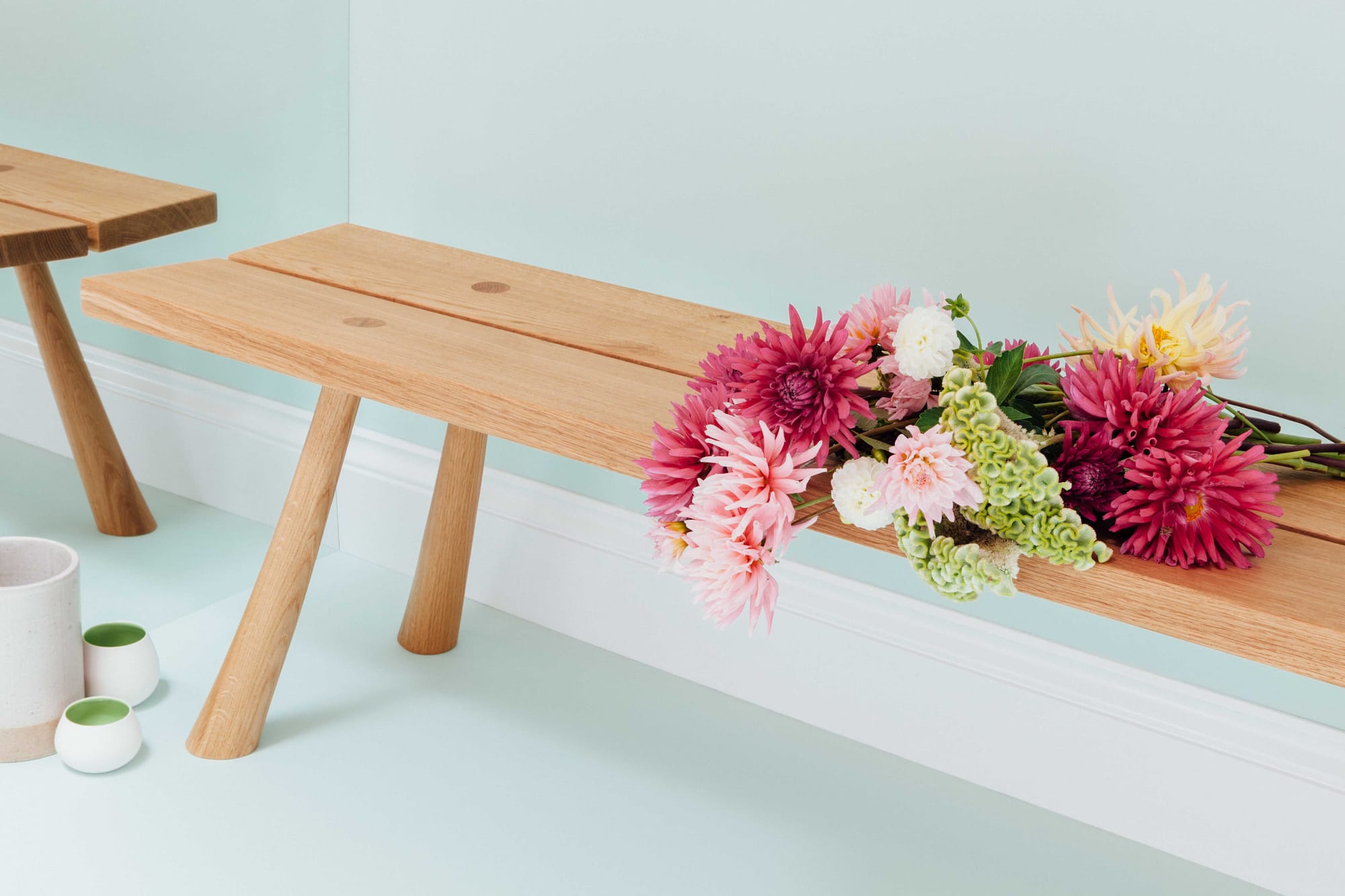
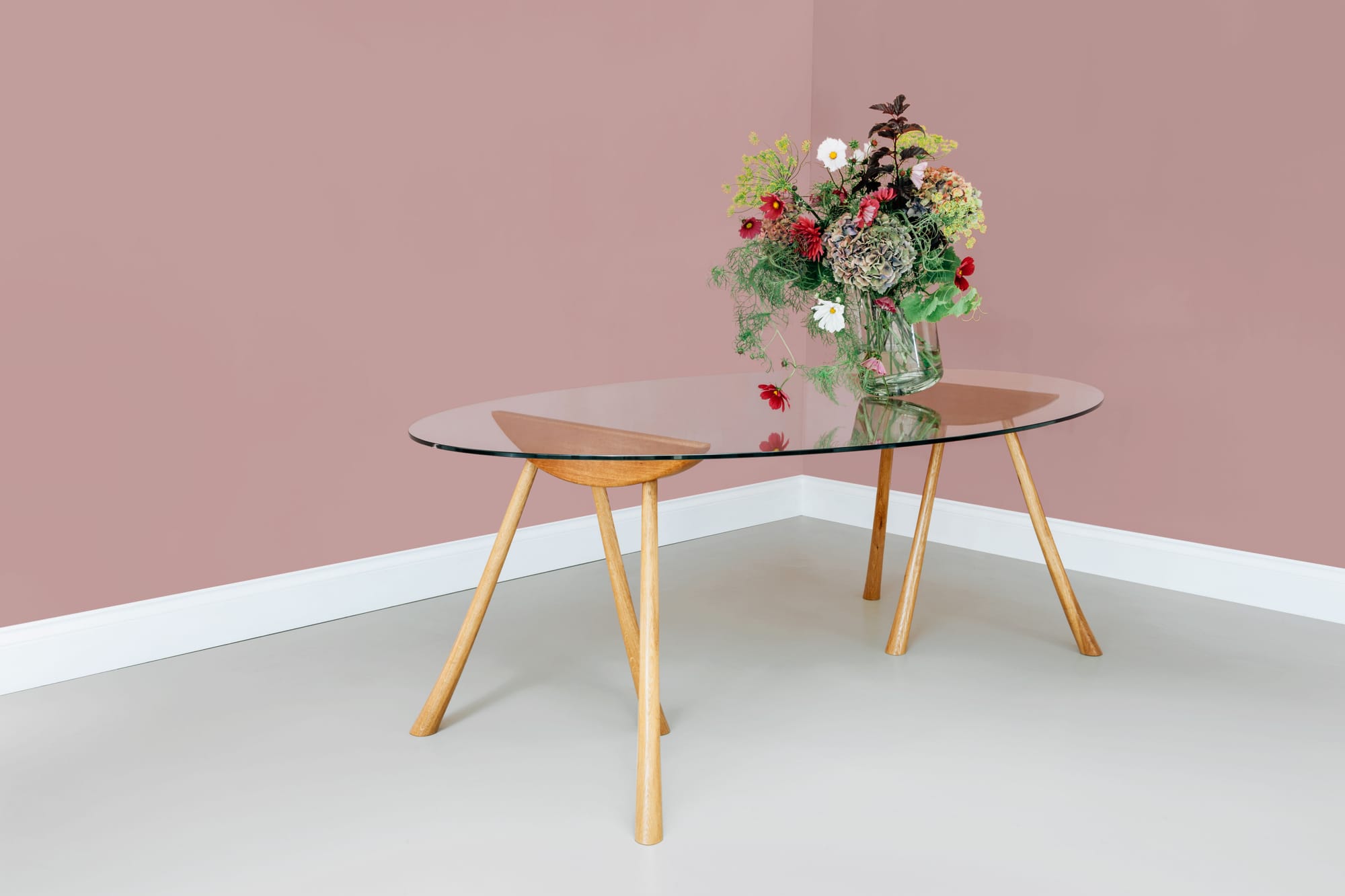
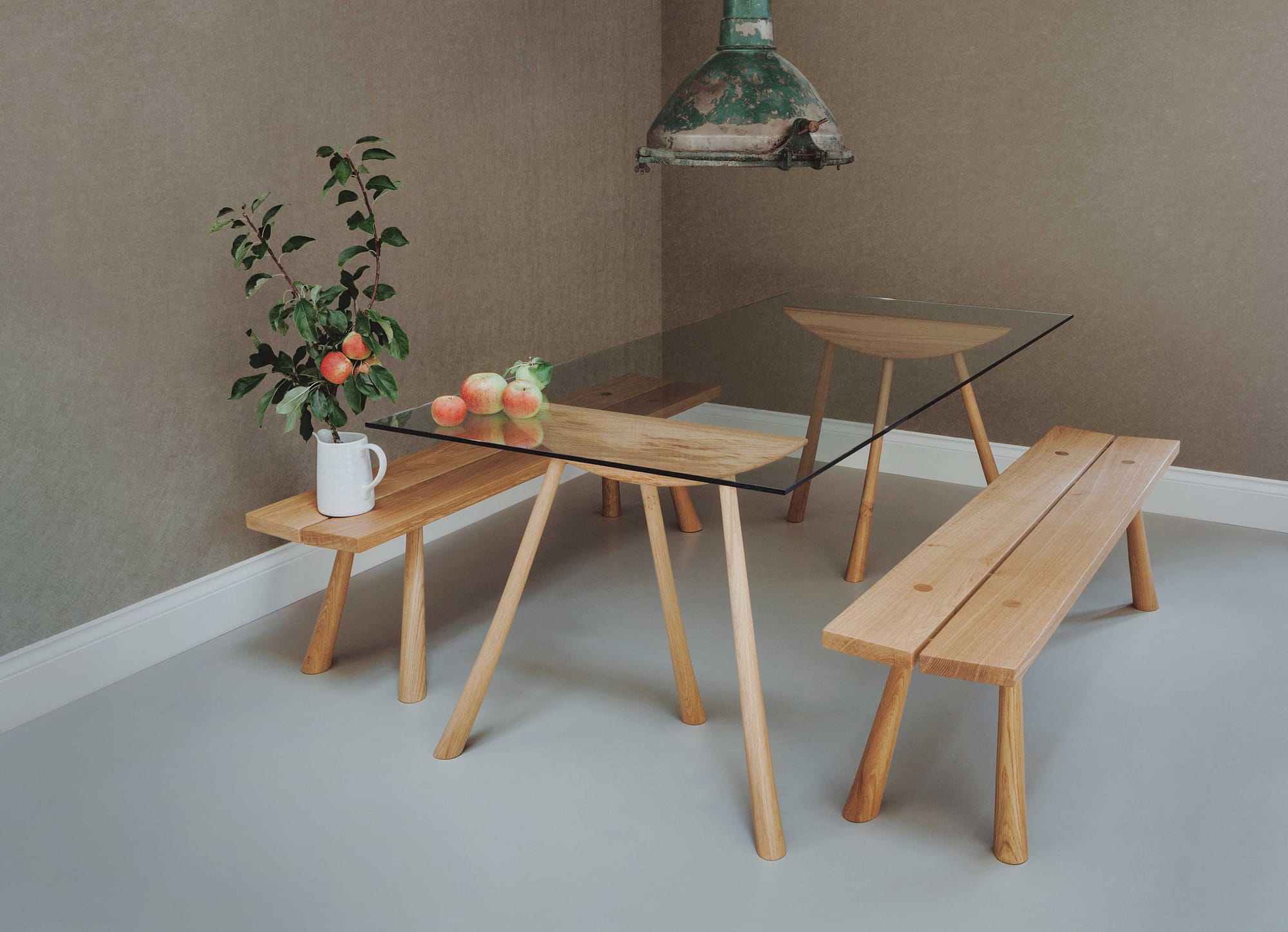
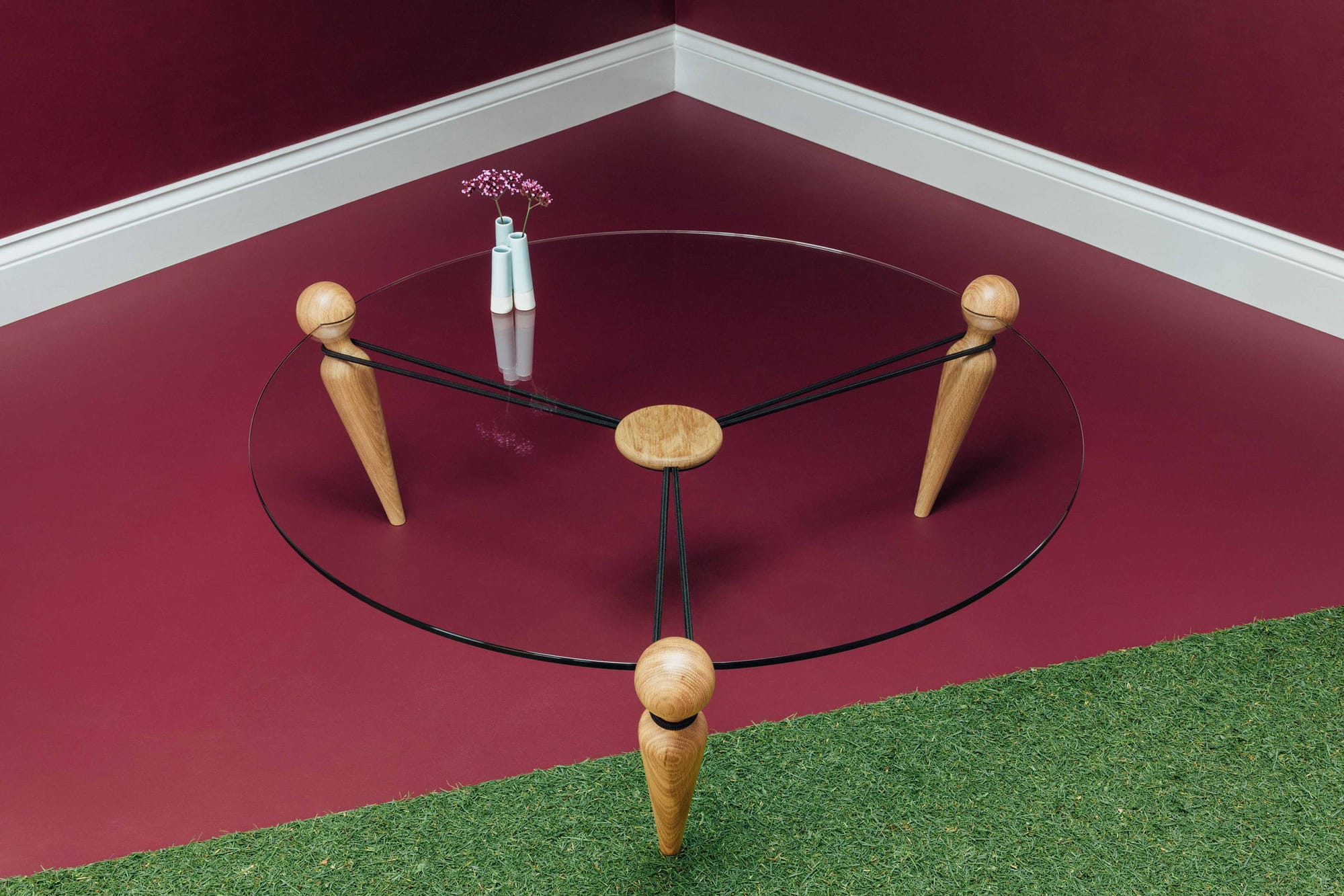
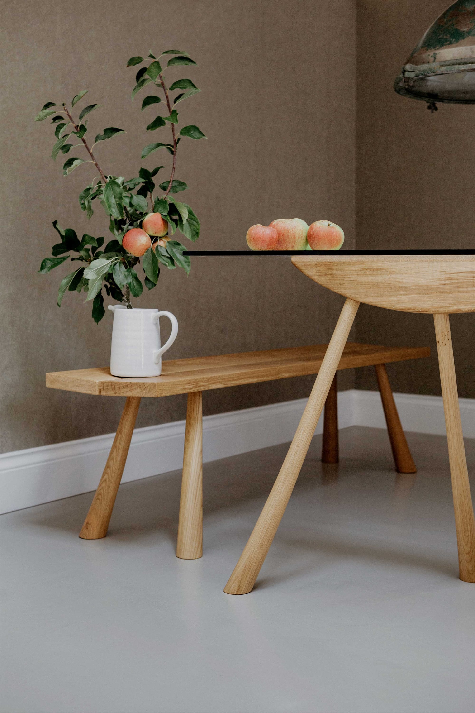
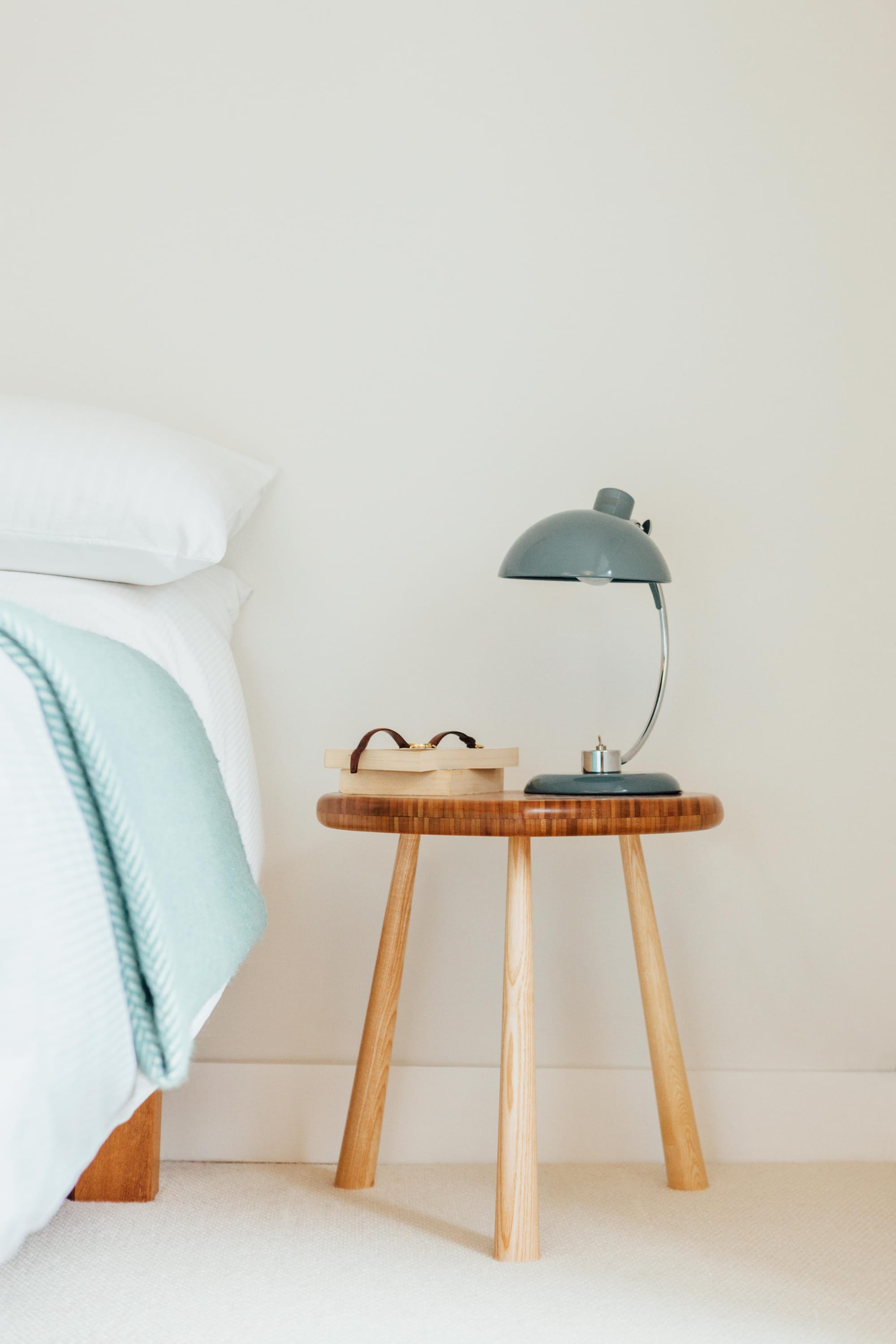
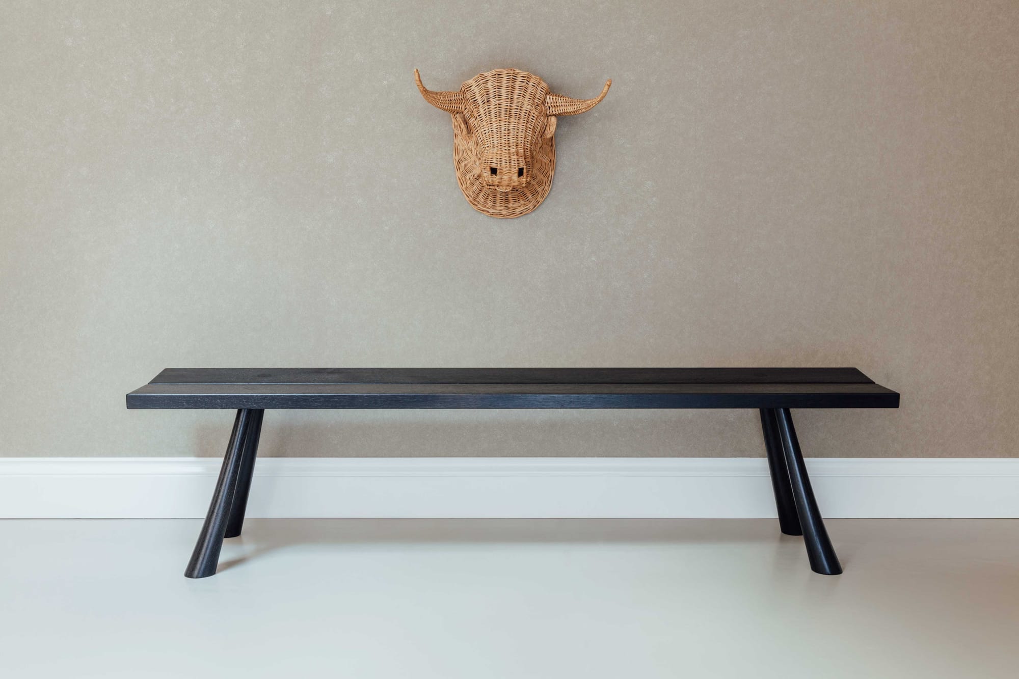
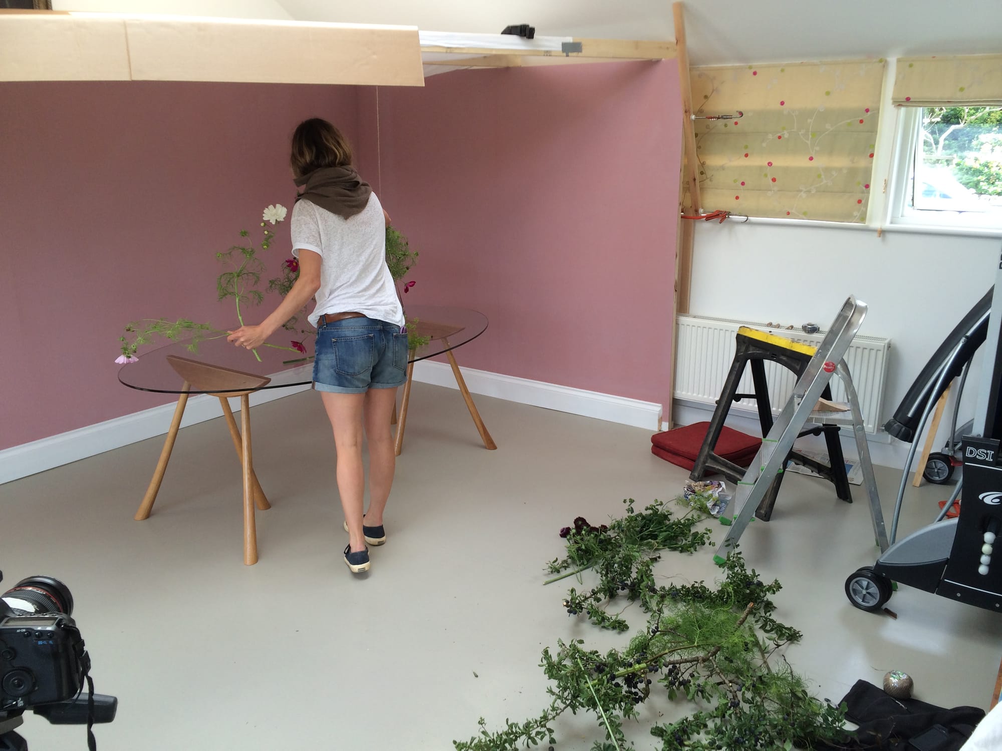
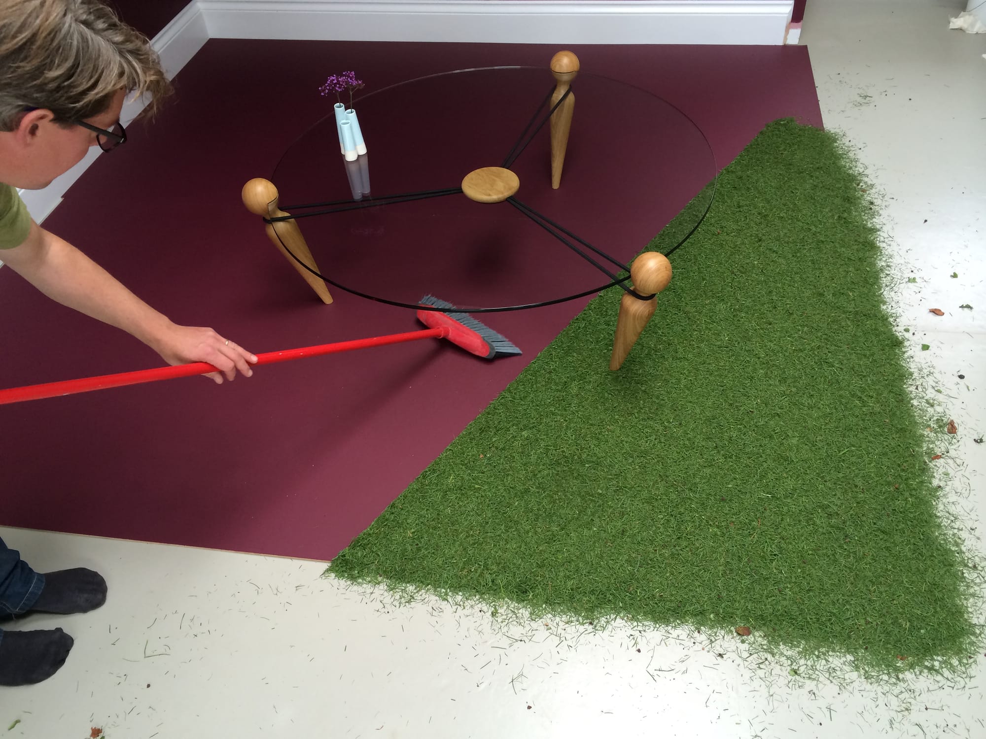
Product imagery
Tipping vases, reflective surfaces, graphic forms and contrasting textures… Studio product shots continue the theme of subtlety, tension and attention to detail.
Project credits
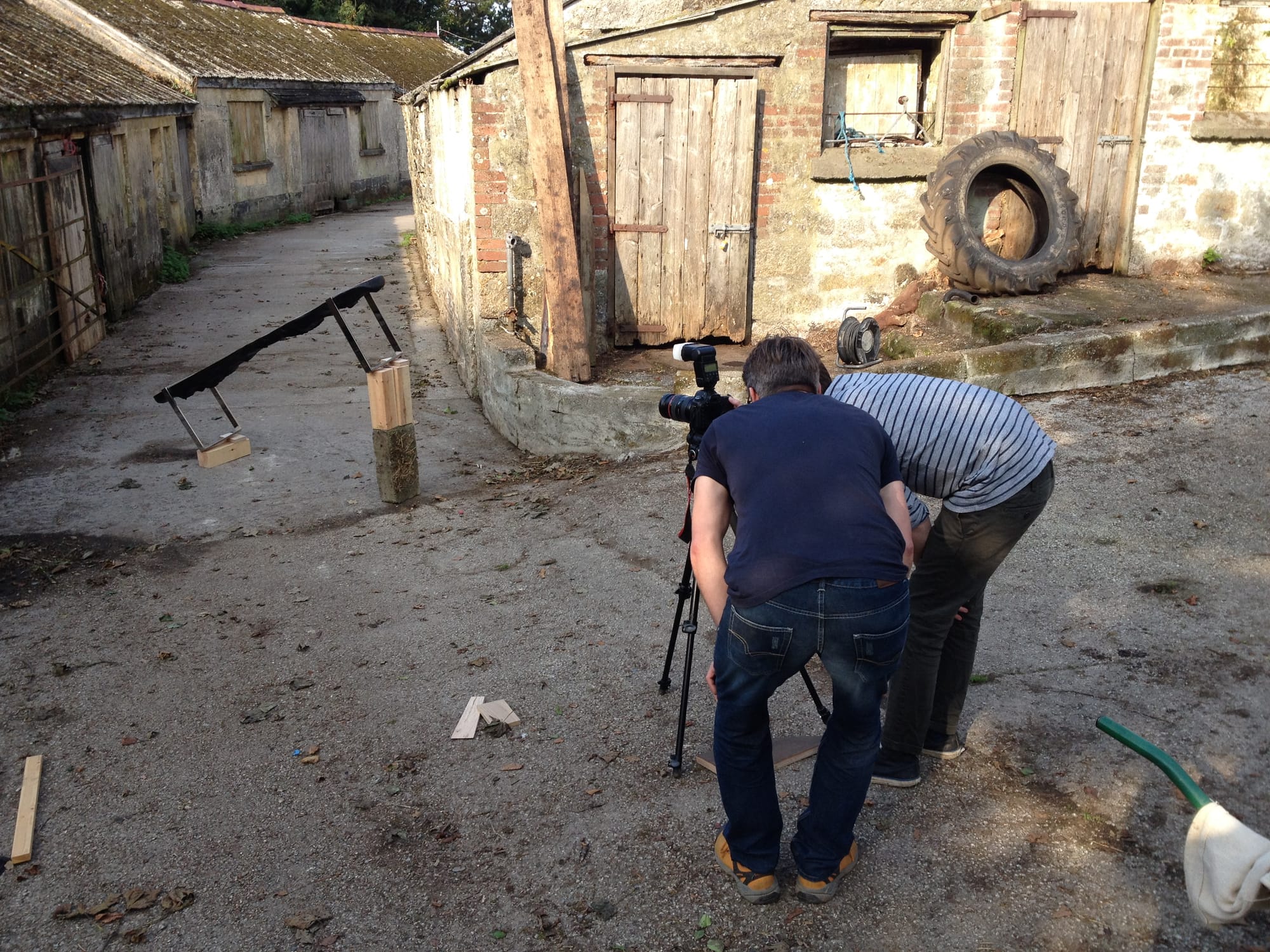
Photography Ben Mostyn