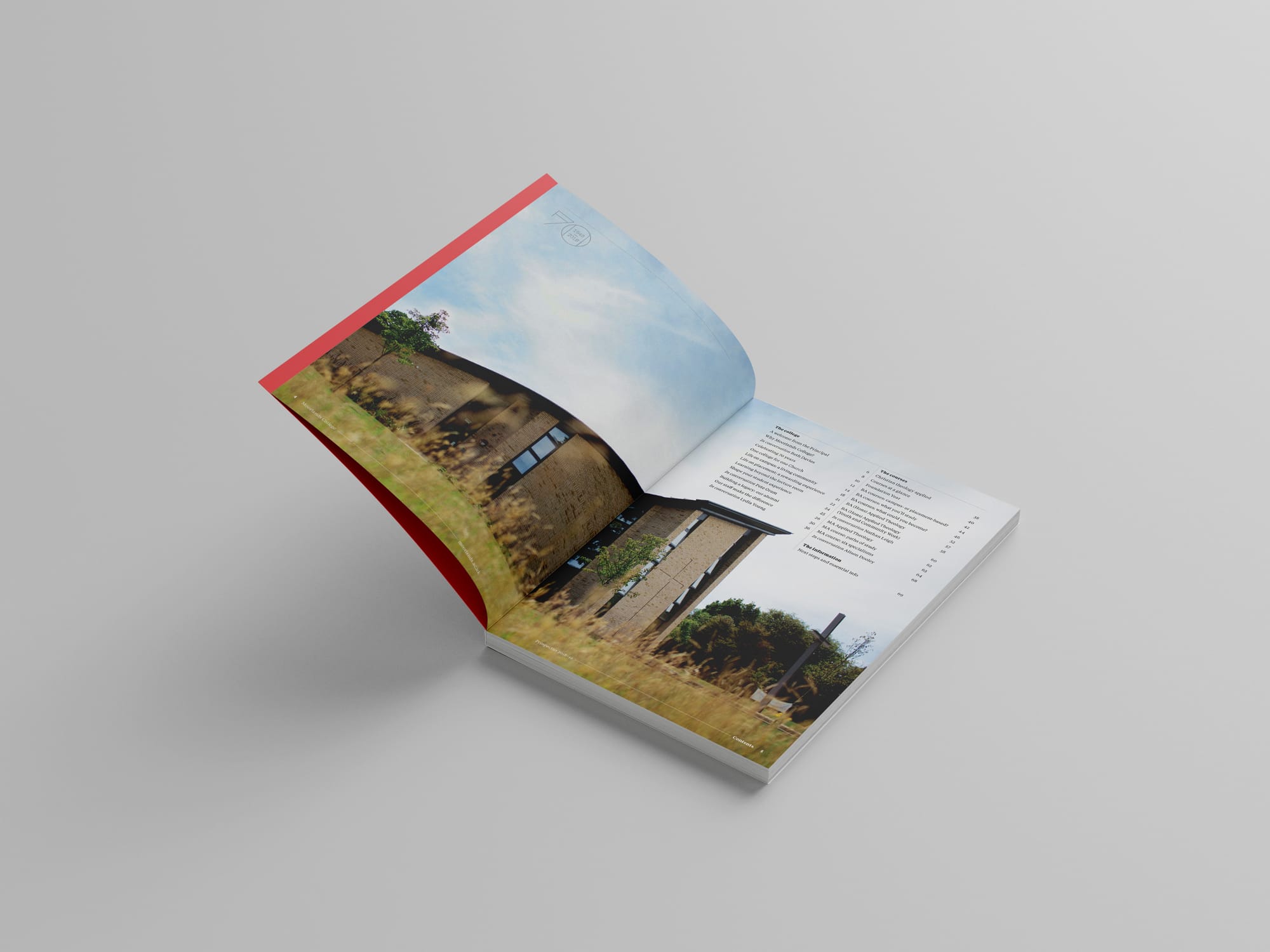
Table of Contents
Background
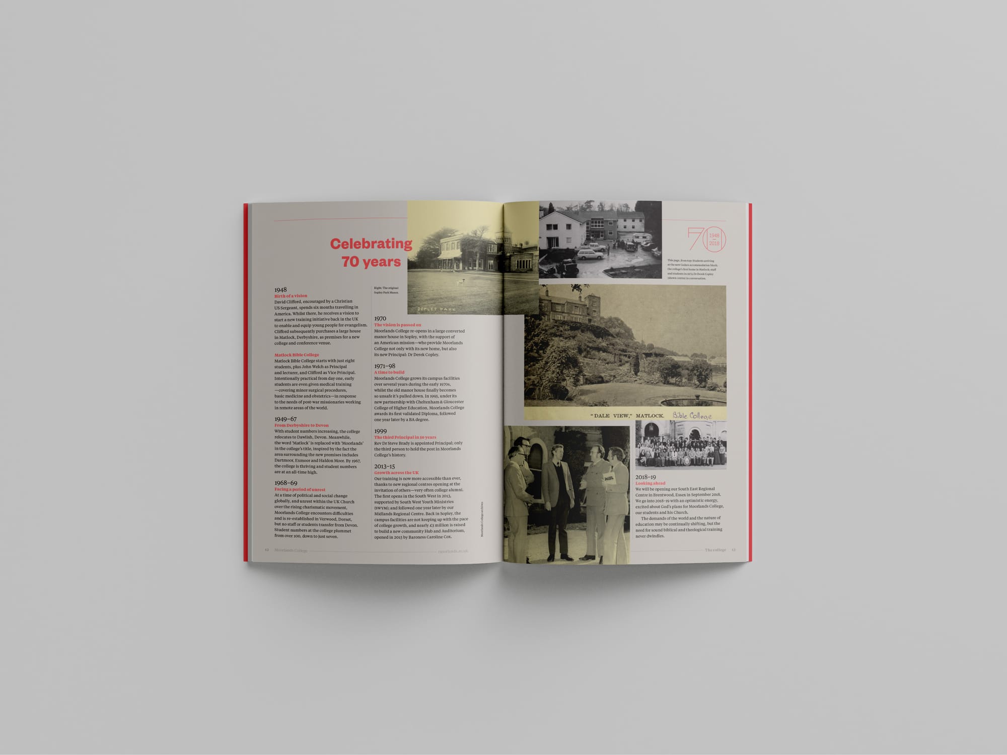
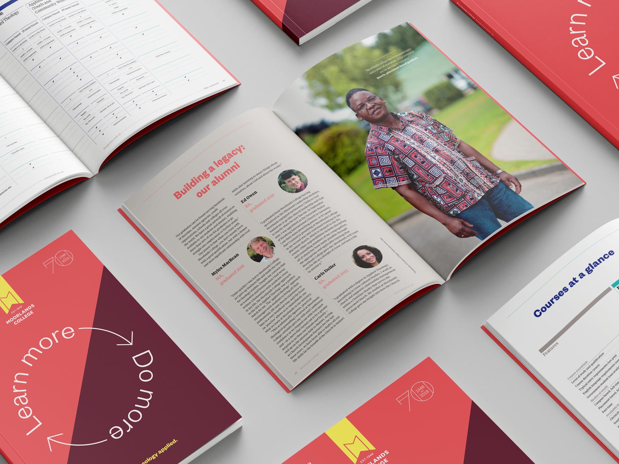
Moorlands College has been equipping students with distinctly applied theological knowledge and skills since 1948. With a scenic campus on the UK’s south coast, and a collection of regional hubs providing nationwide coverage, Moorlands College runs undergraduate and postgraduate courses that see, on average, over 90% of graduates finding work around the globe.
Having been with the college first as a postgraduate student, I later joined the staff as Marketing Manager, leading the college’s in-house department and occasionally lecturing on both BA and MA courses.
In my first full year in post, total student enrolment grew by over 15% on the previous year, against a backdrop of a 2% drop in UCAS applications nationally.
Brand strategy
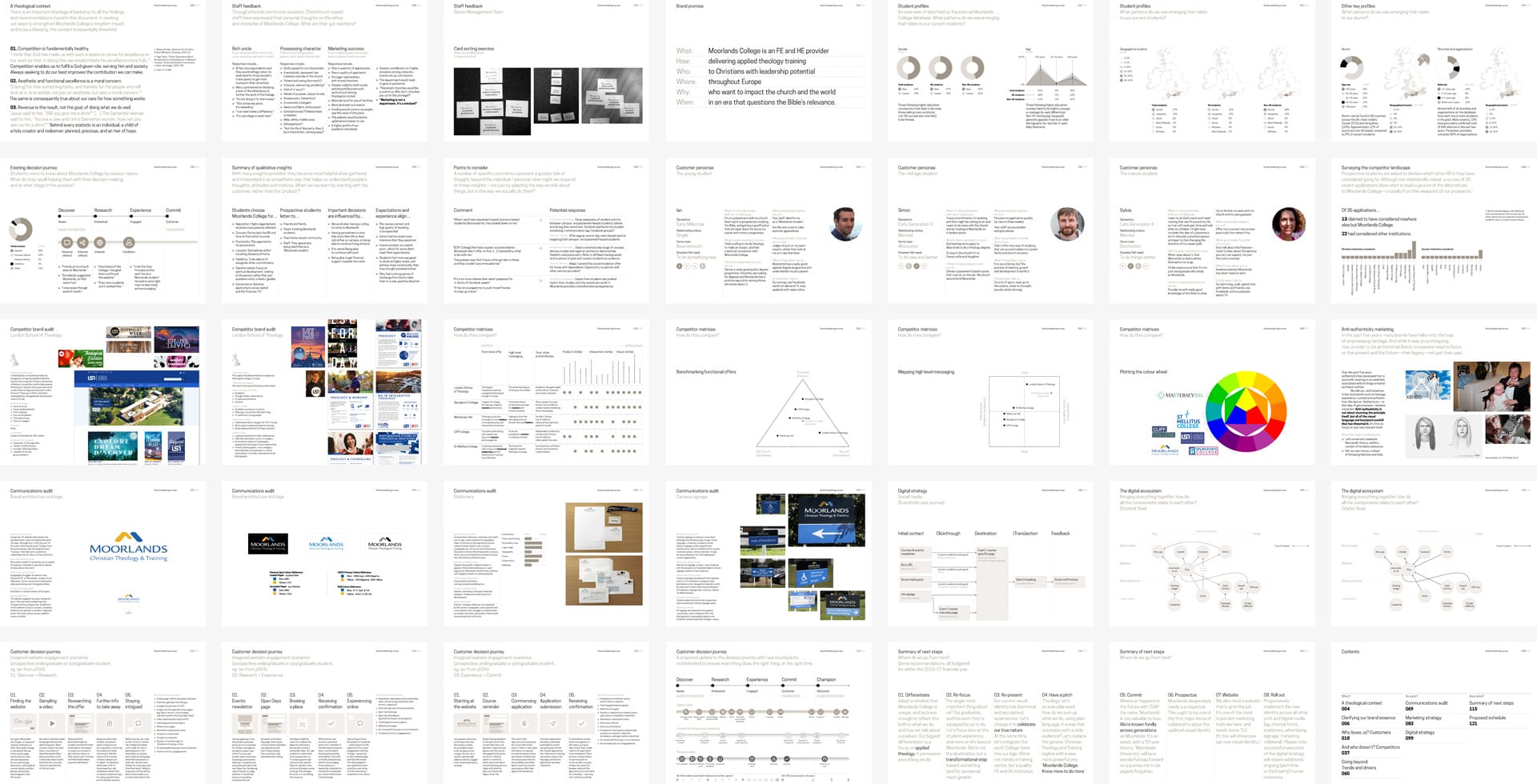
Undertaking a thorough review of the brand (positioning, audiences, competitors and strategic objectives) was always top of my first-year priorities. Featuring specially-commissioned quantitative and qualitative research, the resulting document left no stone unturned, and concluded with a set of recommendations—the top three being…
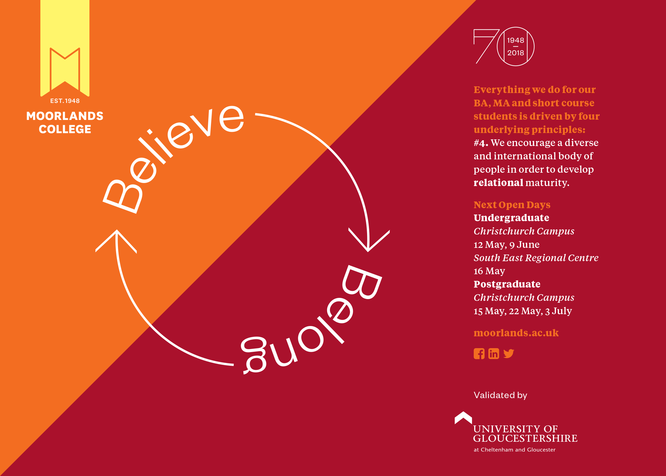
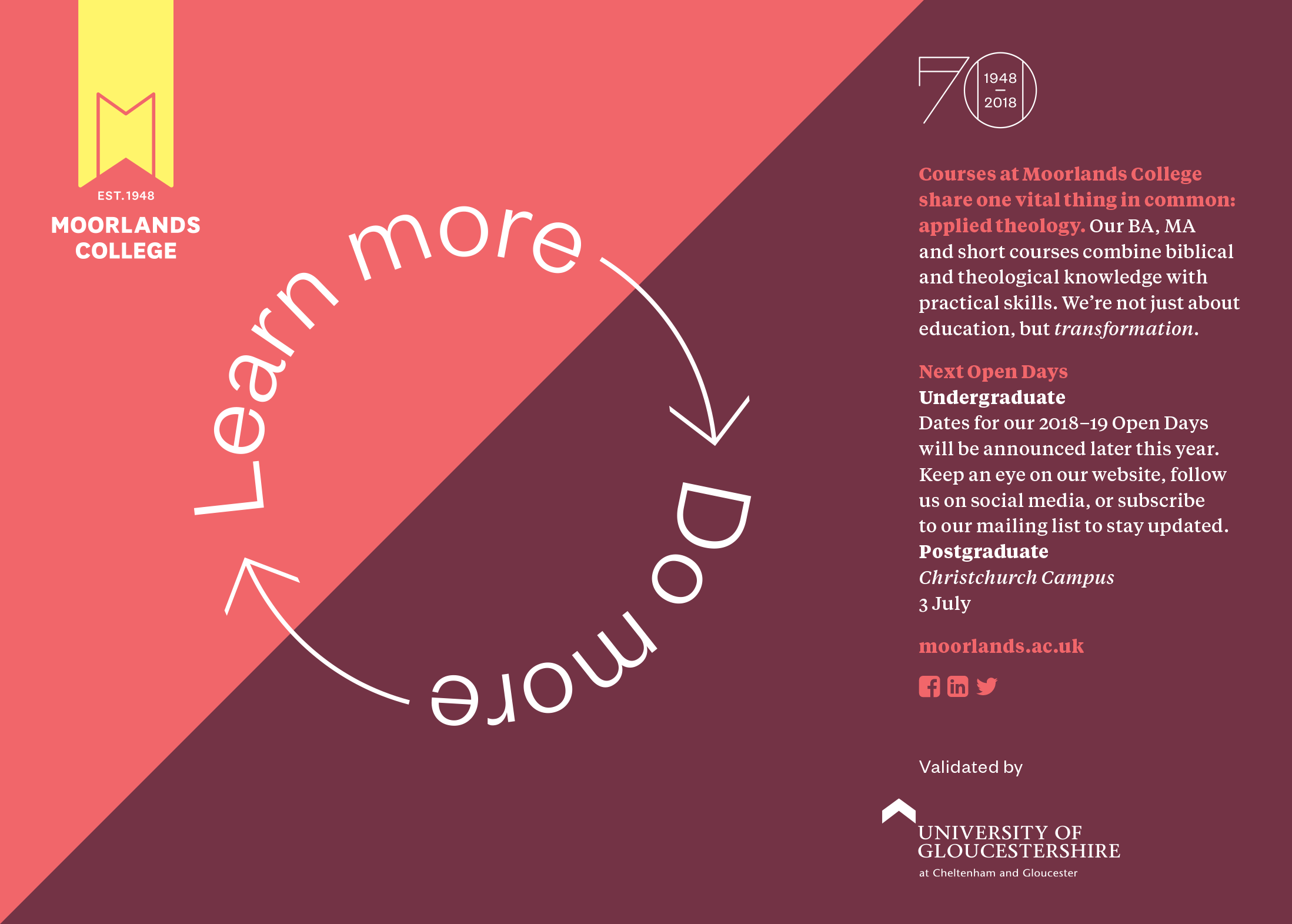
- Re-position. Our biggest differentiator is our focus on applied theology. Adopt a mindset that we’re unique, and be brave enough to embrace it.
- Re-focus. Our graduates, and the work they’re equipped by us to do, are the single most important thing. We’re not the destination, but a transformational step toward something greater. Let’s focus less on the student experience, and more on life beyond college.
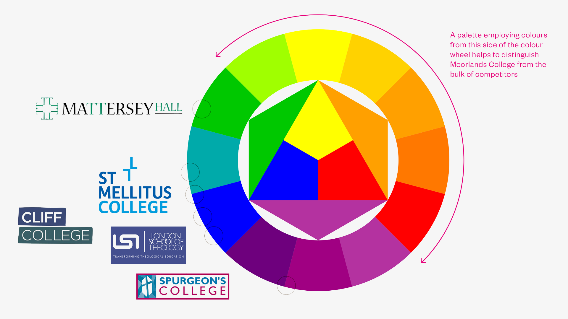
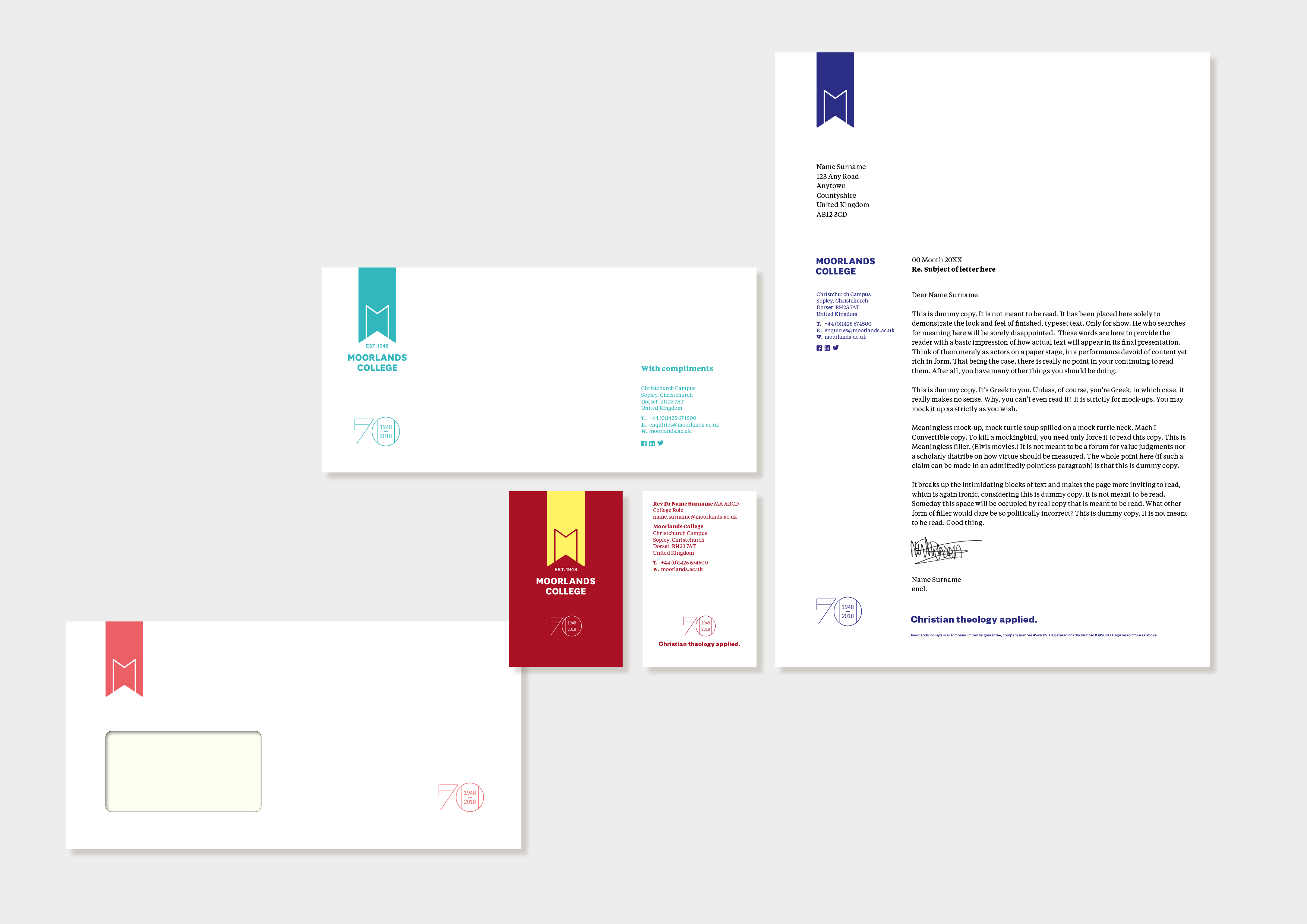
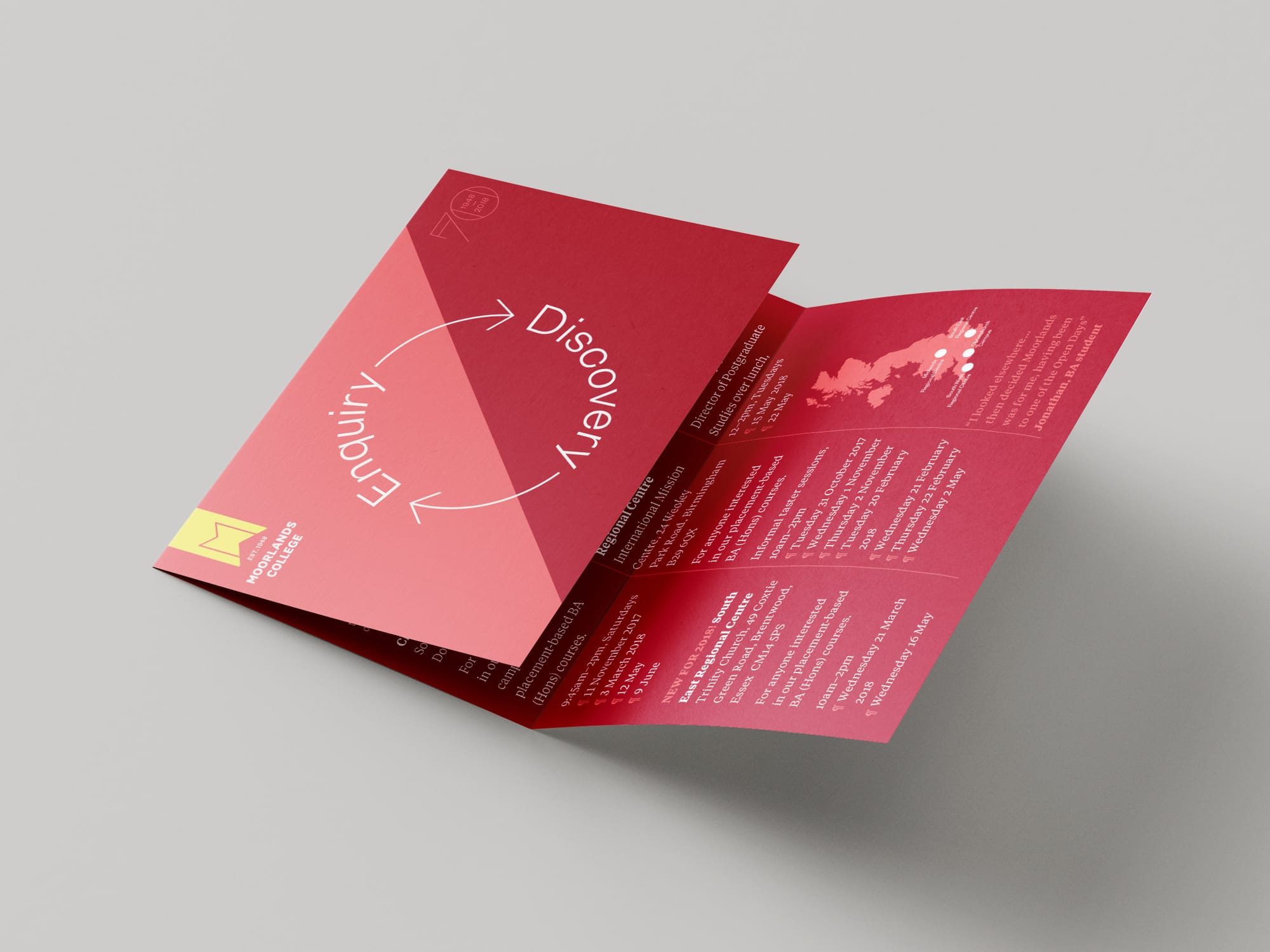
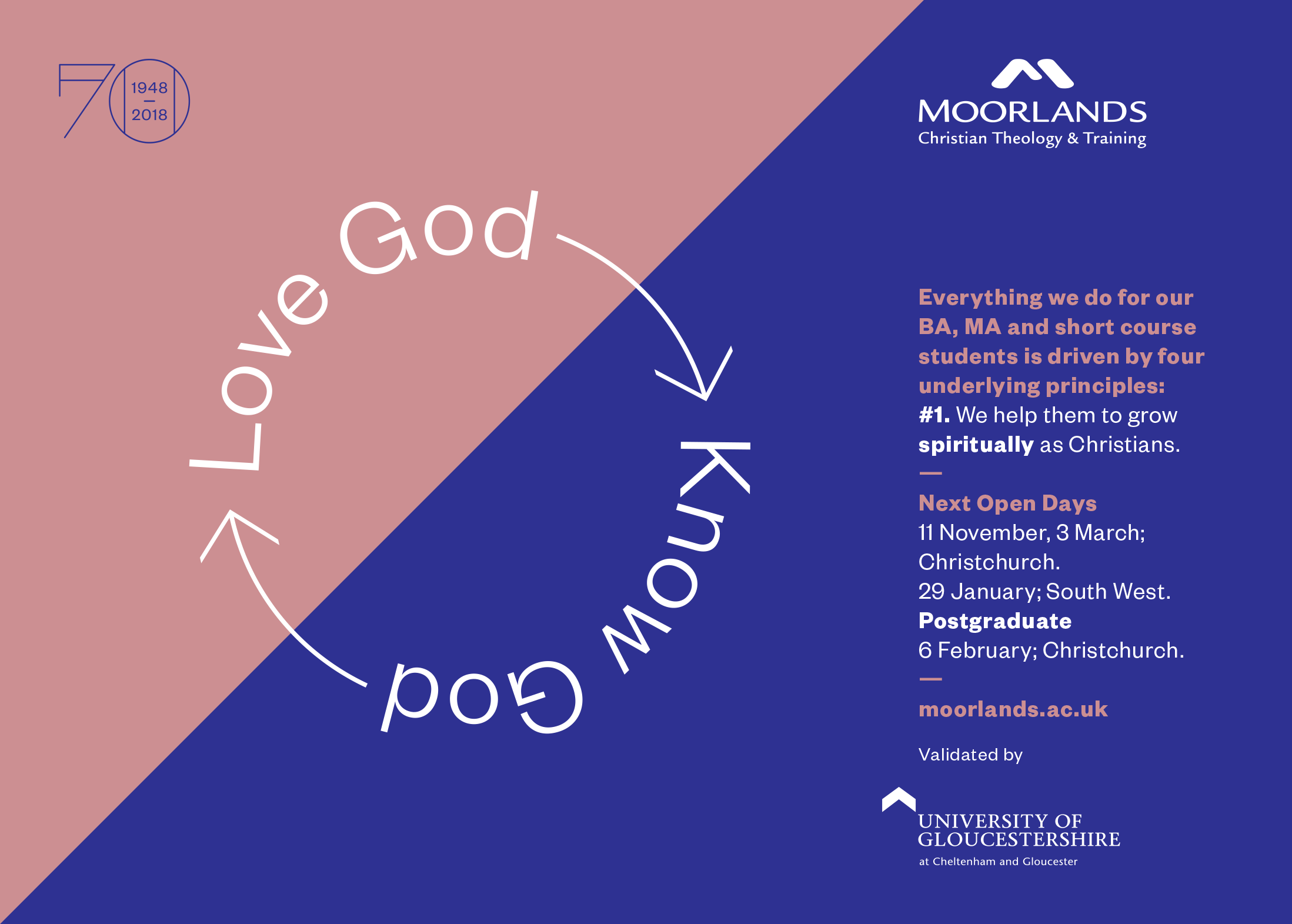
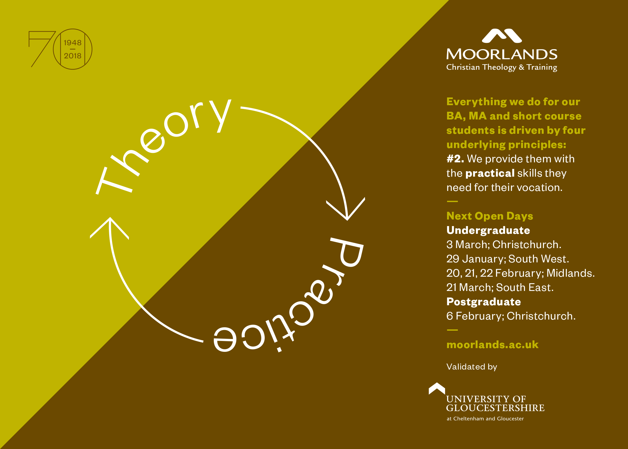
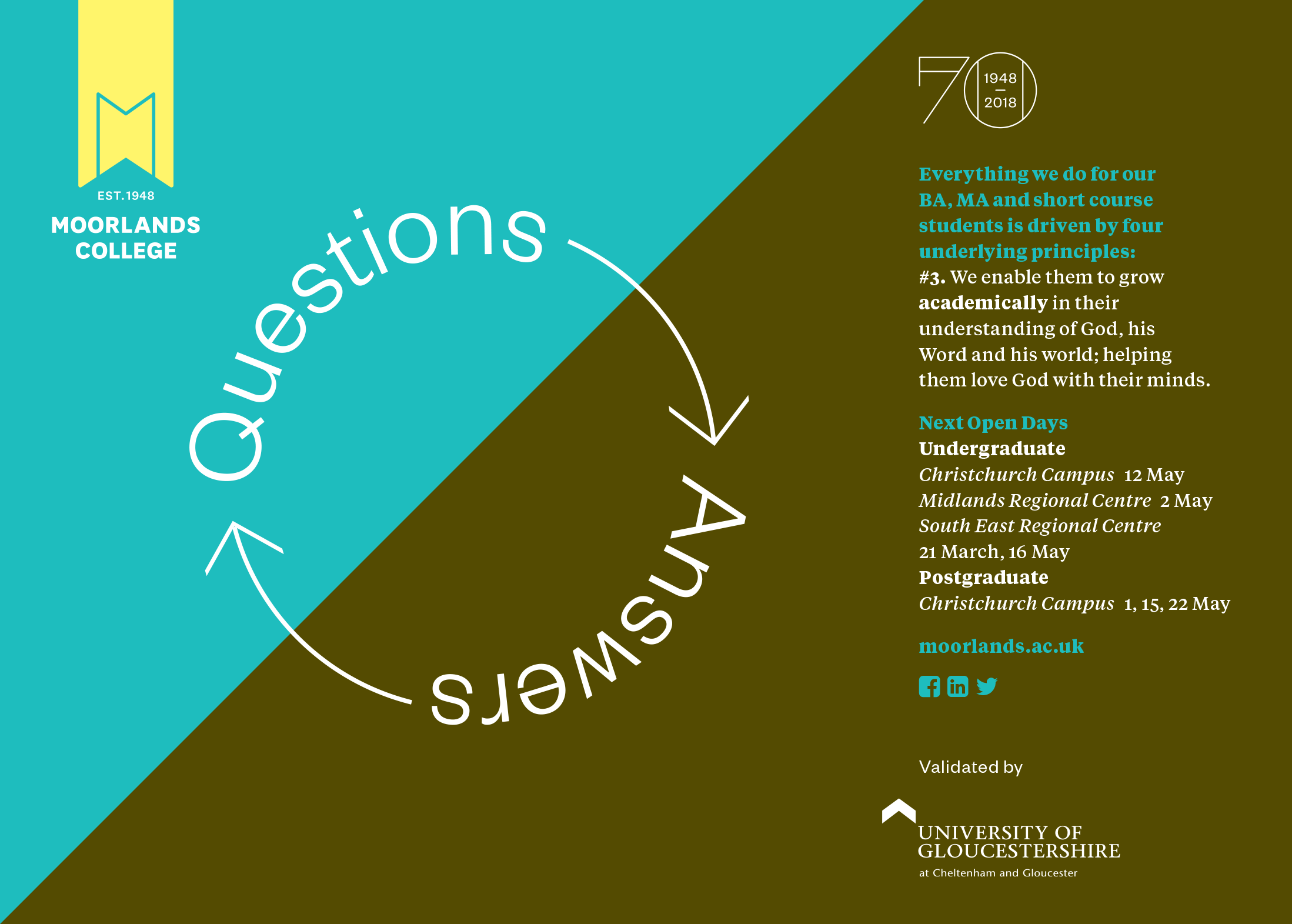
- Re-present. We’re known fondly across generations as “Moorlands.” It’s an asset with a 70+ year history. But our visual identity has weaknesses. Let’s change it to celebrate our true nature, and reintegrate the word ‘College’ to show we’re a quality FE and HE institution.
Brand identity
In partnership with a supporting visual designer and a brand writer, we explored how to re-position, re-focus and re-present Moorlands College through its visual and verbal identity.
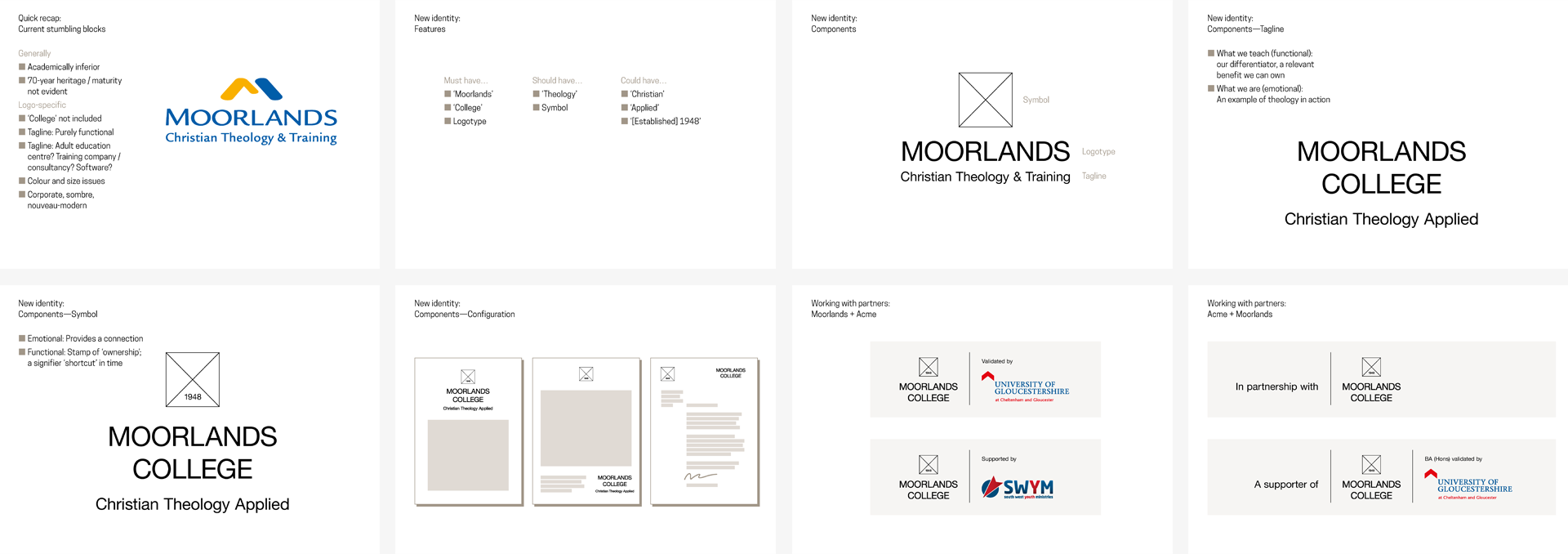
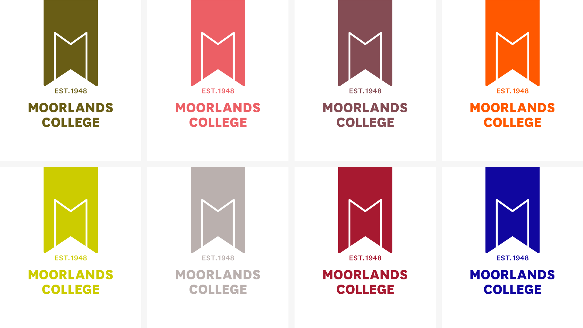
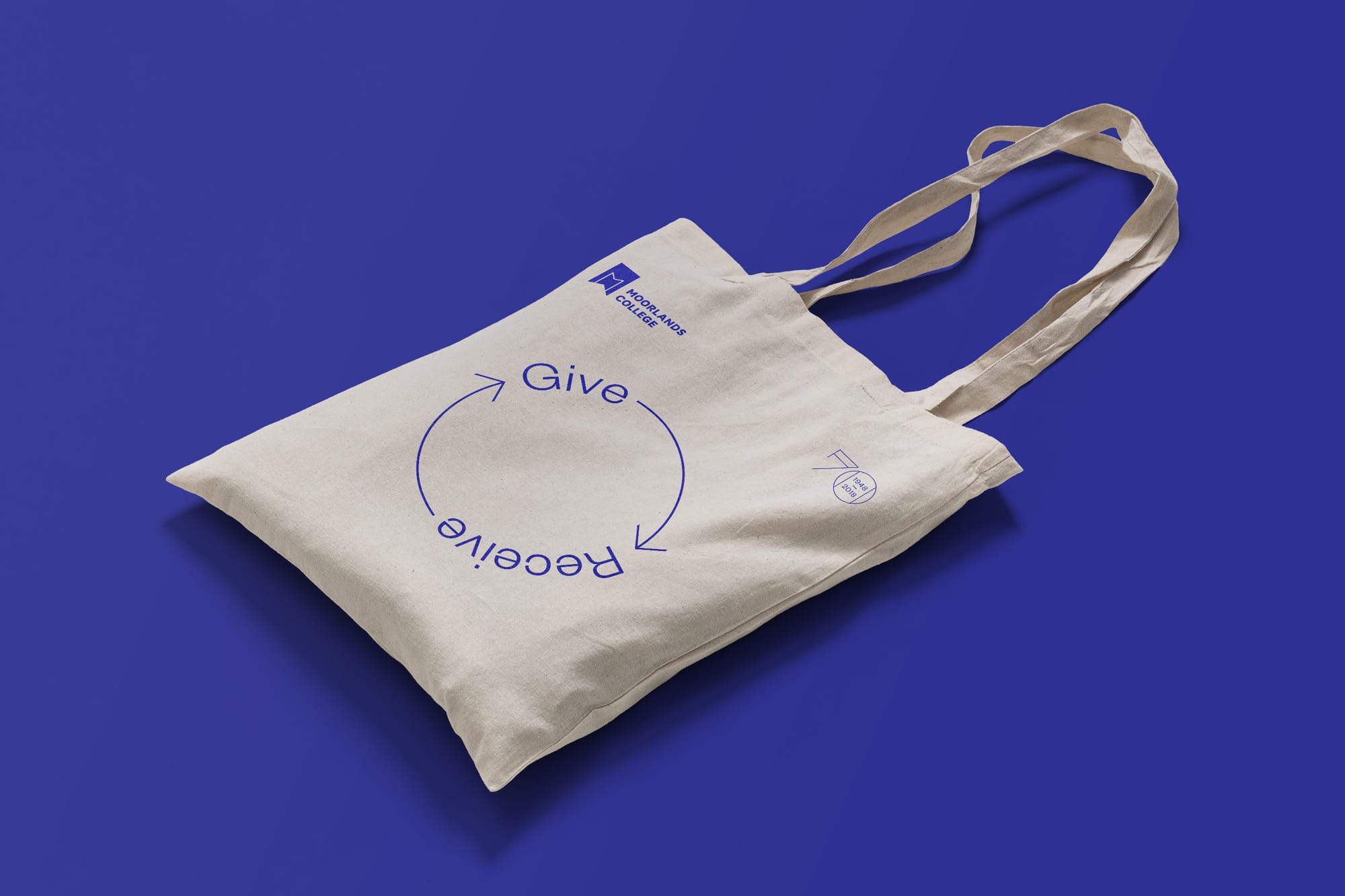
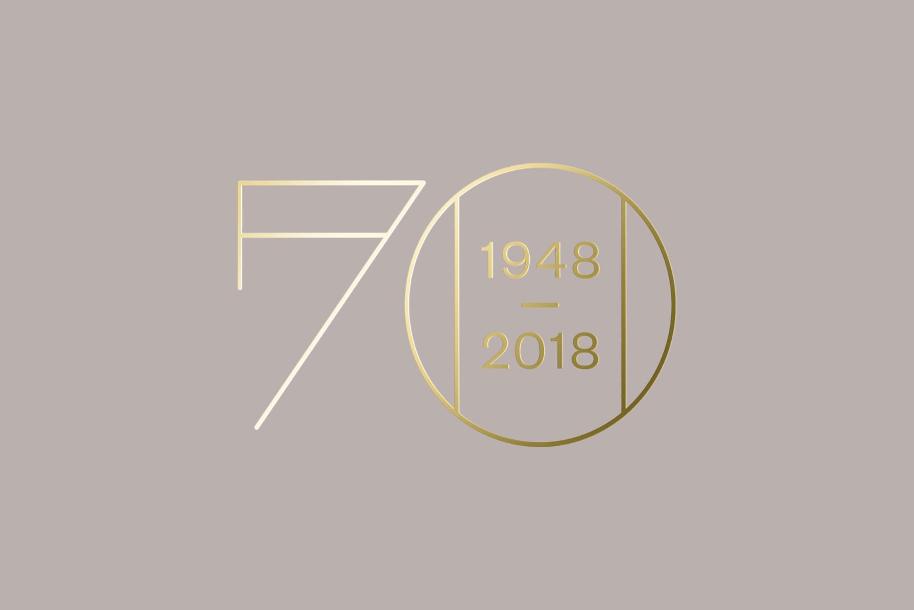
The new logo proudly puts the word ‘College’ front and centre, and reminds viewers that, despite its re-energised appearance, Moorlands College has a proven track record going back over 70 years. The ribbon device, inspired by the wealth of scholarly books in the college’s vast library, features an ‘M’ device that can also be interpreted as an open door.
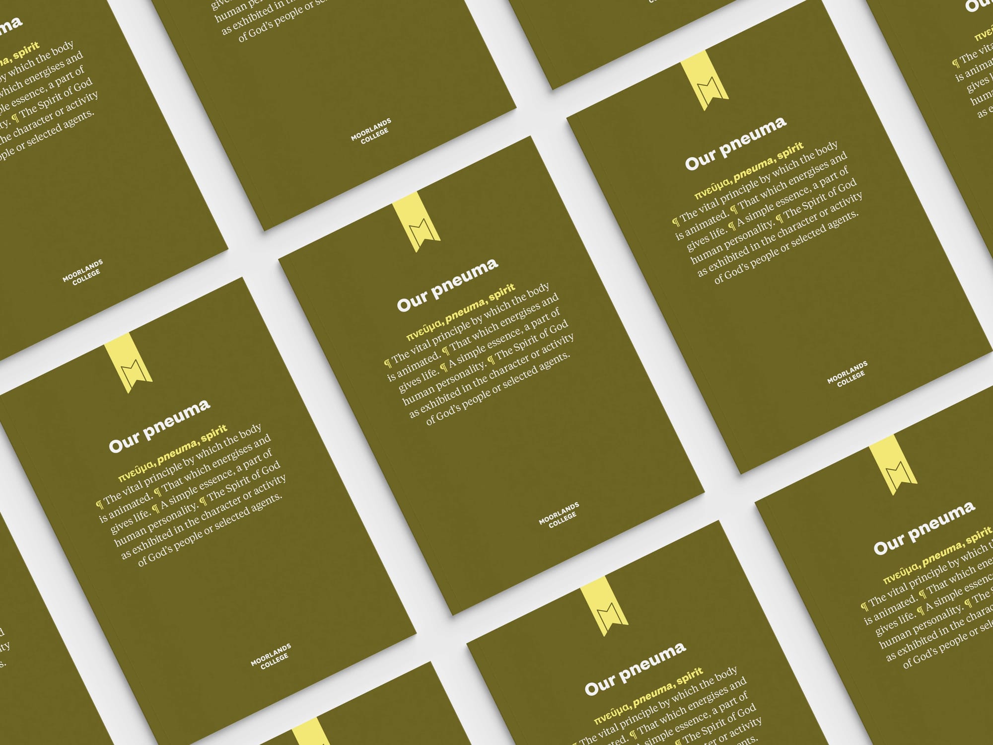
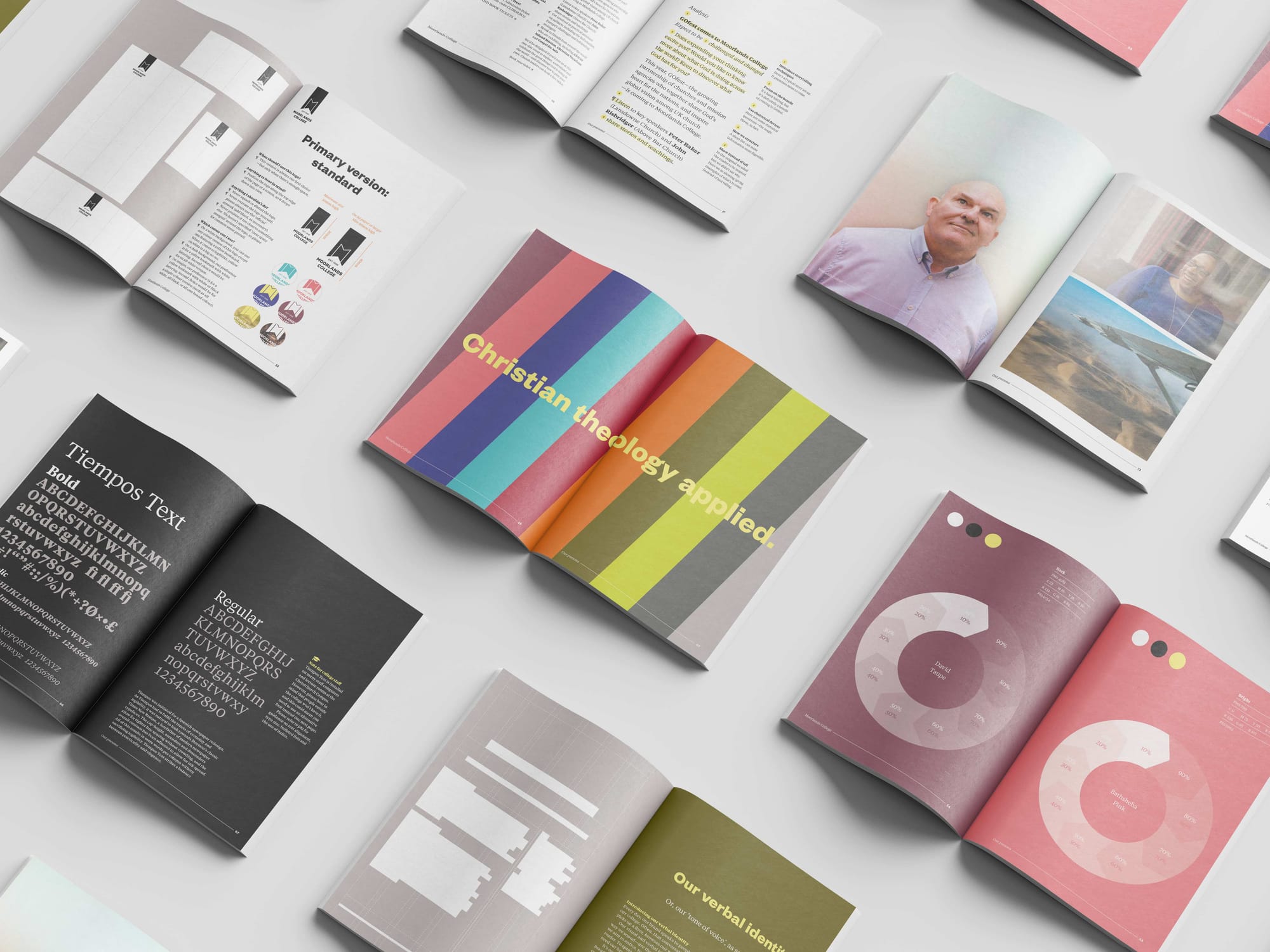
Helping staff across the college to understand, embrace and apply the new brand, our guidelines manual—Our pneuma—was designed as a keepsake, worthy enough to take up space on any desk or bookshelf.
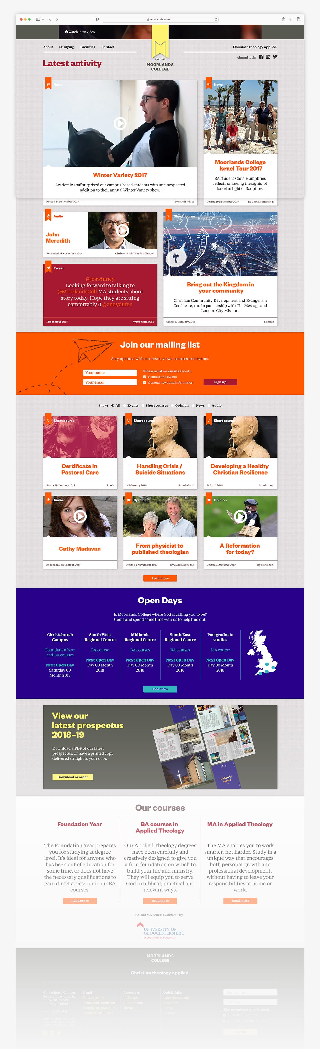
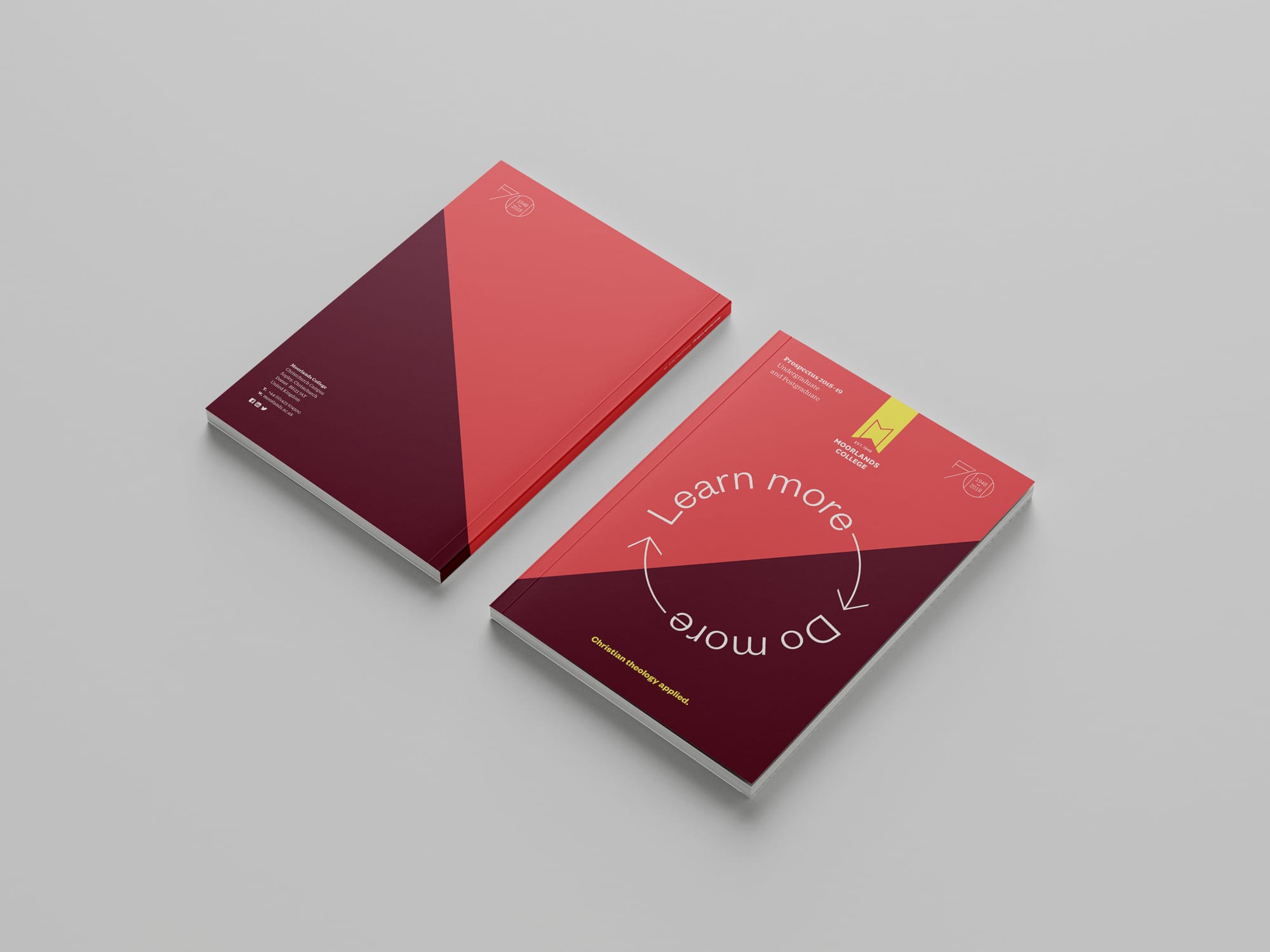
Whilst our printed prospectus would adopt the marketing campaign of the moment (see student recruitment campaign below), Moorlands College’s other flagship comms piece—its website—would embody the new brand at large. With the help of student ambassadors, via a series of workshops, we planned user-centred improvements to the site’s content and structure. The site, featuring a short promotional video, was visualised in-house and built in partnership with an external agency.
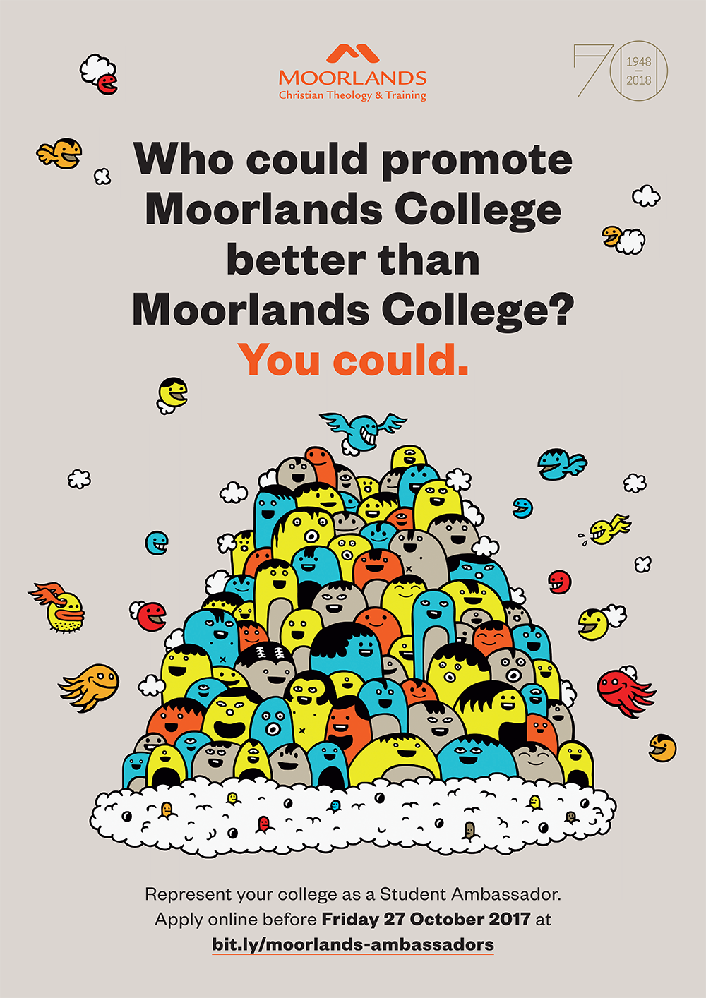
Student recruitment campaign
Under my tenure, the college adopted a campaign-driven marketing stance, bringing a wide variety of ATL and BTL assets, interactions and moments—spread across the year—together with a single proposition and aesthetic.
Our first annual campaign, during which we transitioned to the new brand, was a striking (typo)graphic concept in contrast to the sector’s sea of sameness. Perpetually enforcing statements emphasised the head/hands nature of applied theology, and stood us apart from the competition.
General marketing
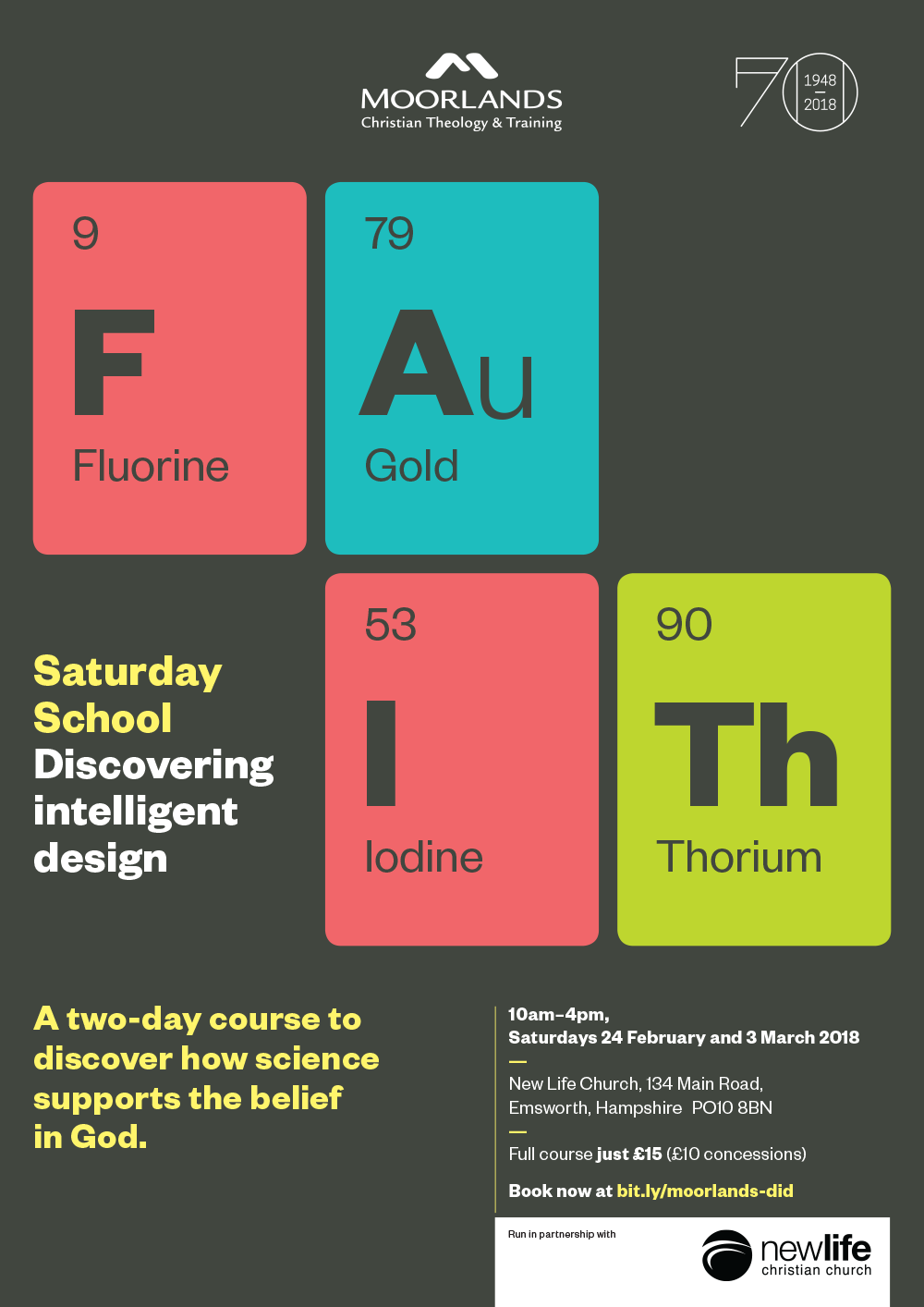
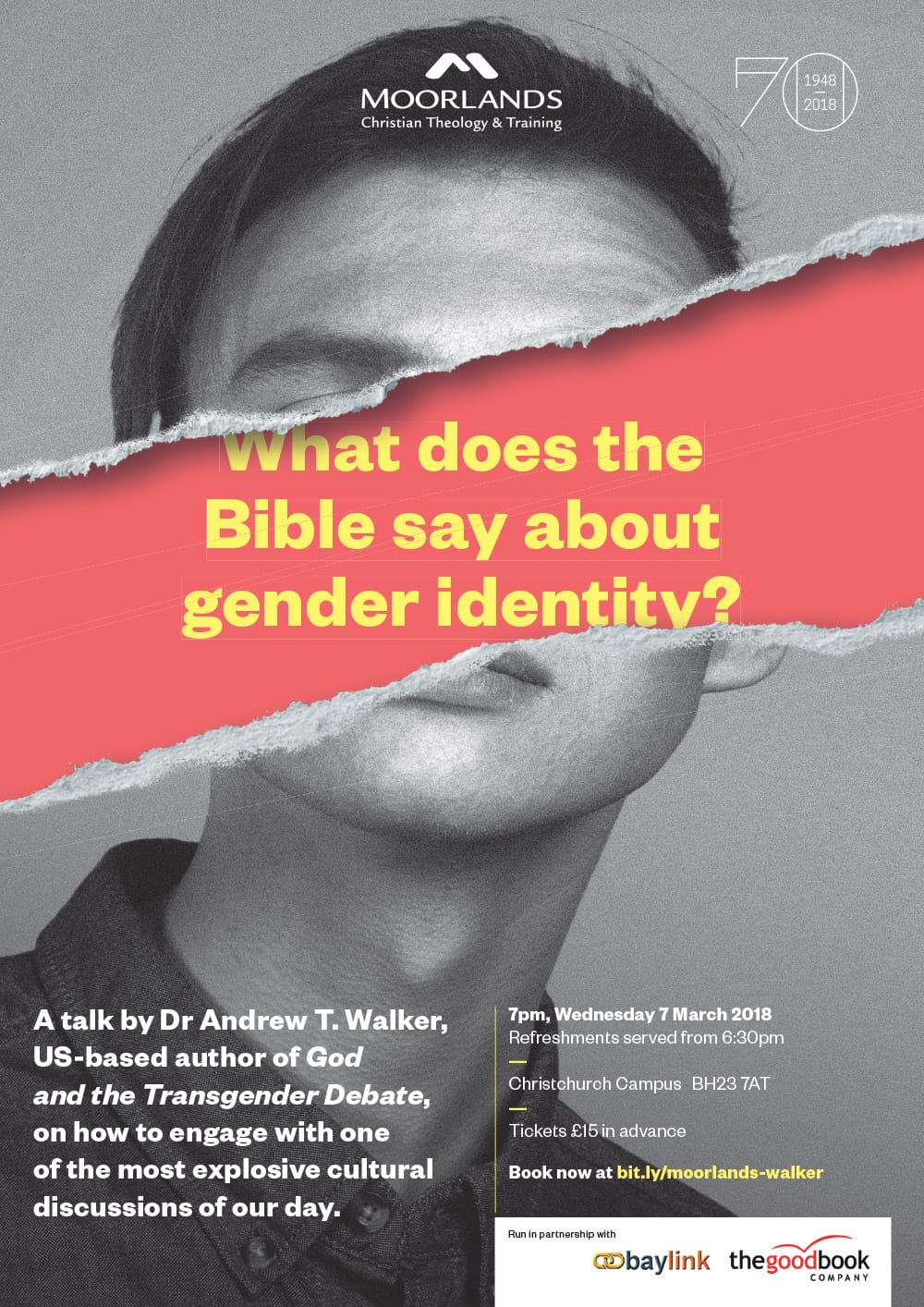
Whilst the rebranding exercise progressed, I began to introduce improvements to the college’s marketing materials that would help reorientate us accordingly. Enriching our visual language through imagery and colour; bringing consistency to typography, layout and composition; and relying on conceptually-driven work all played a critical new role.

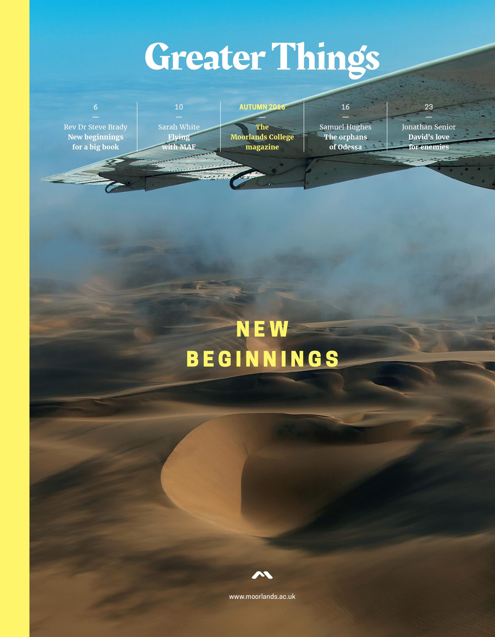
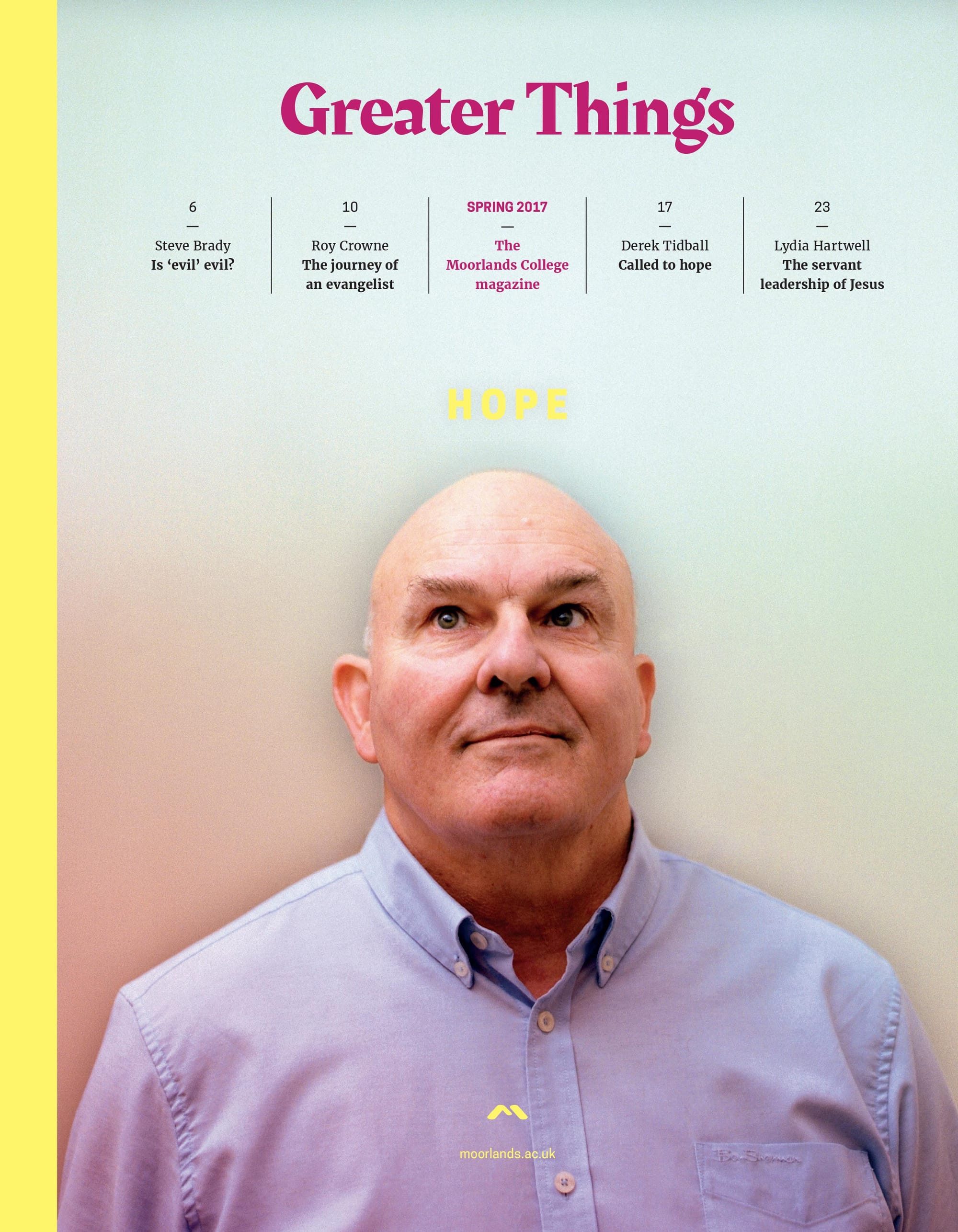
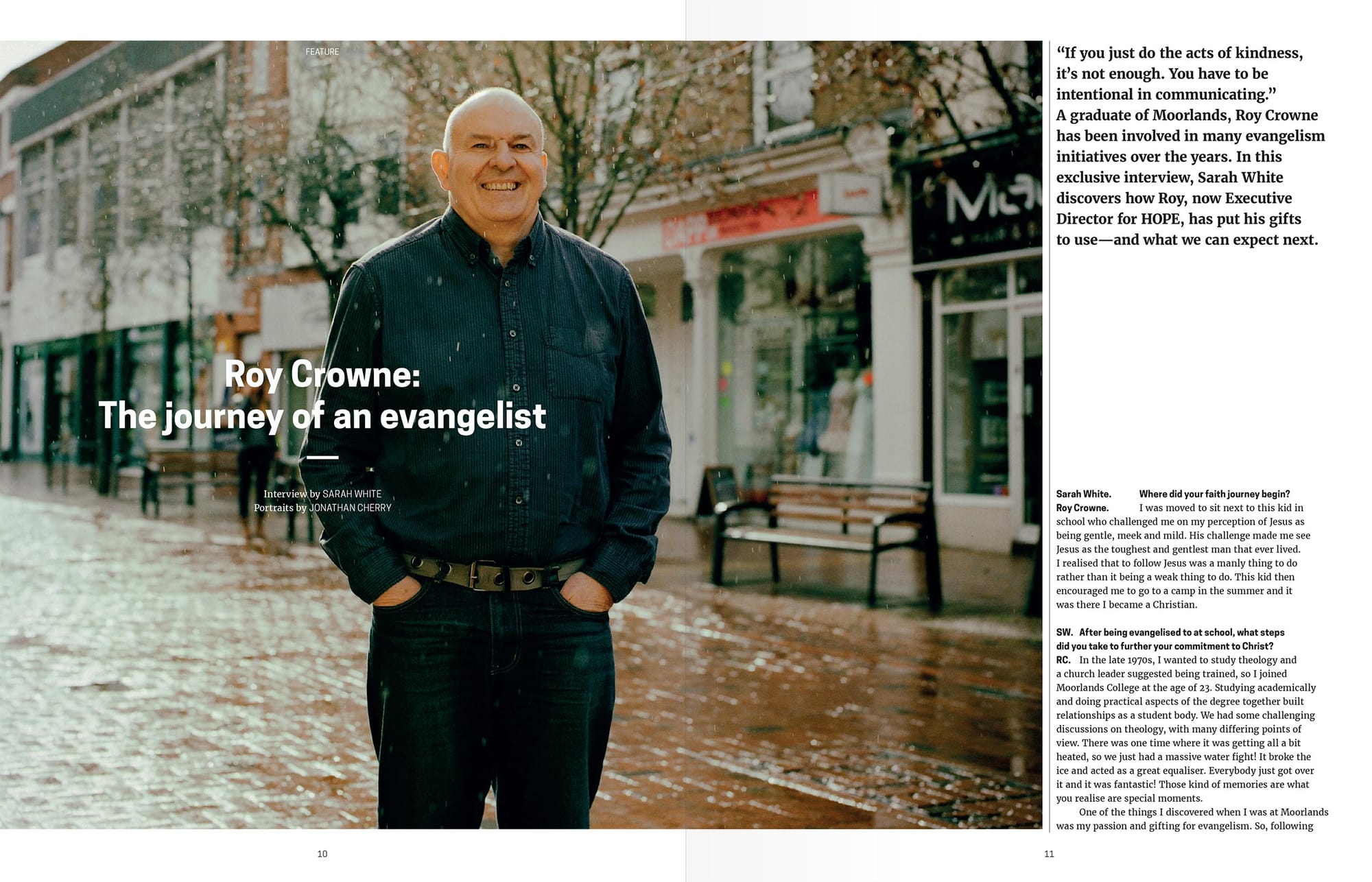
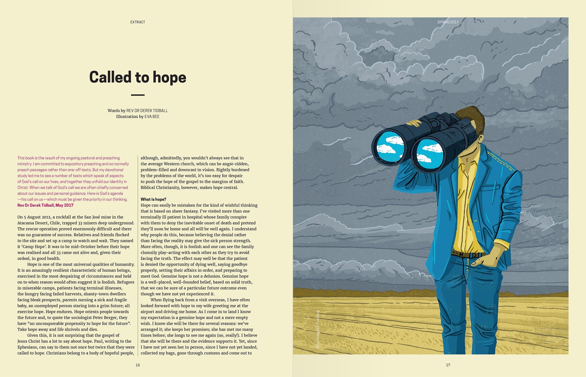
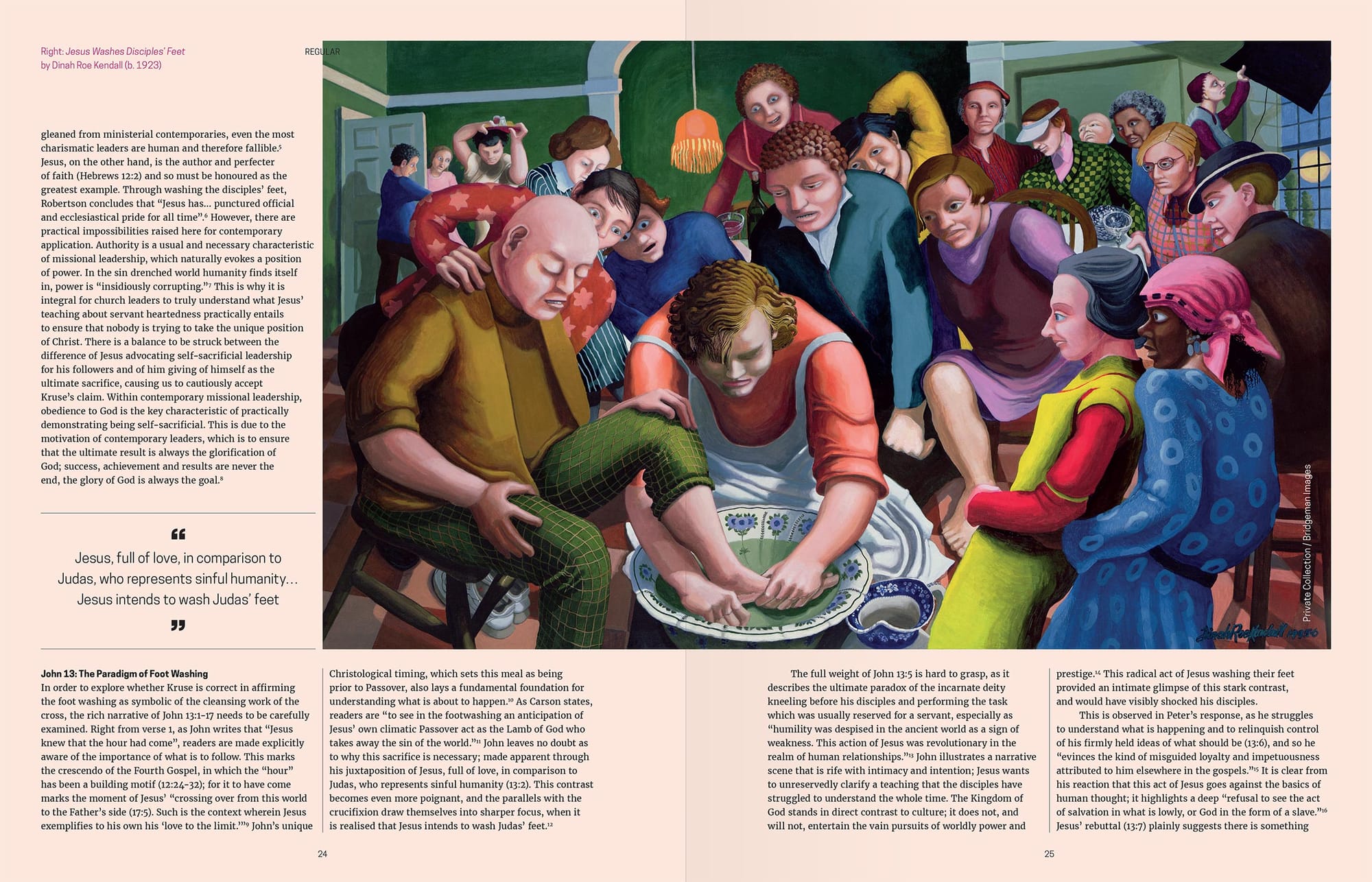
Greater Things magazine
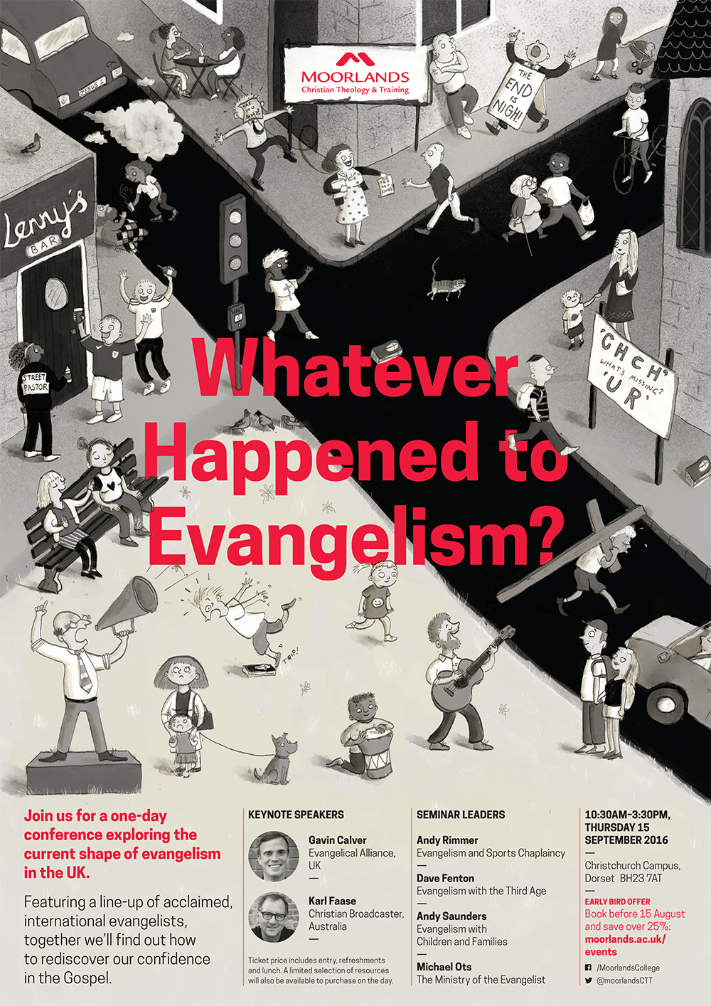
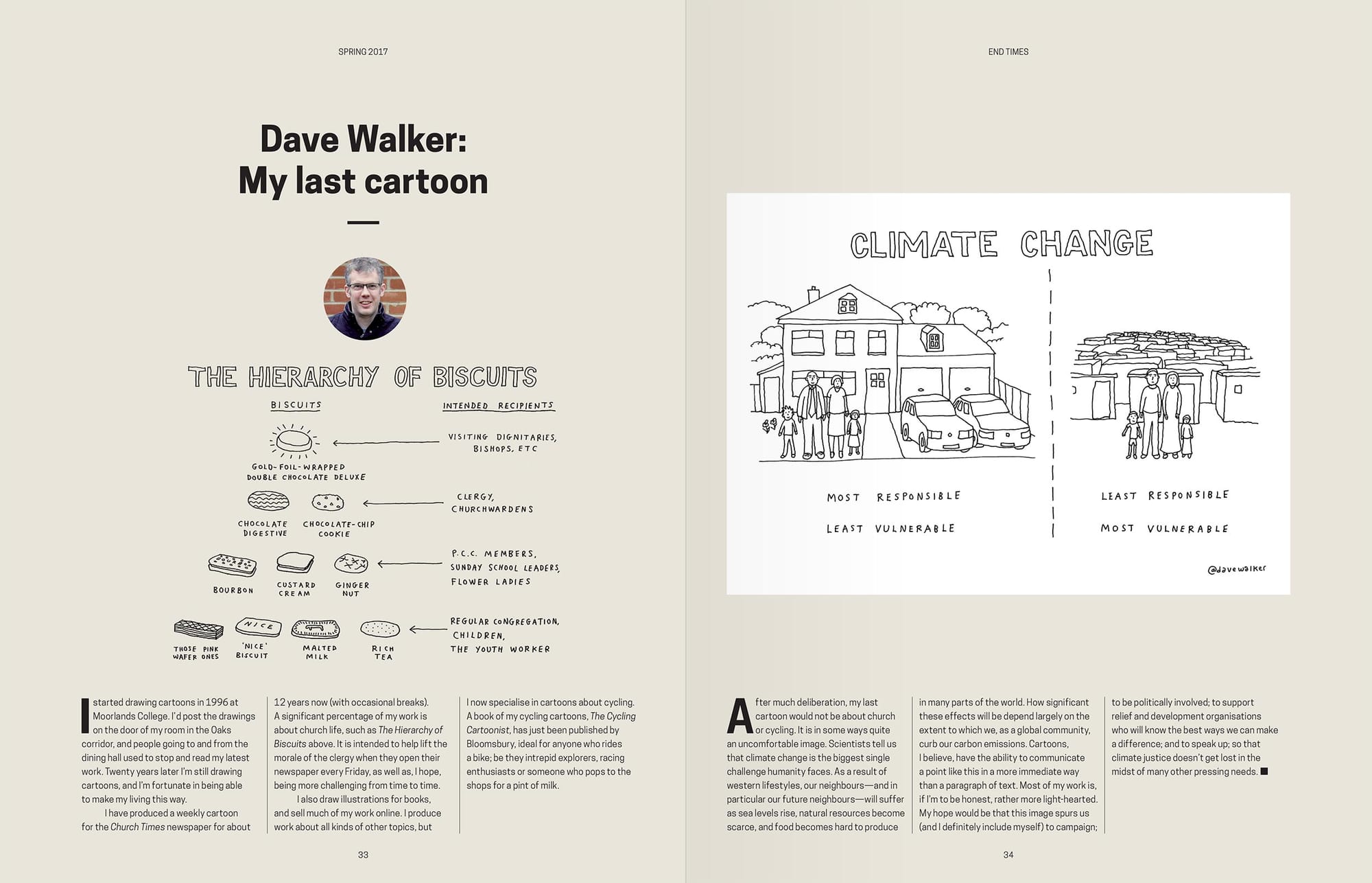
To help demonstrate Moorlands College as a thought leader in the field of theology, I initiated a new biannual magazine featuring the work of students, academic staff and our extended network of respected thinkers. Aimed at current and prospective partners, students, publishers and event organisers, Greater Things even became a role model for organisations in other industries looking to launch something similar.
Project credits
Verbal identity The Brand Language Studio
Market research PFA Research
Design support Peter Jordan
Marketing team Tom Rothwell, Sarah White
Photography Jonathan Cherry
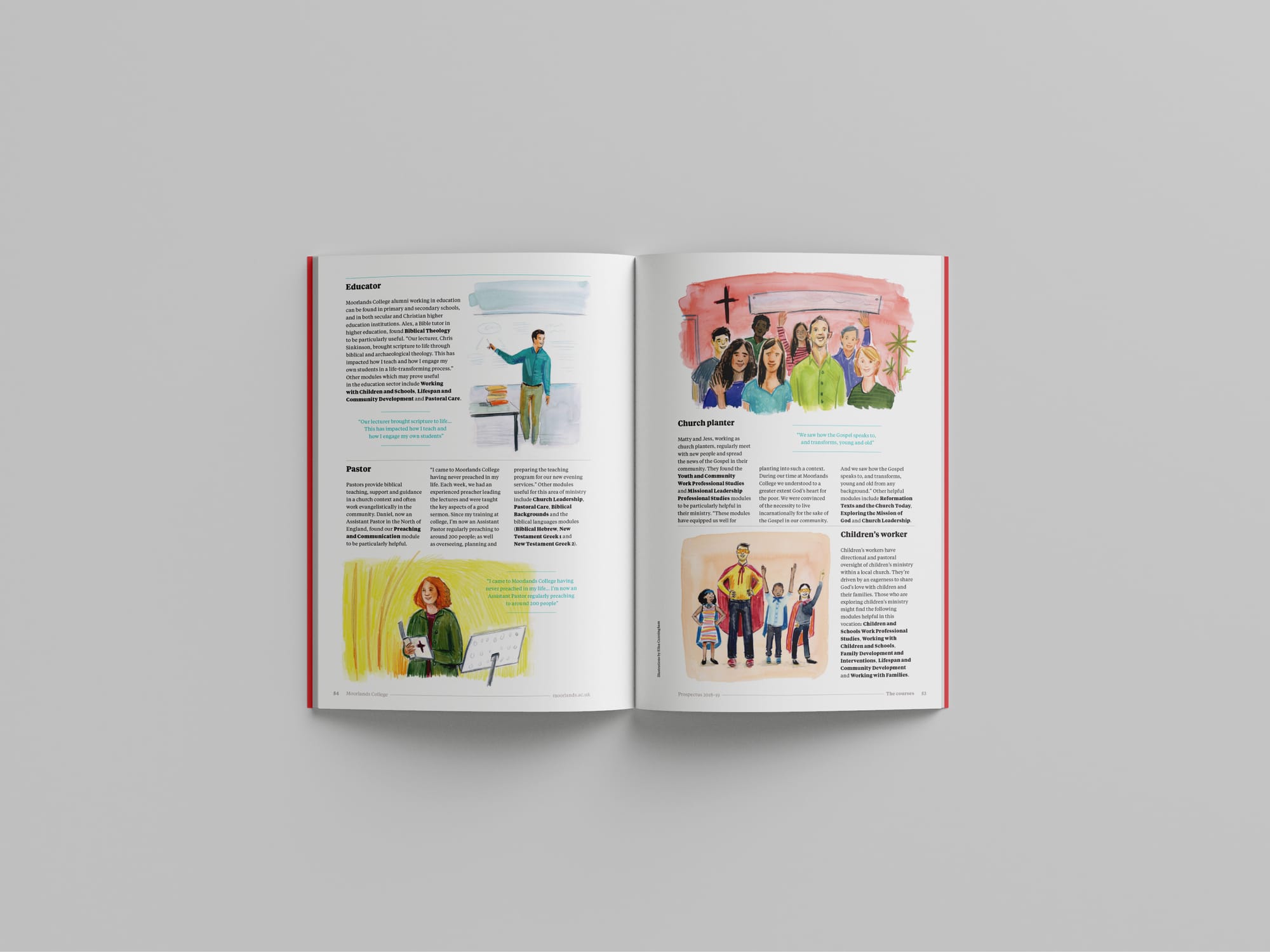
Illustration Elisa Cunningham
Web development Beep! Digital