Table of Contents
Orphanages don’t protect children, they harm them. Which is why Hope and Homes for Children is working towards a day when orphanages are history and every child can grow up in a loving family.
Hope and Homes for Children is a global expert preventing the institutionalisation of children by keeping families together, reuniting children with their families, and building new families—right across eastern Europe, south and eastern Africa, and south Asia.
I worked in a newly-created role as part of the global Brand and Communications team, based in the UK, primarily to focus on performance marketing and fundraised income.
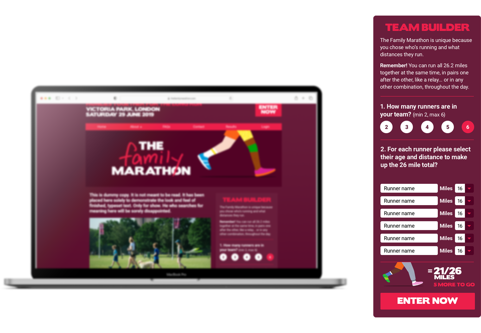
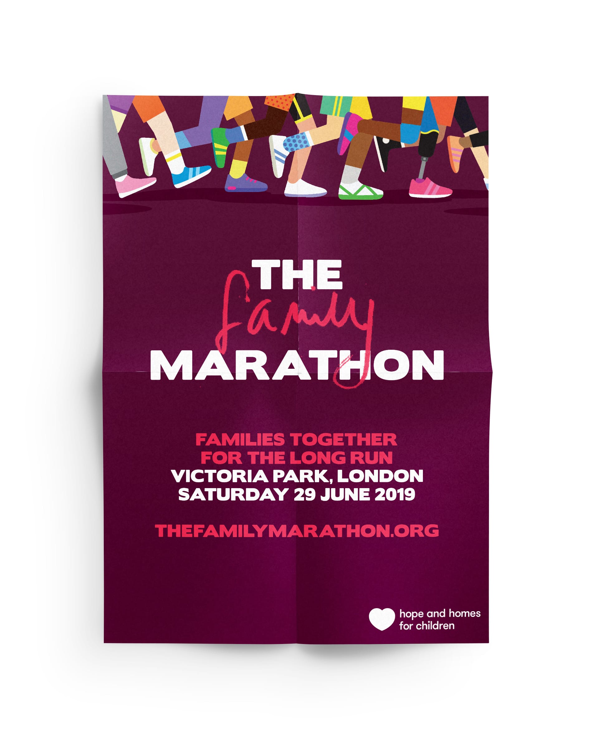
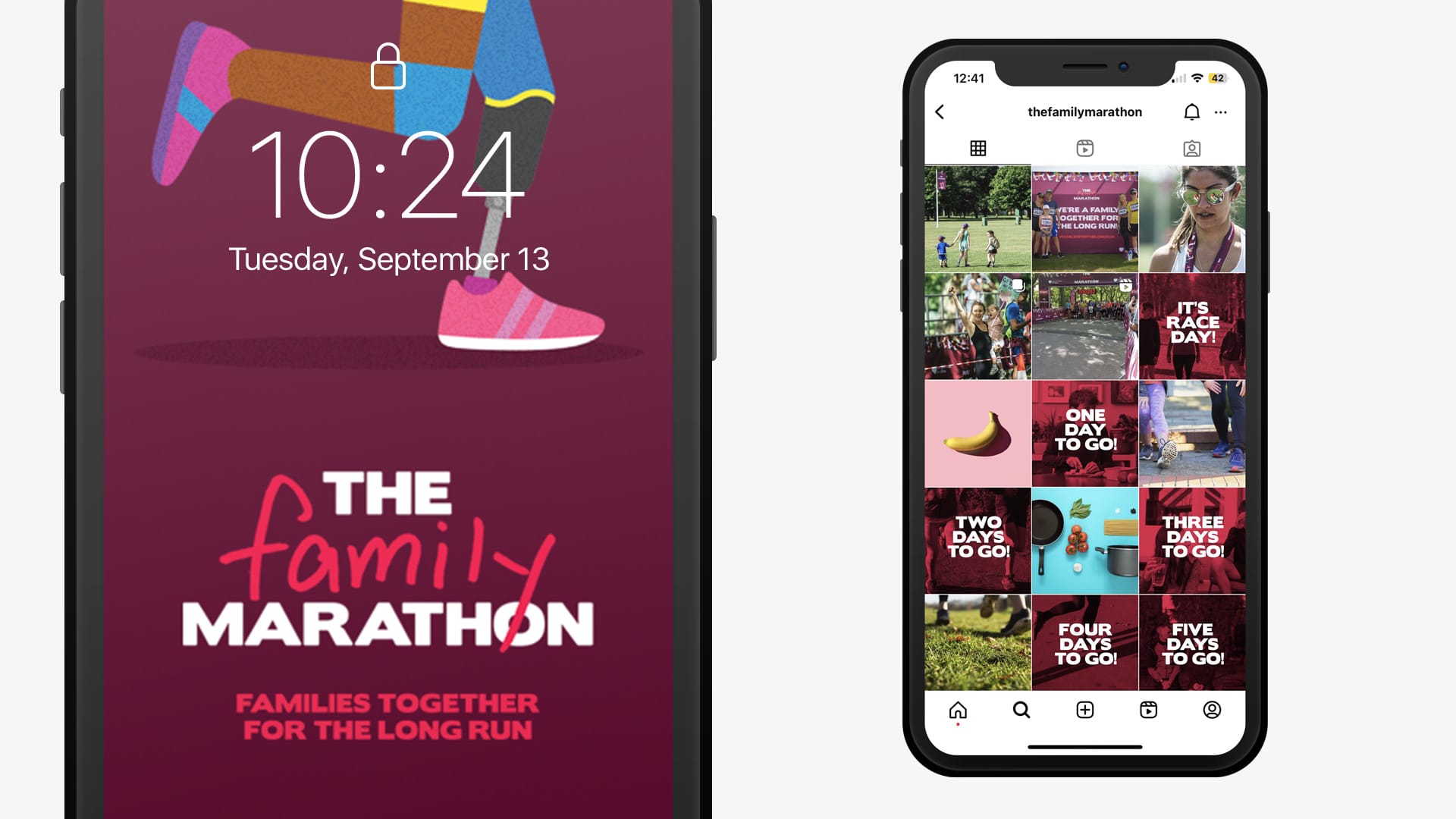
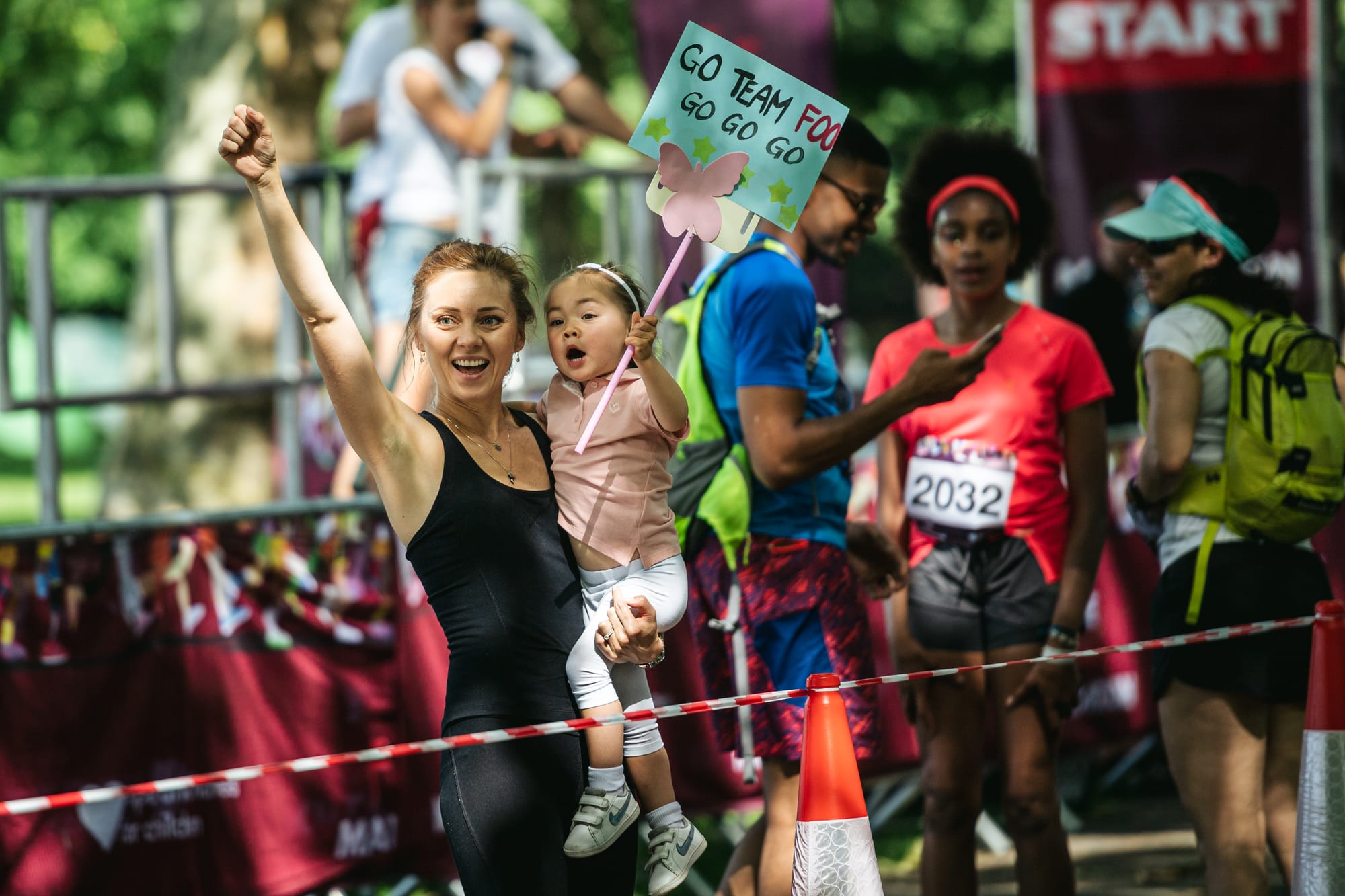
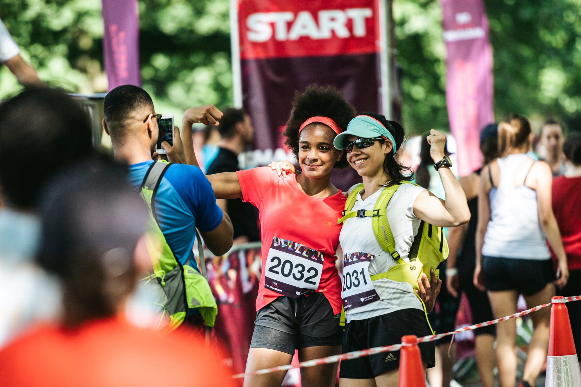
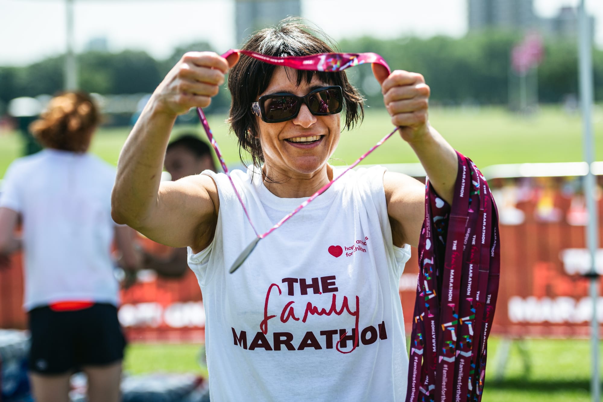
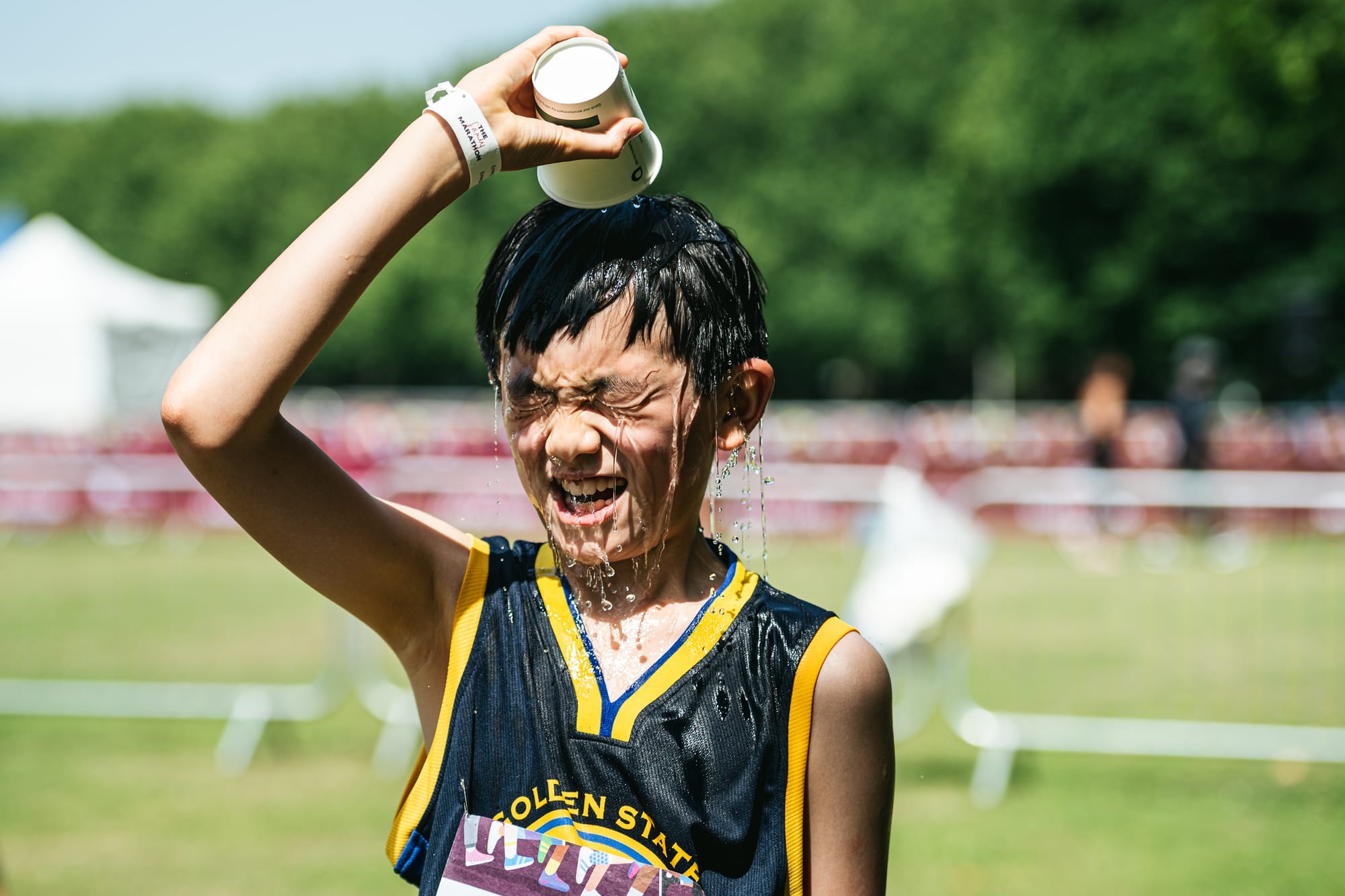
The Family Marathon
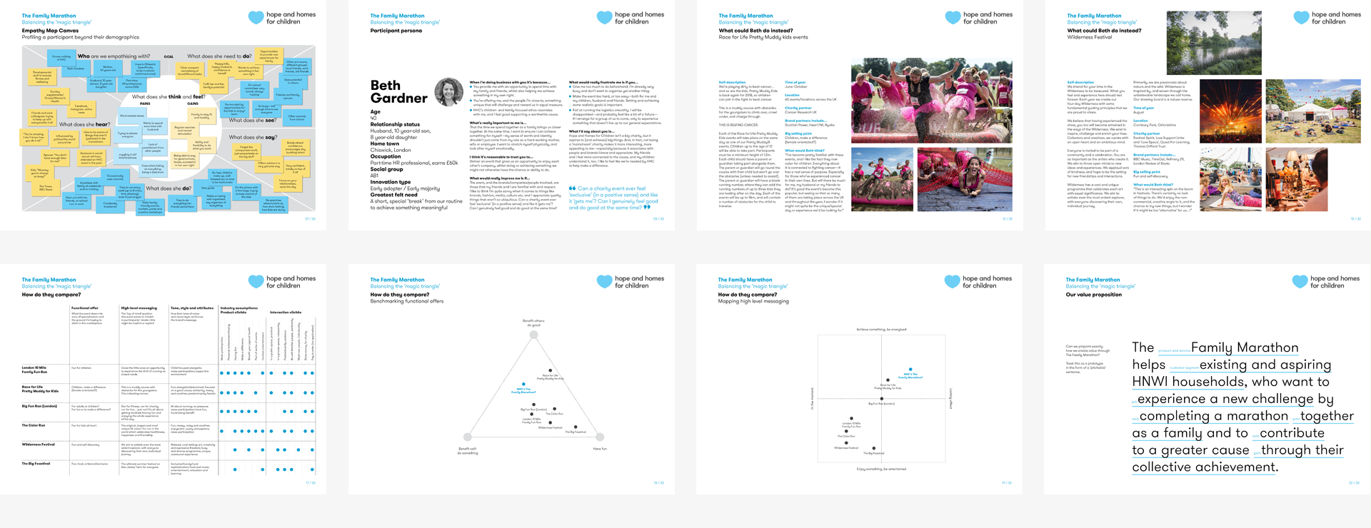
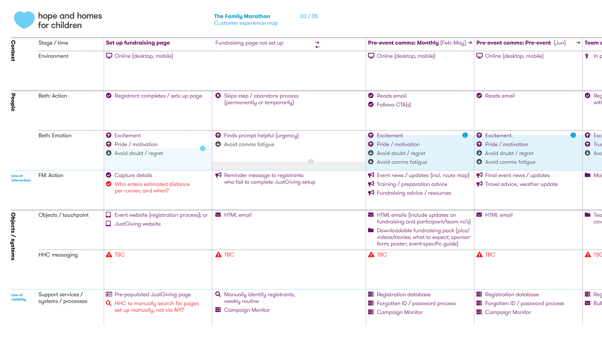
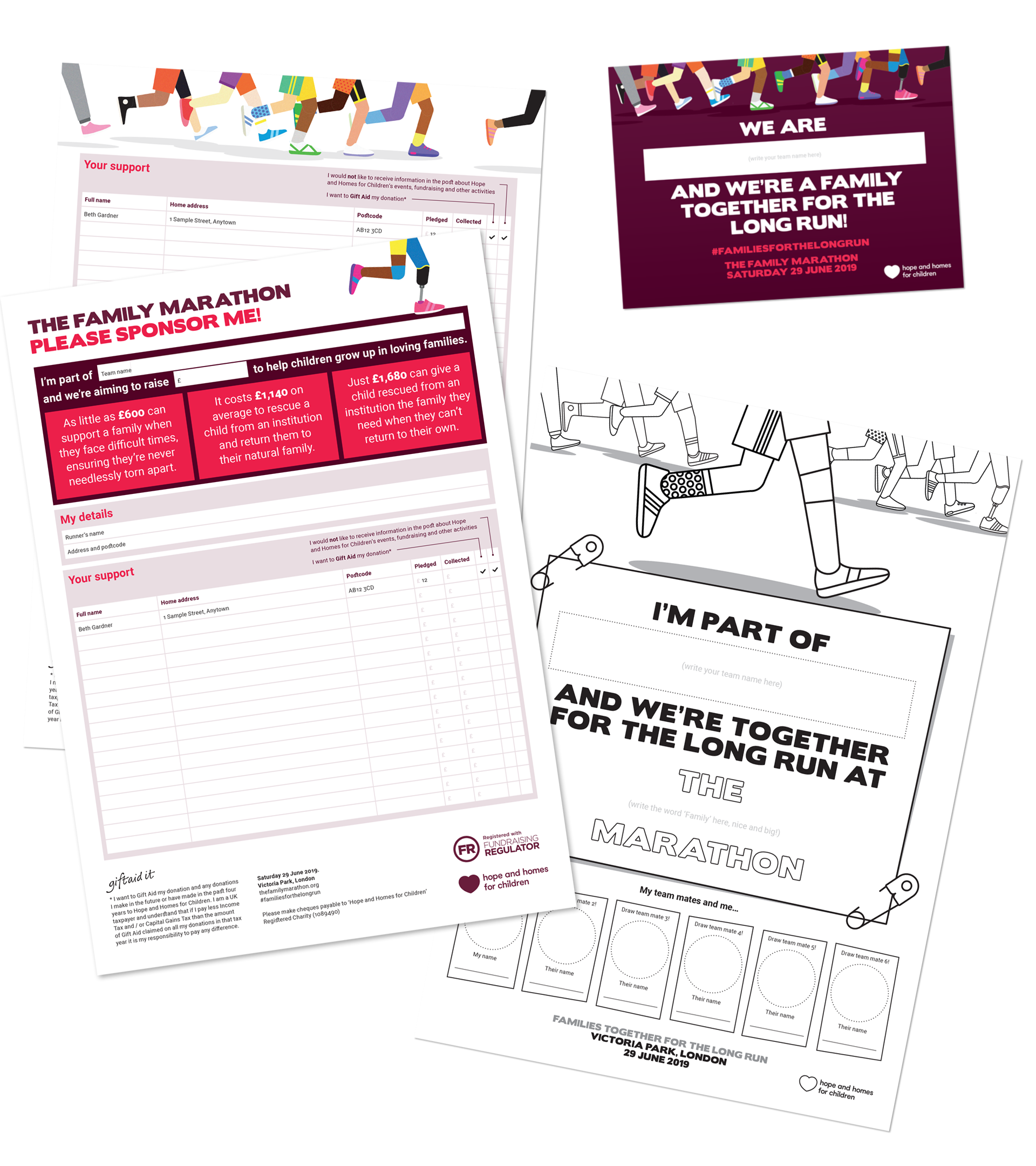
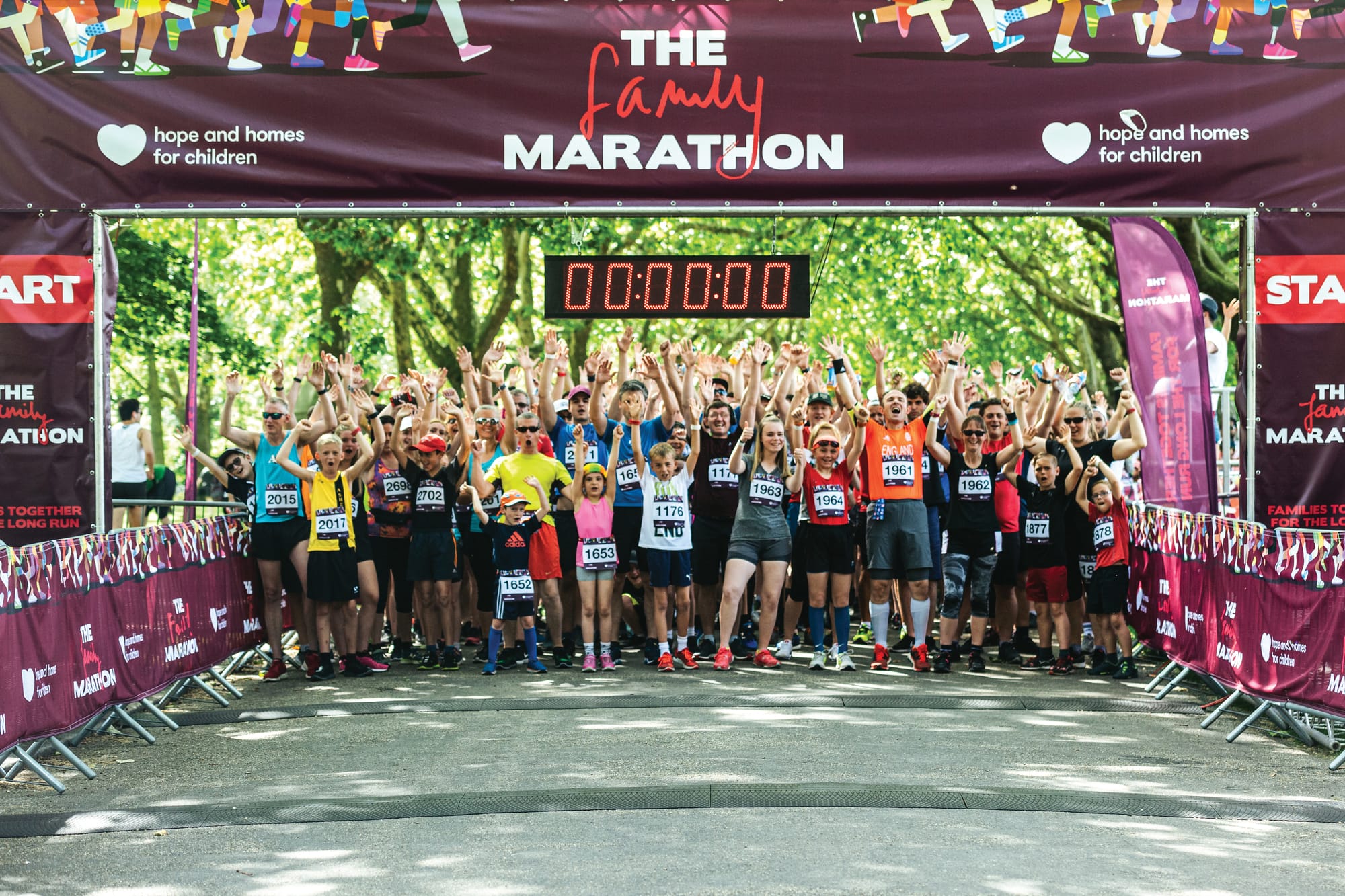
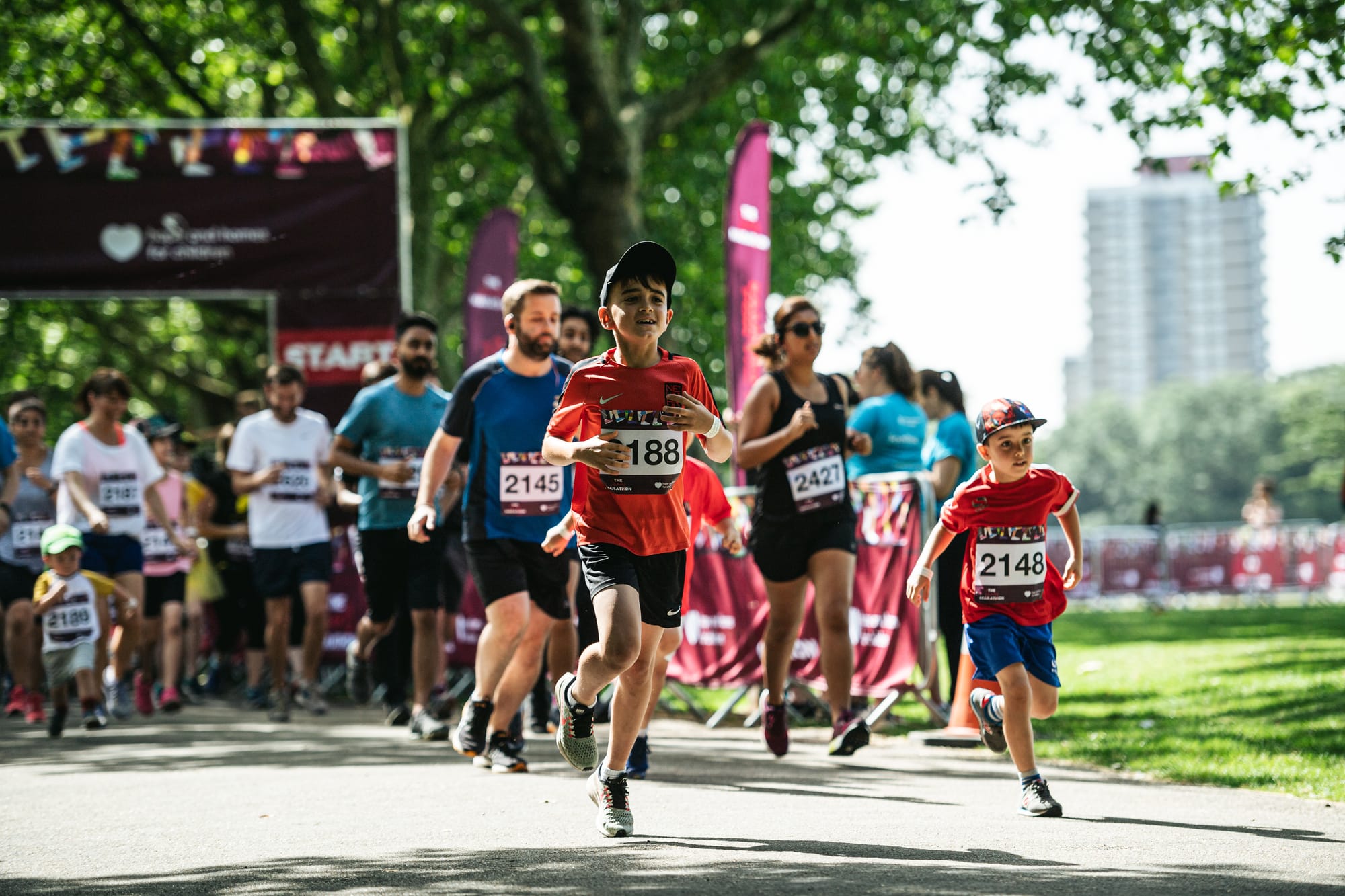
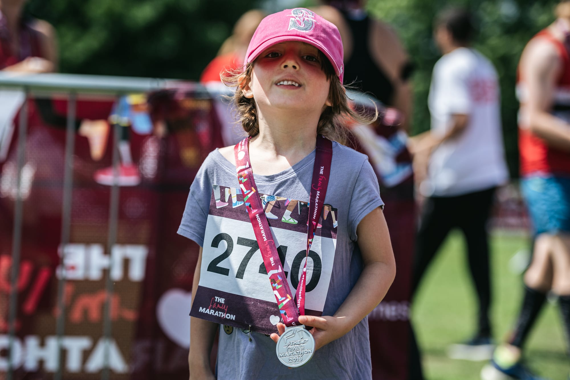
As Hope and Homes for Children’s first ever mass participation event, The Family Marathon was designed to raise awareness of our cause among people who’d never previously heard of deinstitutionalisation—let alone our charity.
The format was simple. Families, or teams of friends or colleagues, committed to running 26.2 miles between them over the course of the event. On what turned out to be the hottest day of the year, 1,500 participants and hundreds of spectators were rewarded with an exceptional family experience in the heart of London.
First, I created a rigorous new brand architecture framework for all of the charity’s events, distinguishing between monolithic, endorsed and third party categories (with a decision tree to help teams discern). Then, working closely with our specialist event partner, I devised and oversaw the execution of The Family Marathon’s creative campaign; participant experience planning and comms; and all earned and owned marketing channels.
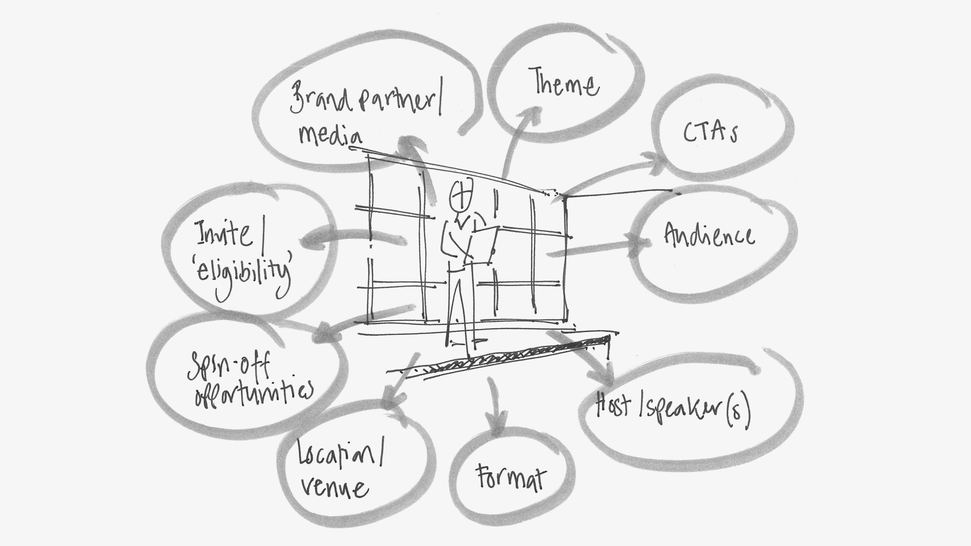
Regular Giving concepts
As part of a small cross-functional team, comprising two department heads and charity strategist Chloë Amstein, we were tasked to explore concepts for a mid-value Regular Giving fundraising product the charity could take to a wider market.
The creative process was built on the insight that our target donors were independent thinkers with a strong sense of agency. From this evolved our proposition to rewrite the story for children in orphanages.
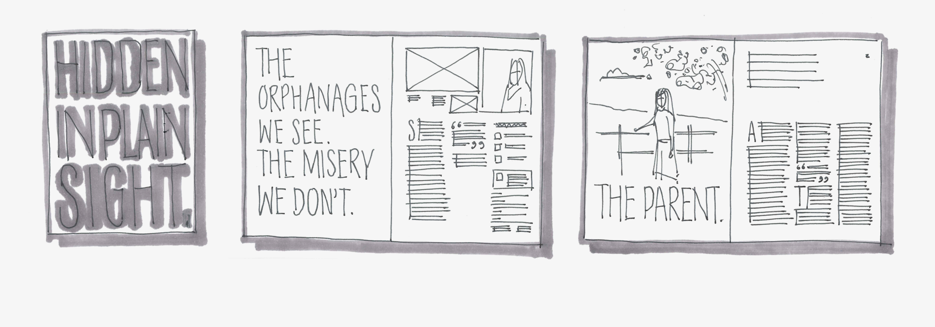
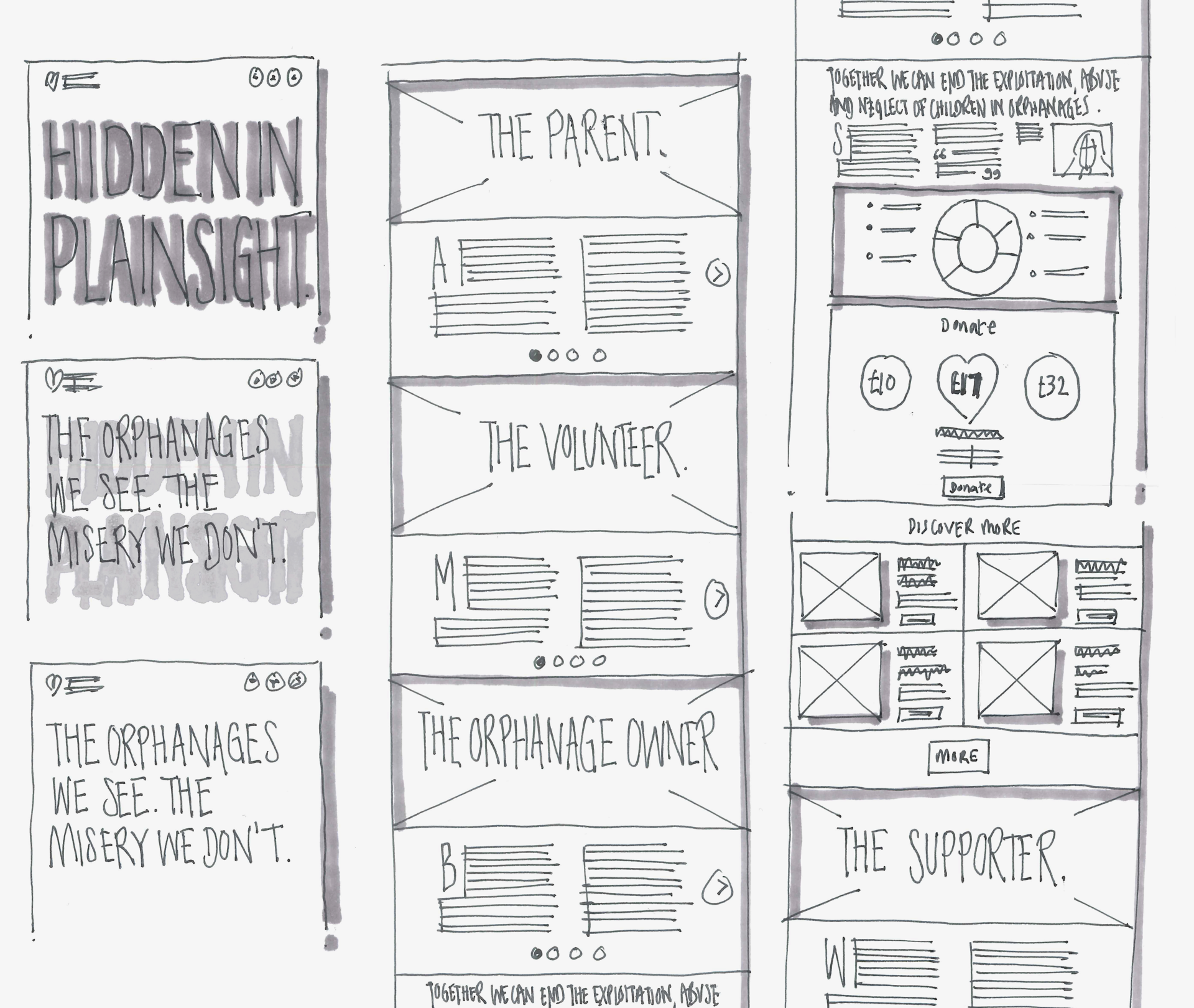
Concept 1. Hidden in plain sight
Orphanages are not the loving homes they claim to be. They are in fact homes to child abuse, exploitation and neglect all hidden in plain sight.
Additional ideas? What if we…
- Lobbied to redefine the dictionary definition of ‘orphanage’; working with Nick Hewer and Countdown to raise awareness?
- Worked with a national chain of opticians and integrated messages about the truth of orphanages into sight test procedures?
- Set up orphan recruitment outposts in locations such as theme parks; playgrounds; and toy departments in high street stores?
- Placed YouTube ads on shows and movies at the moment of a key plot twist; such as when Keyser Söze’s identity is exposed in The Usual Suspects?
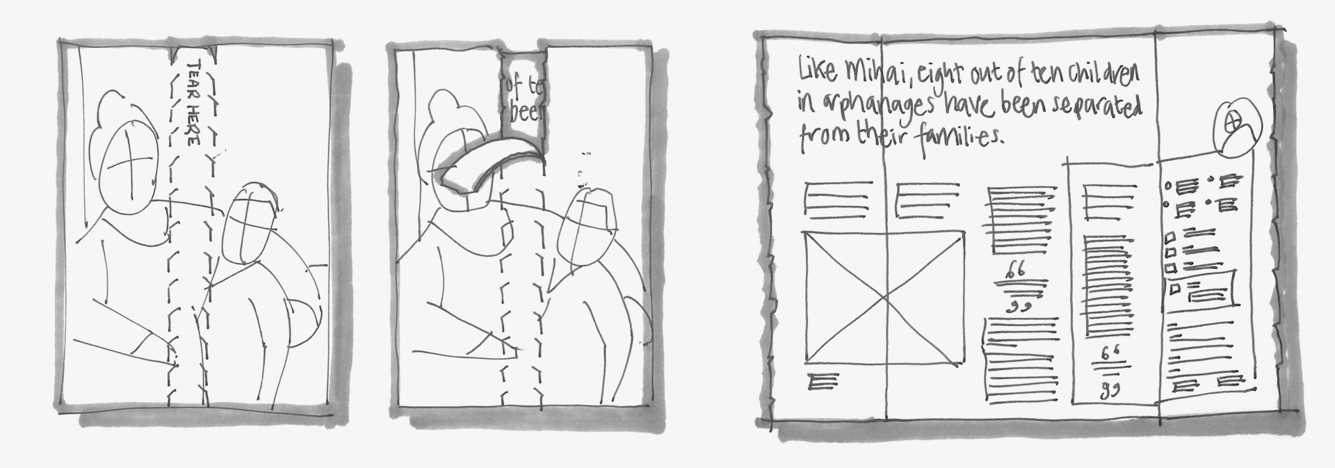
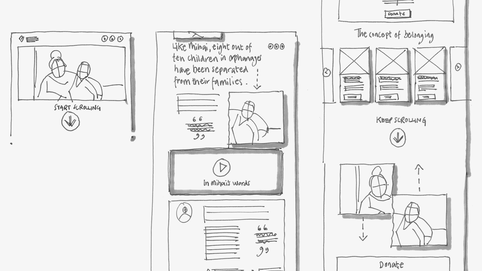
Concept 2. Where we belong
Who is the one person who always accepts you, embraces you, and includes you? Whose presence always means that you belong? Children belong in families, never orphanages.
Additional ideas? What if we…
- Allowed orphanages to disrupt games/quizzes by cropping up where they shouldn’t? Eg. by replacing a single piece of a puzzle with an ill-fitting orphanage-themed alternative.
- Used the physical environment to depict the visual separation and reunification of parent and child; by displaying [Child X]’s photo on a pair of elevator doors, for example?
- Exhibited an orphanage at the Ideal Home Show, ridiculing the notion of it being a realistic alternative to family/home life?
- Partnered with IKEA and adapted a showroom interior, recreating an orphanage space that can be explored, experienced and questioned as a place in which children should grow up?
Our Regular Giving products ultimately launched under the Where we belong concept. Via staff workshops, we collectively explored the full potential of the idea to permeate the work of every fundraising team; from redefining comms, to influencing all elements of a supporter event, to prioritising corporate partners. We even developed a new forward-thinking supporter pledge as a result.
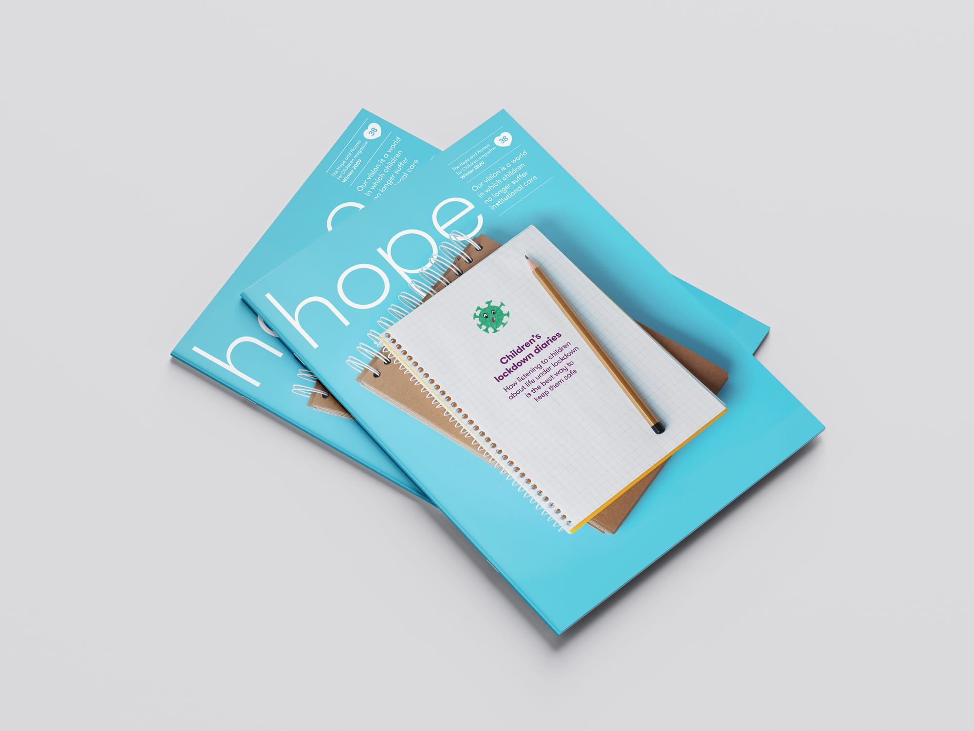
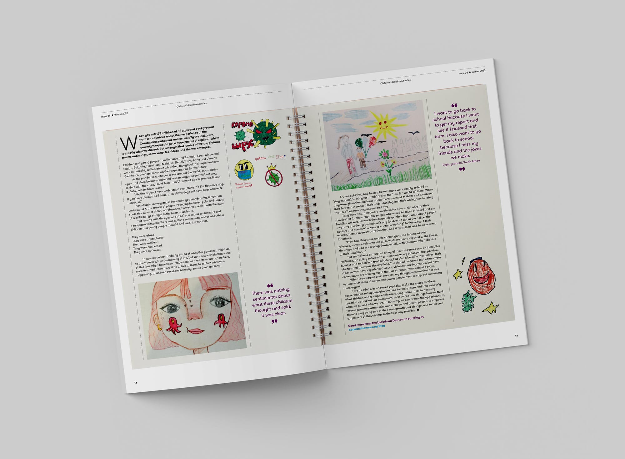
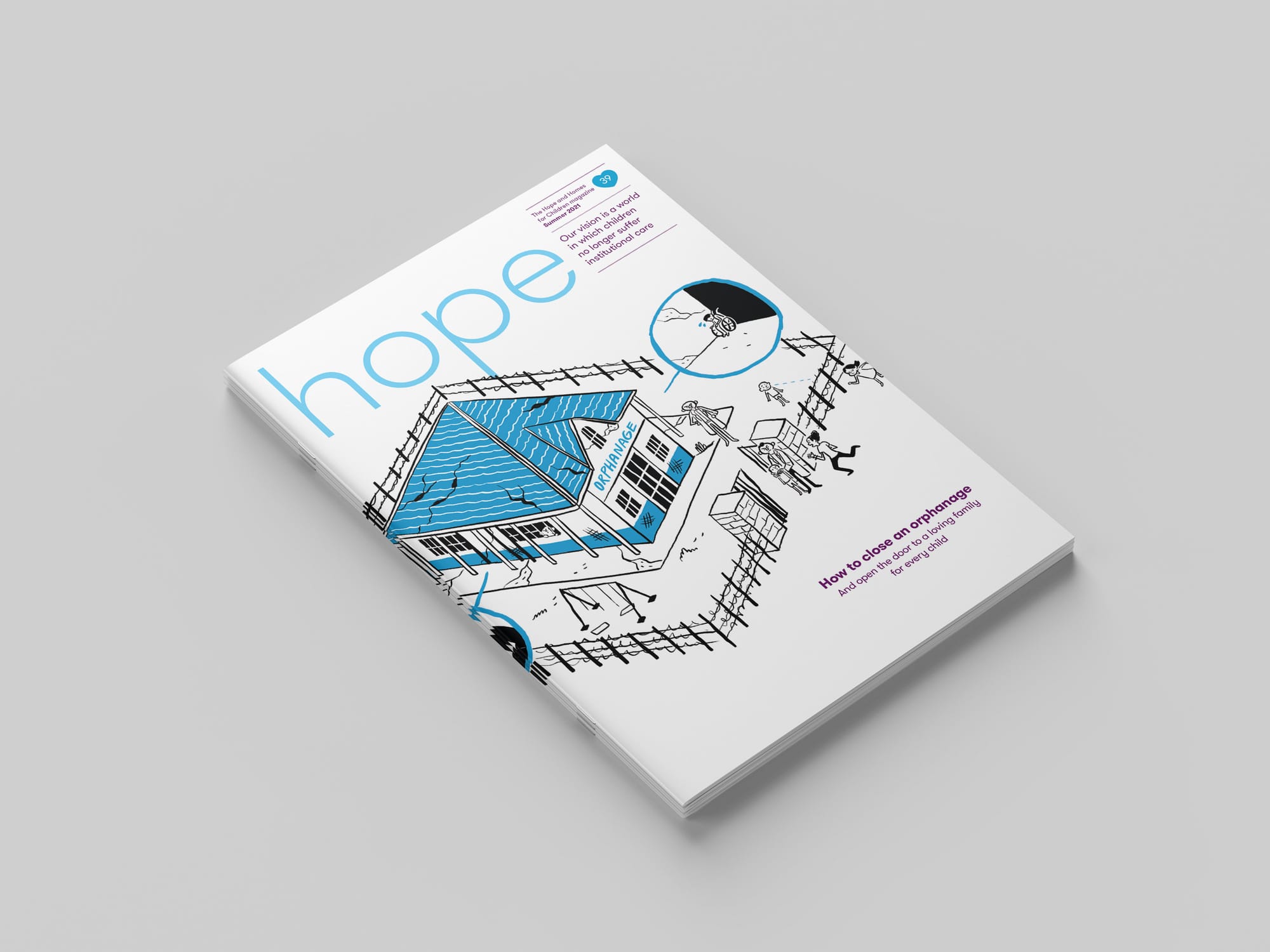
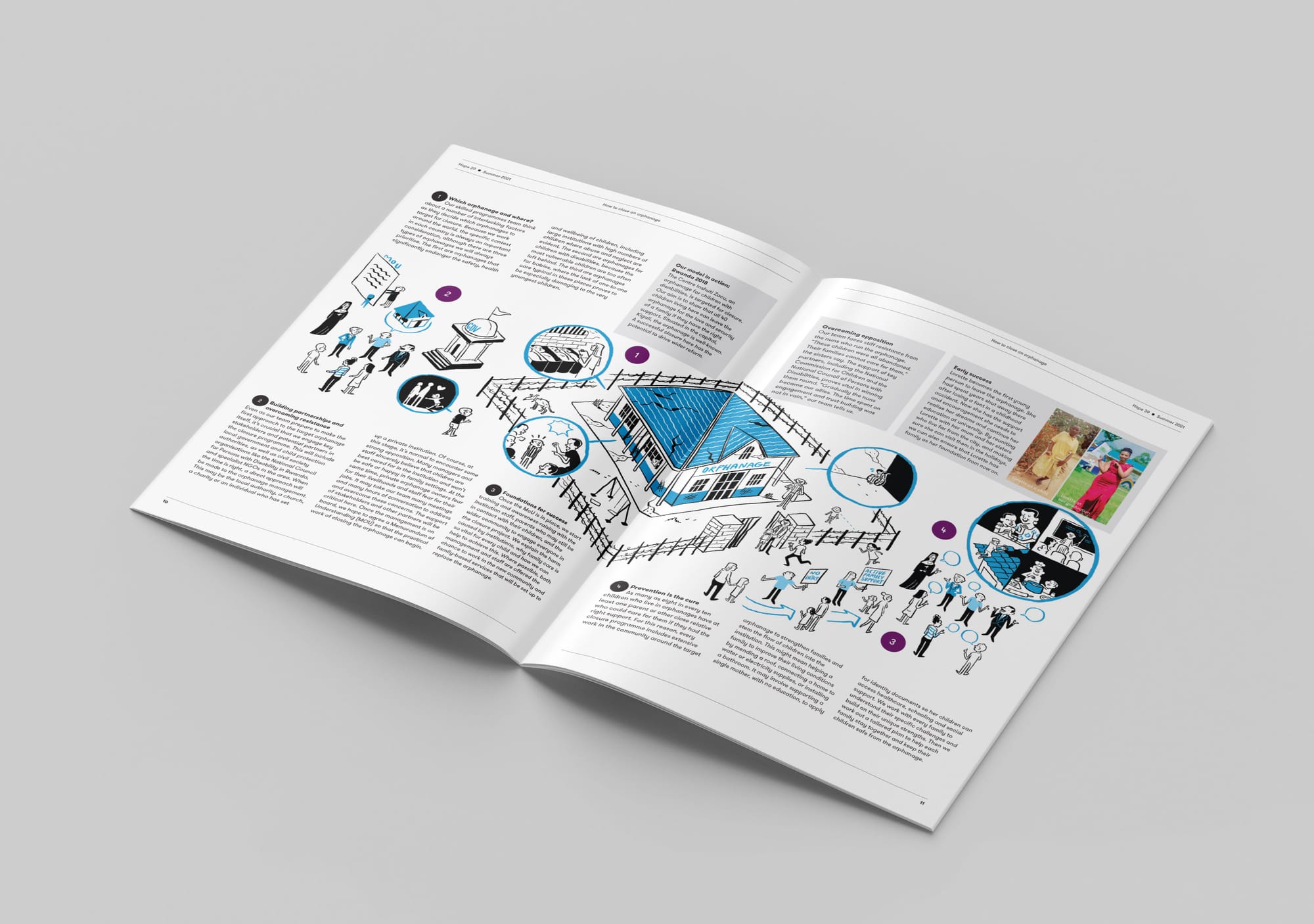
Hope supporter magazine
Our biannual supporter magazine was a longstanding fixture on Hope and Homes for Children’s comms calendar. Although it had enjoyed subtle, iterative design tweaks over a couple of years, Hope was the obvious candidate to undergo a rethink and become the showcase of our new Where we belong concept.
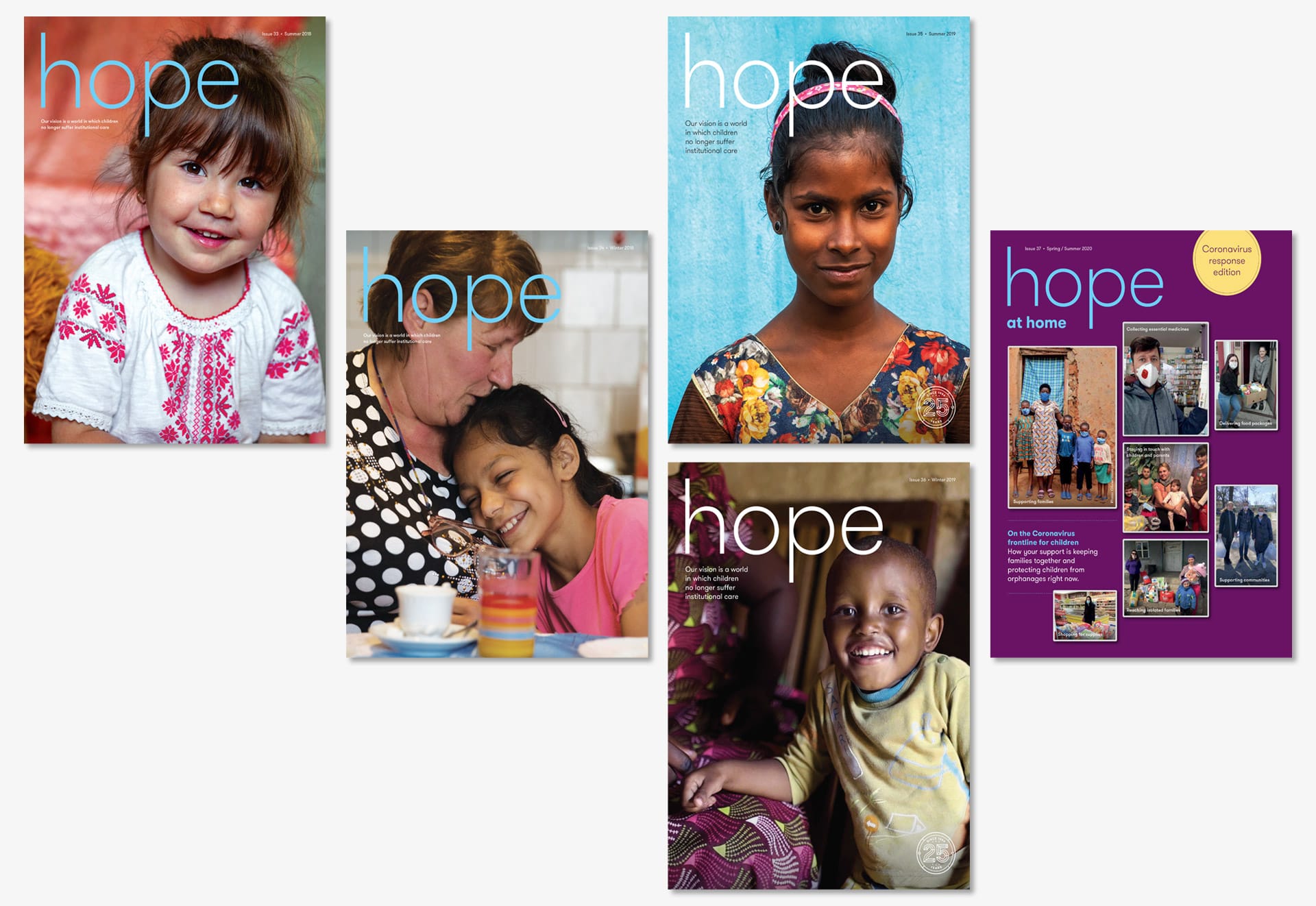
Under my supervision, we made both editorial and design changes to Hope. We set ourselves the benchmark that every issue would adopt a theme to give it focus; behave more like an outward-looking, intelligent publication than a navel-gazing charity newsletter; present a range of voices from within the charity and beyond; and aspire to be something a reader would actively choose to pay for.
Our editorial filter moved us from what we wanted to say, to what target supporters wanted to read—giving direction to our storytelling, content and desired emotional response.
And it worked. These changes brought in more income through average gifts and high-value donations after just one issue, than the previous three issues put together; generating 345% ROI and positive feedback from fundraisers and readers alike.
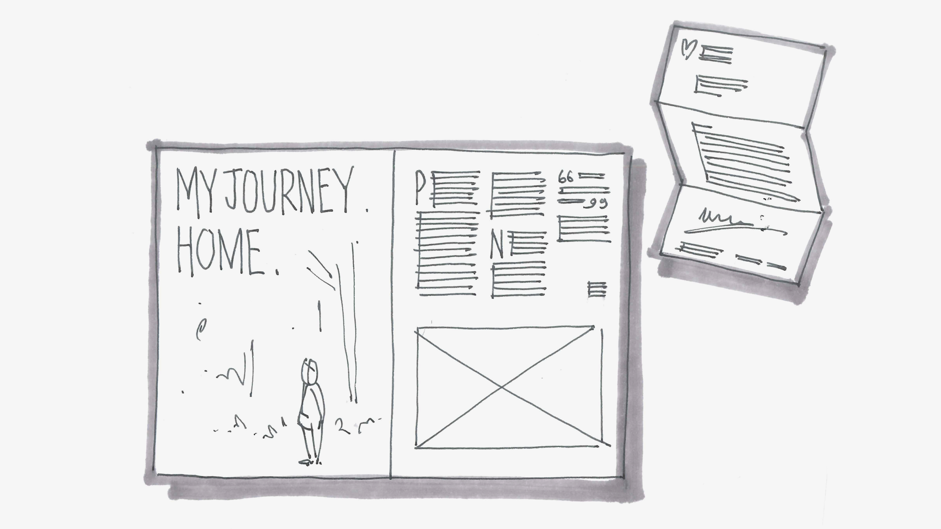
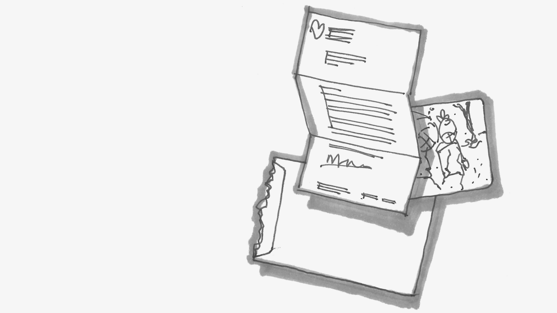
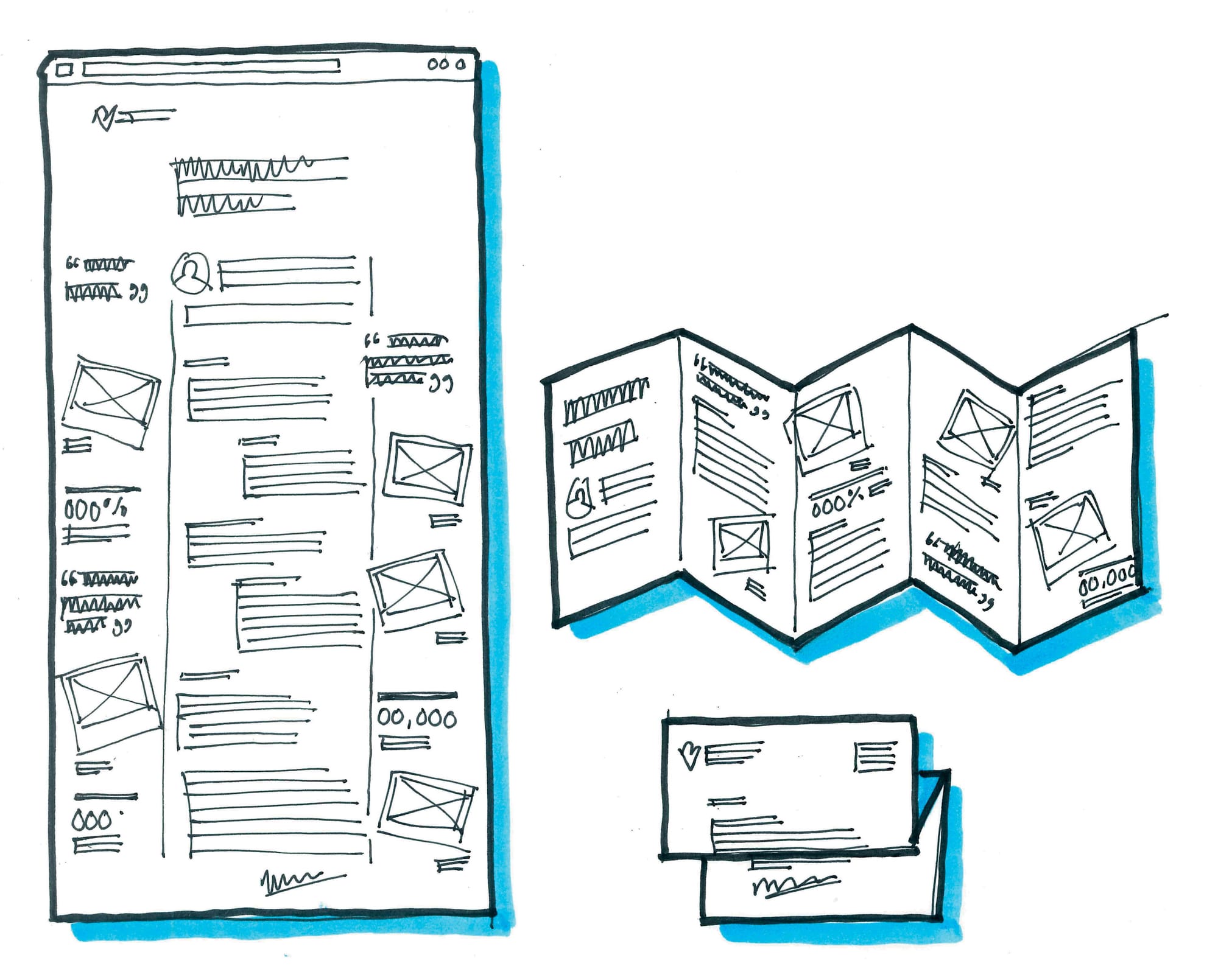
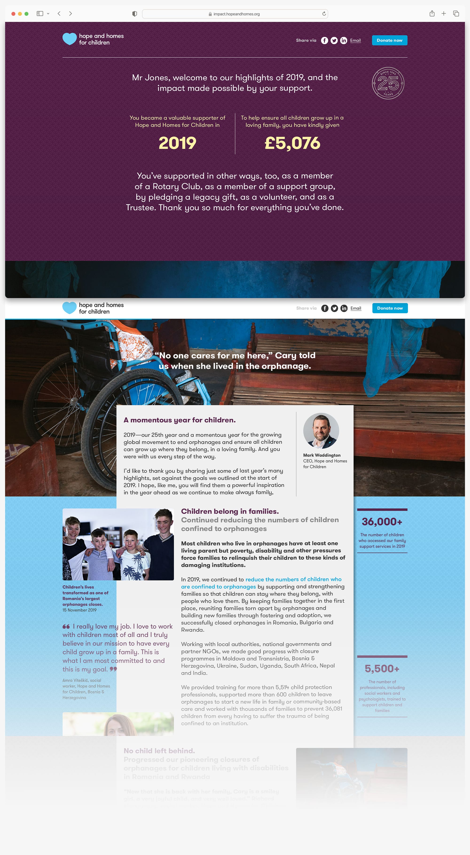
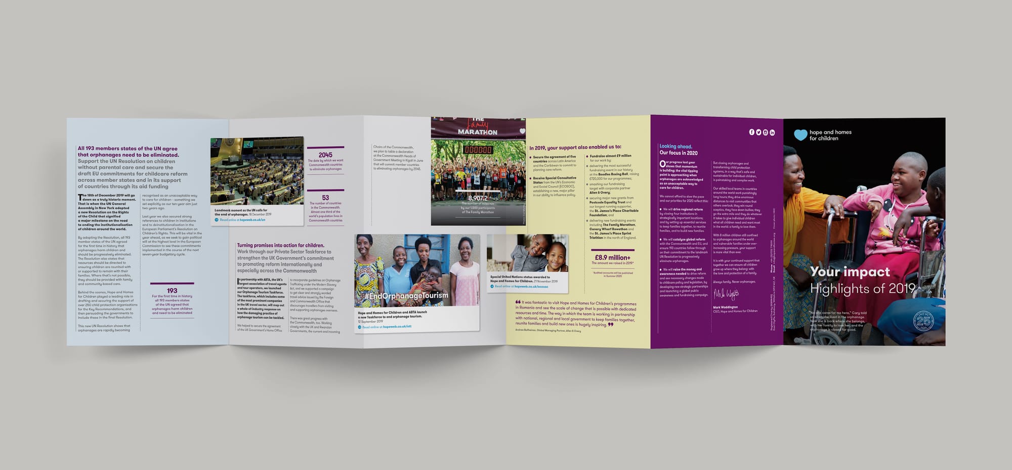
Impact Report
Our mid-year impact reports had, until now, been conventional printed booklets mailed to individual donors, corporate supporters and advocacy contacts every year. We wanted to up the ante.
Instead, I proposed we break our reporting down into two annual mailings; the first being earlier in the year to help our fundraising teams build and maintain supporter relationships after the Christmas downtime.
Driven by our CRM data, we emailed a personalised web address to every supporter which took them to a customised microsite. Upon landing, they were reminded of the time, treasure and talents they’d so generously given—and the difference this had made to our work. The content of the microsite was also formatted as a printed mailer, to ensure no supporter was left out.
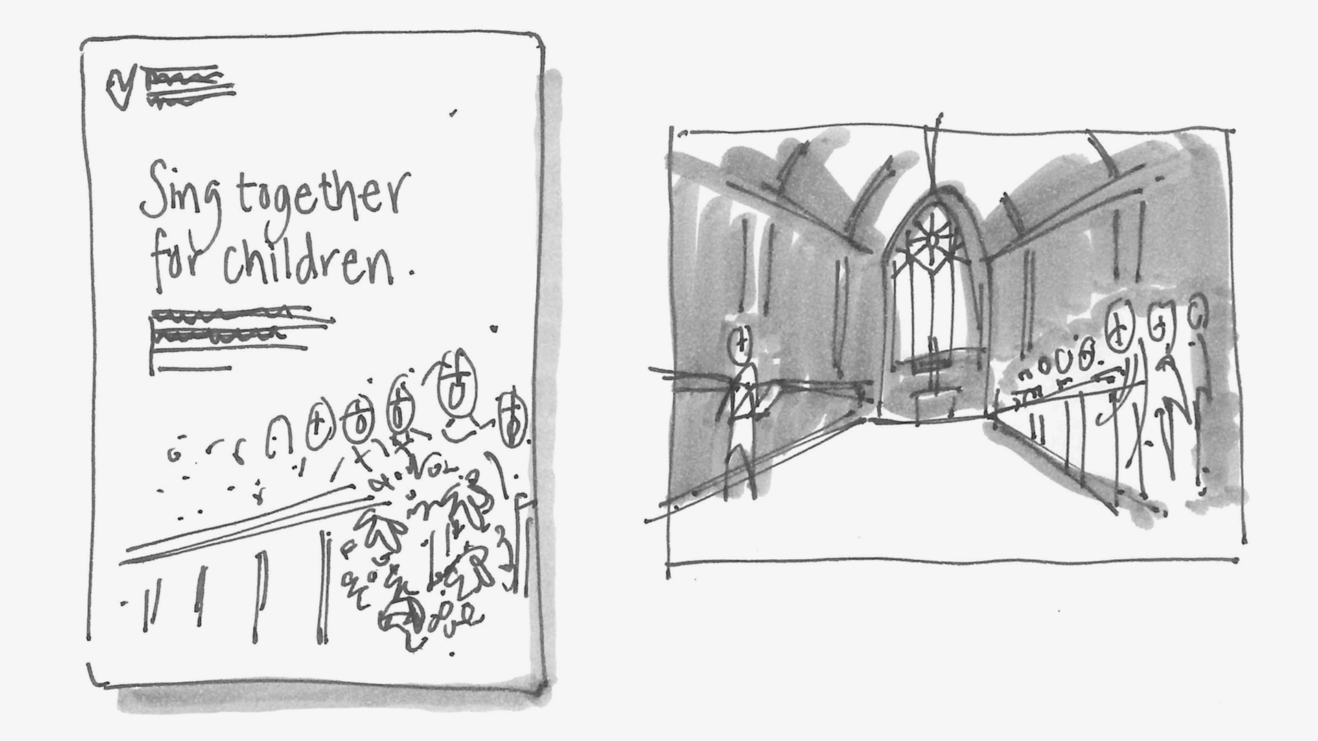
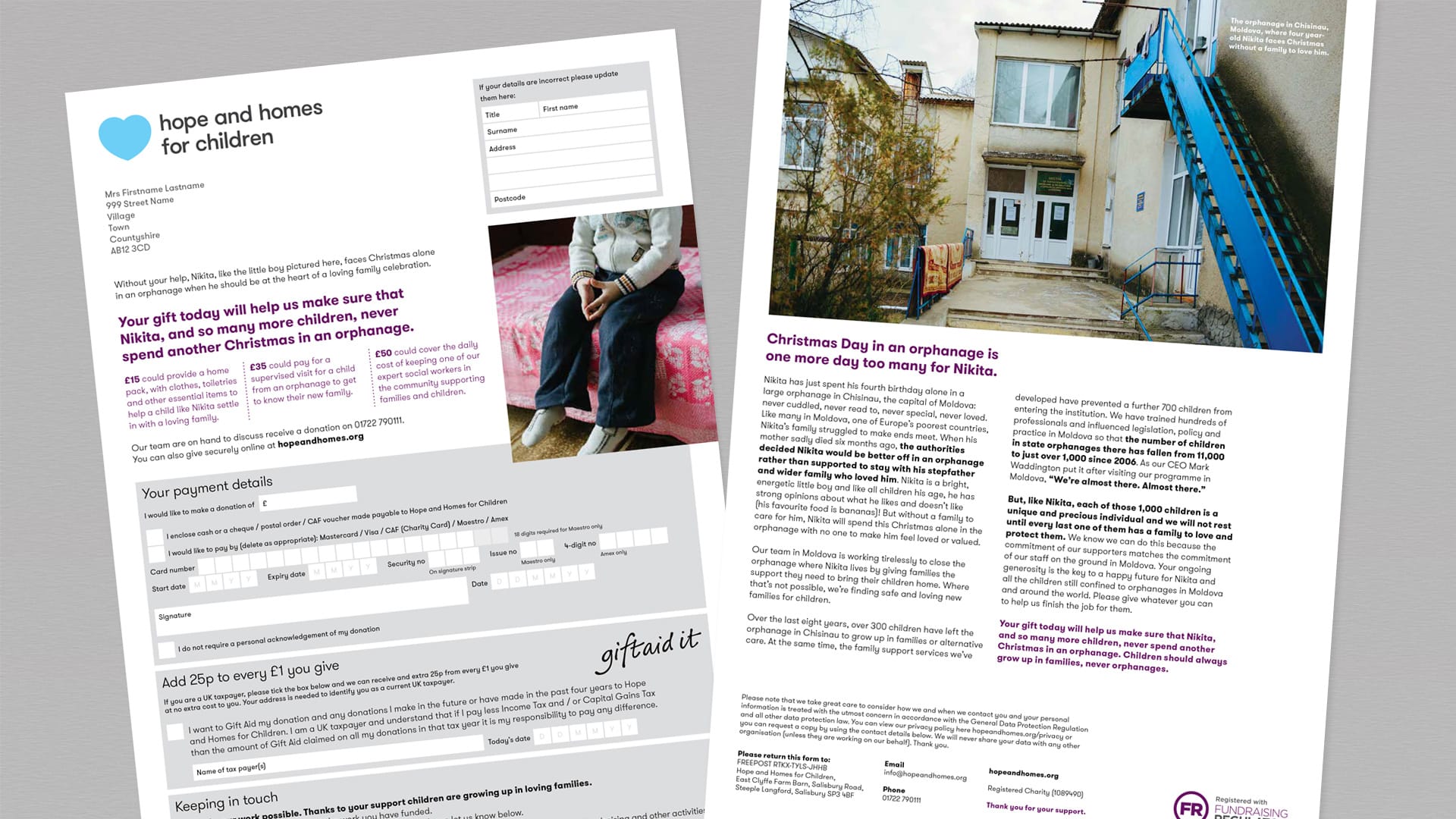
Christmas appeal
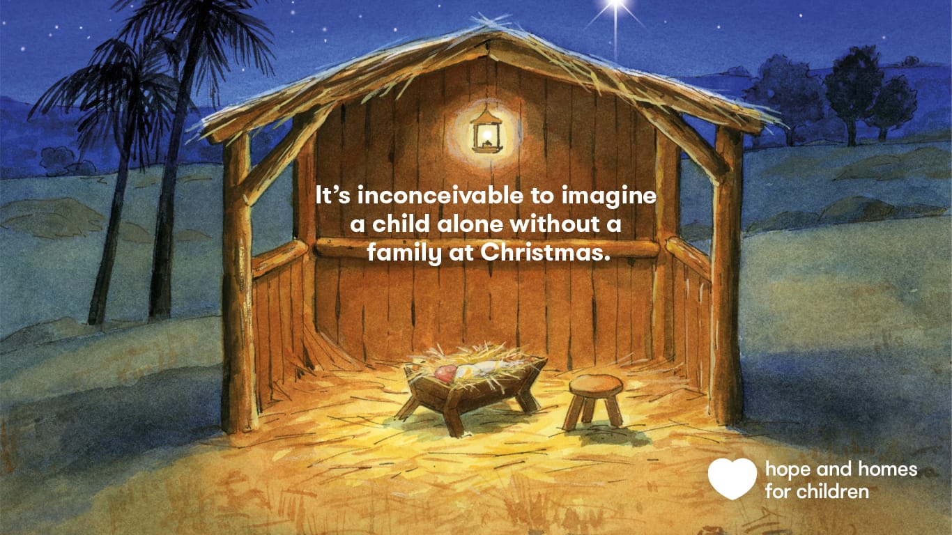
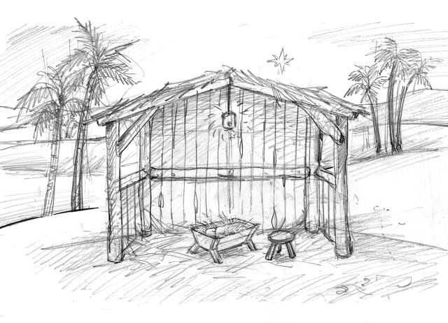
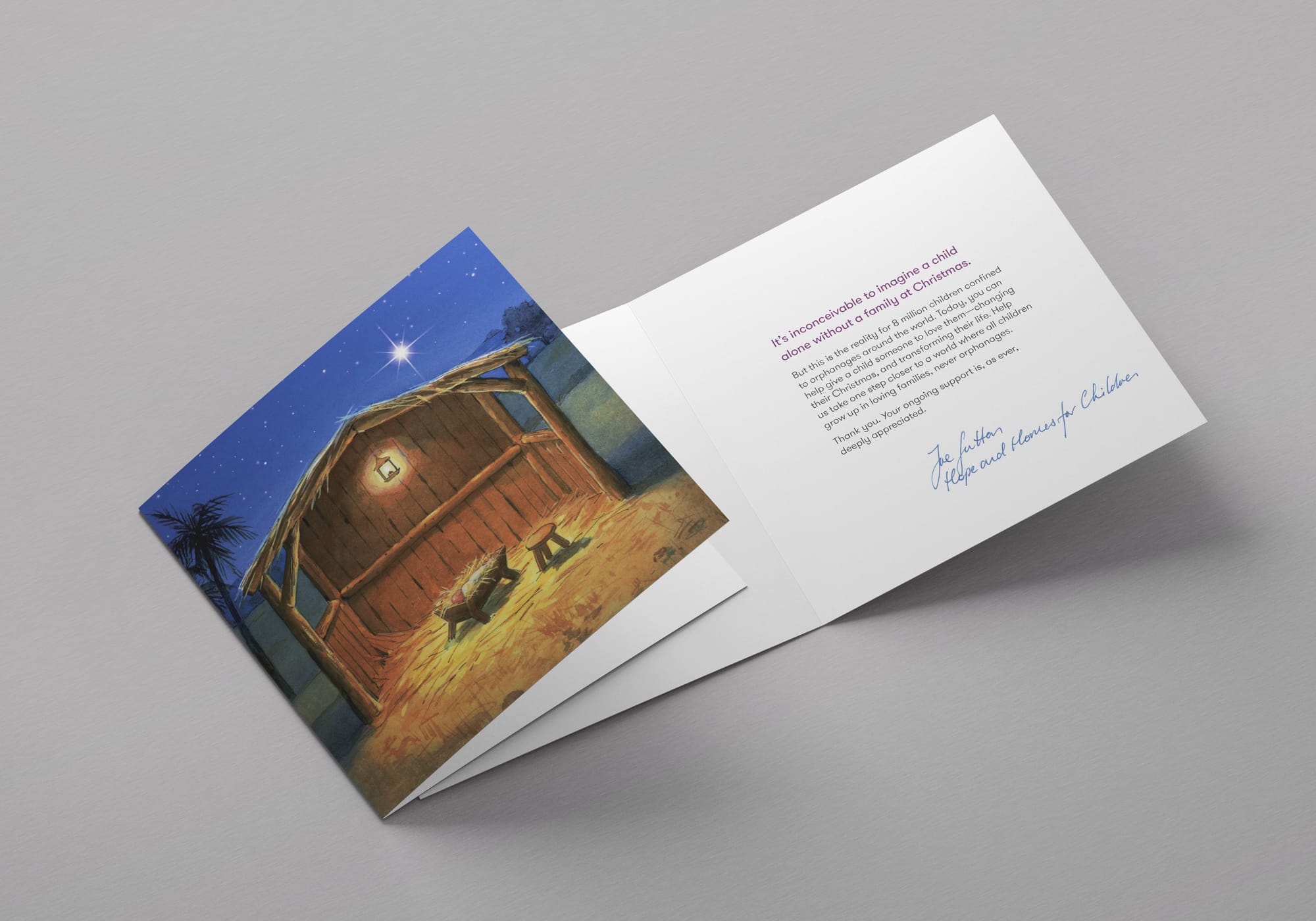
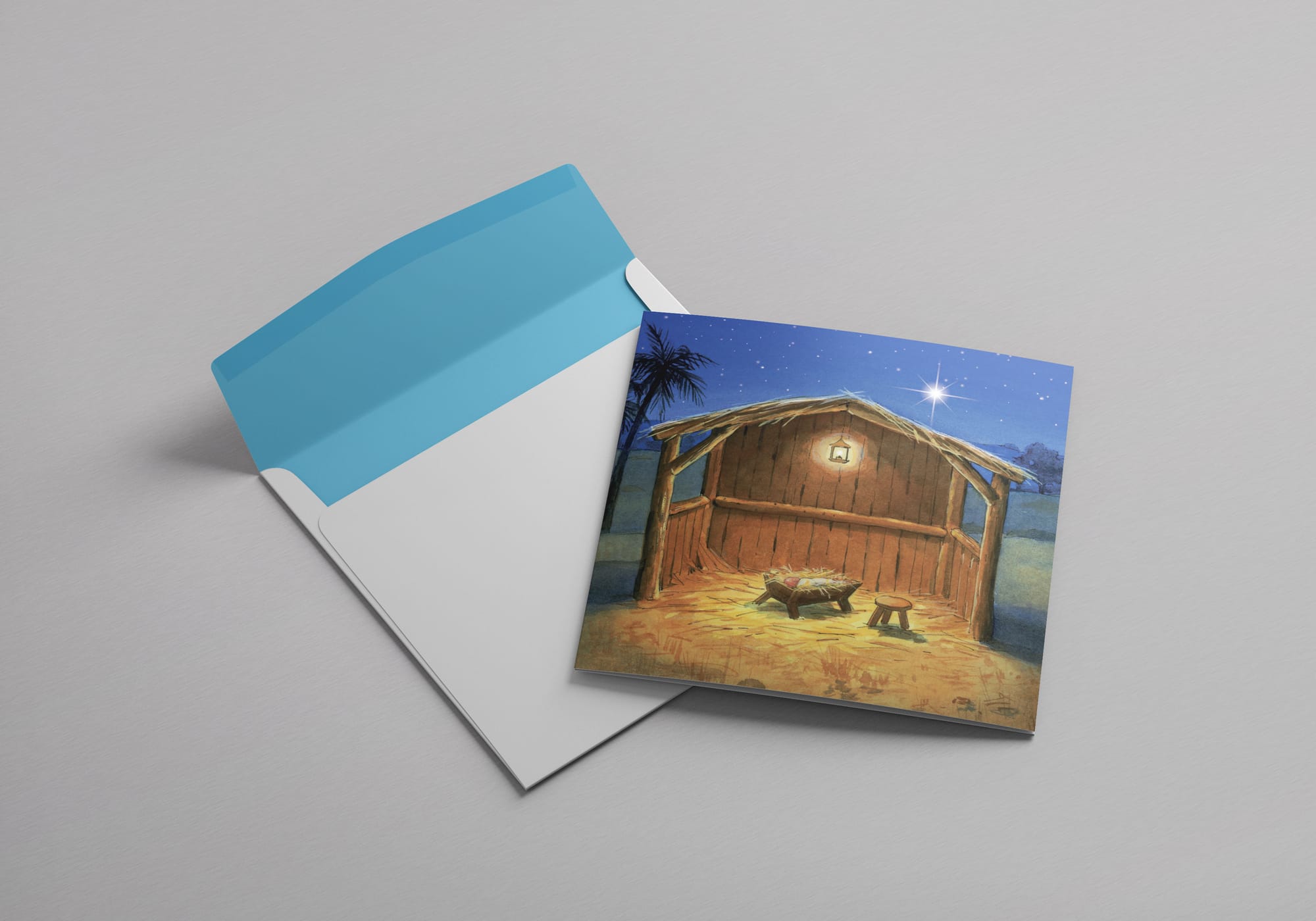
It’s inconceivable to imagine a child alone without a family at Christmas.
But this is the reality for 8 million children confined to orphanages around the world. Today, you can help give a child someone to love them—changing their Christmas, and transforming their life.
This was the message of our last pre-Covid Christmas appeal, symbolised in a singular, powerful, children’s illustration of a baby in the manger—and no family.
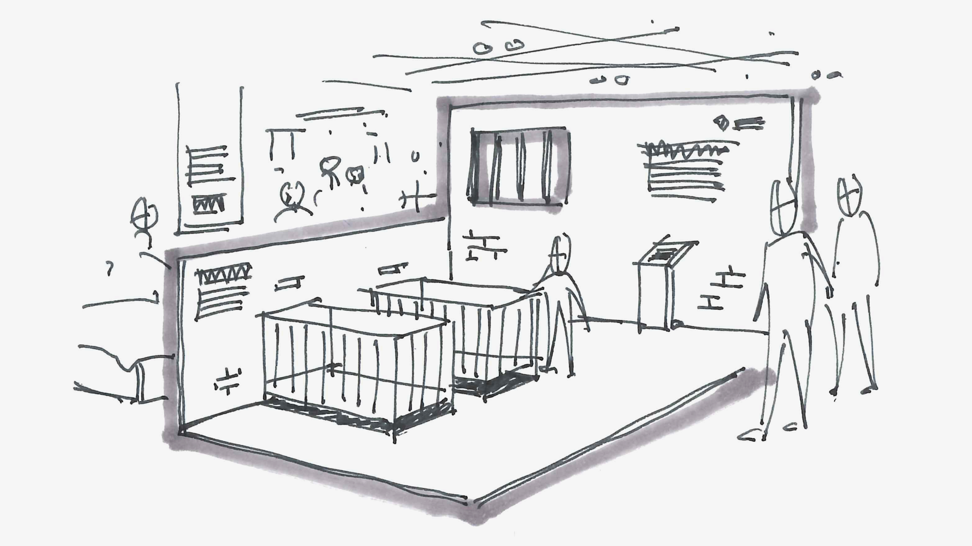
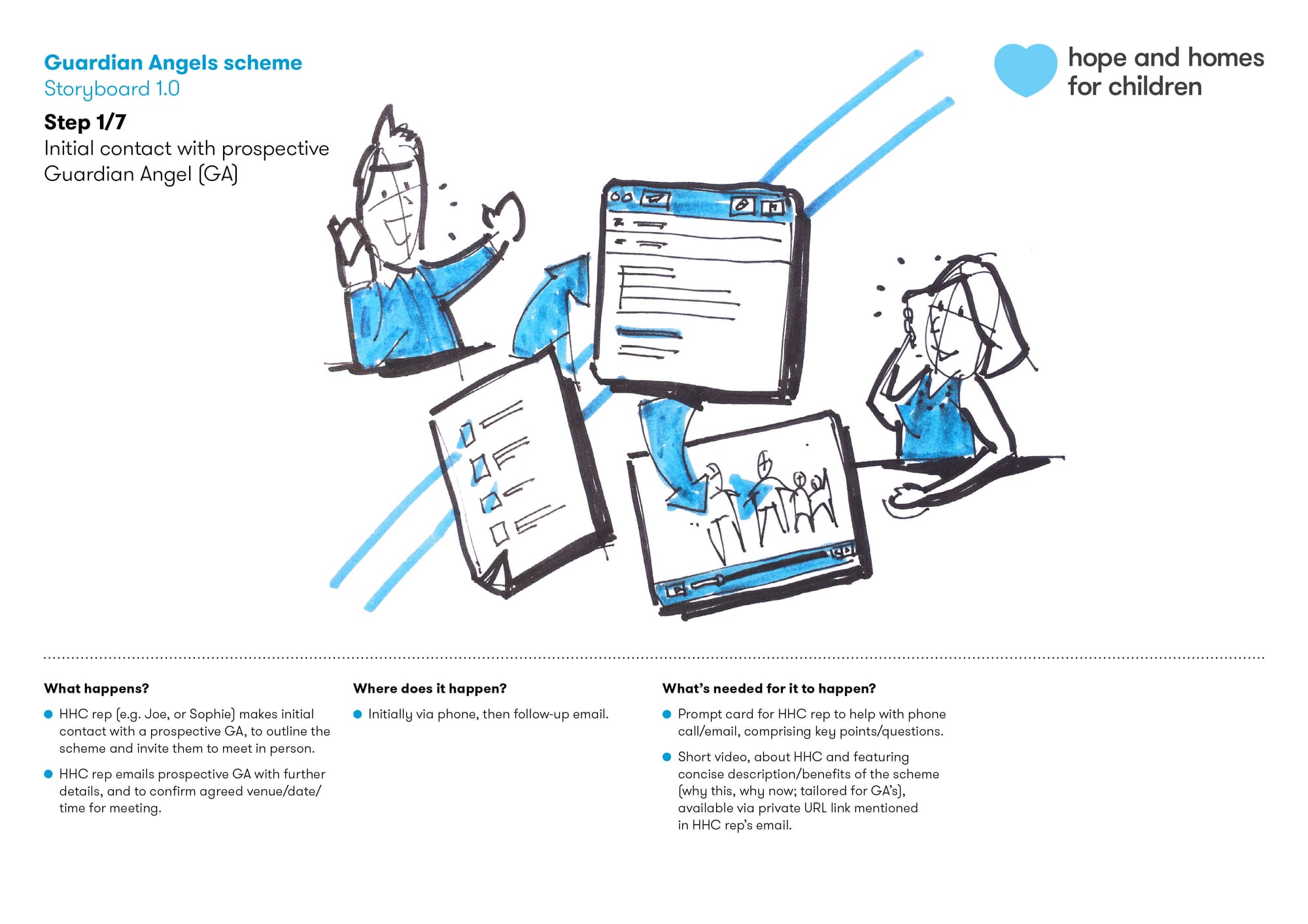
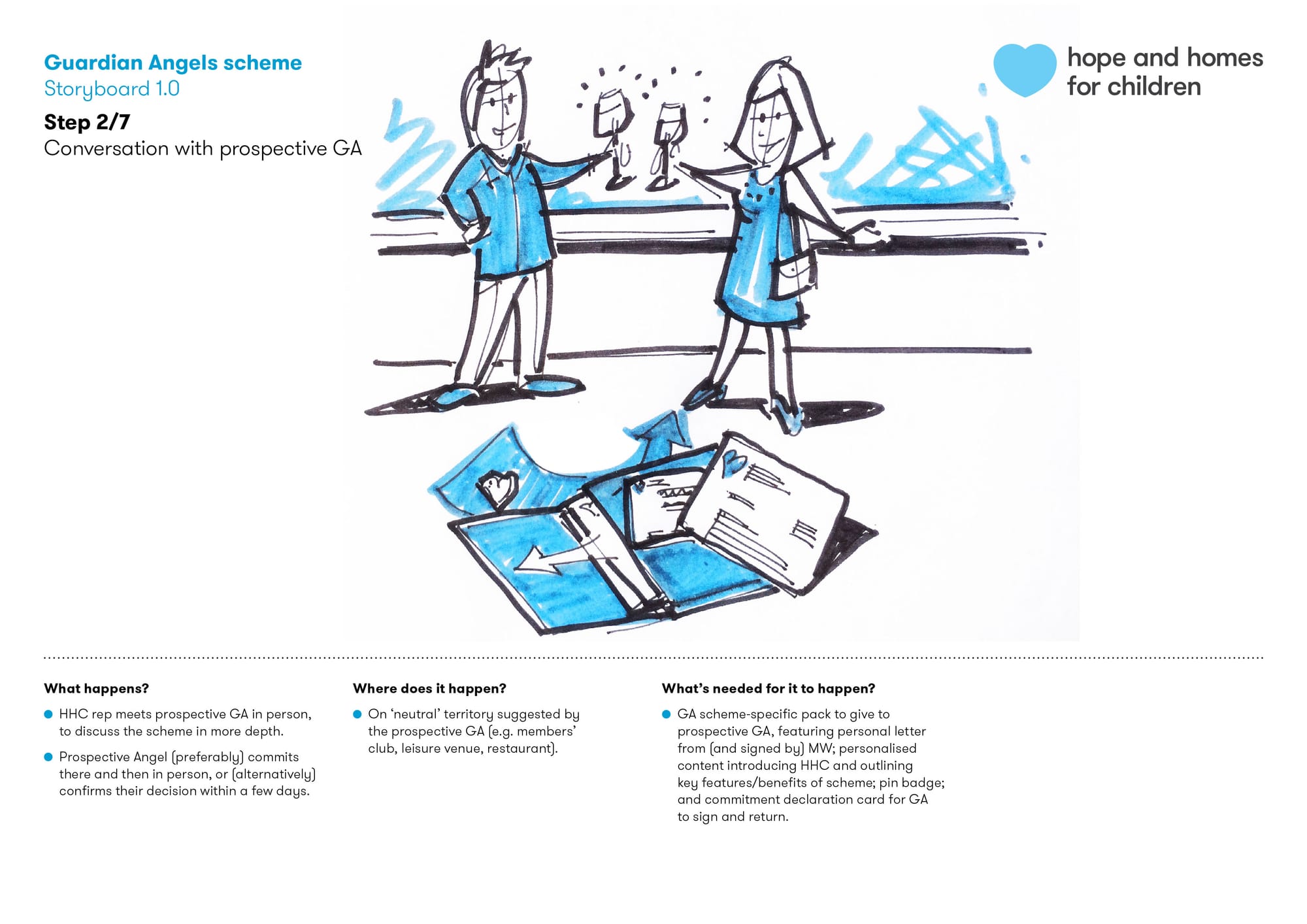
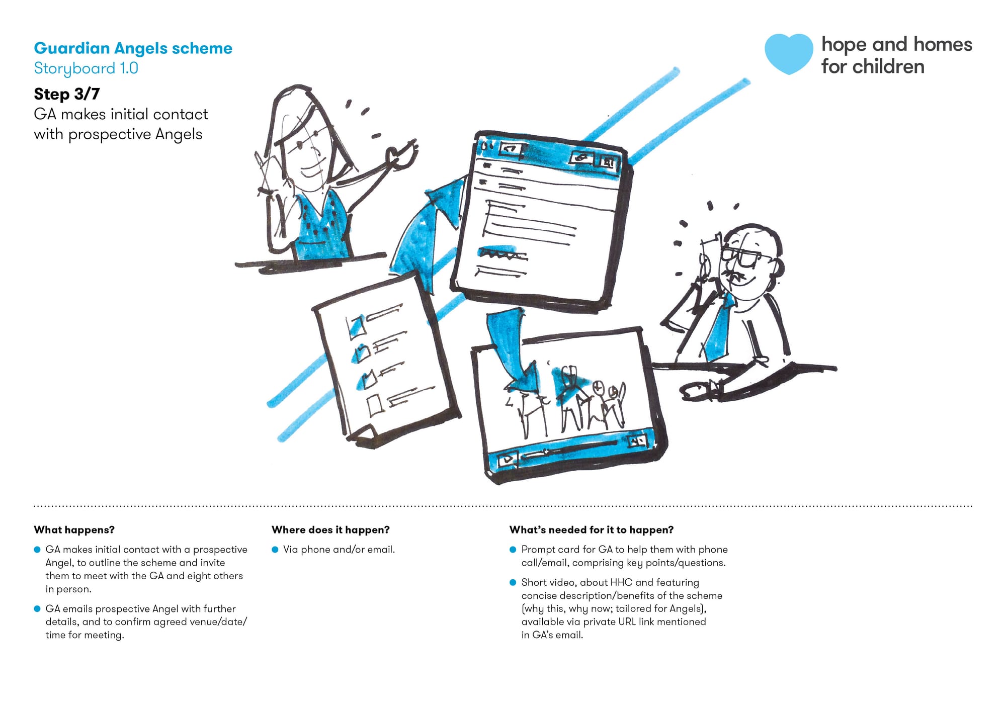
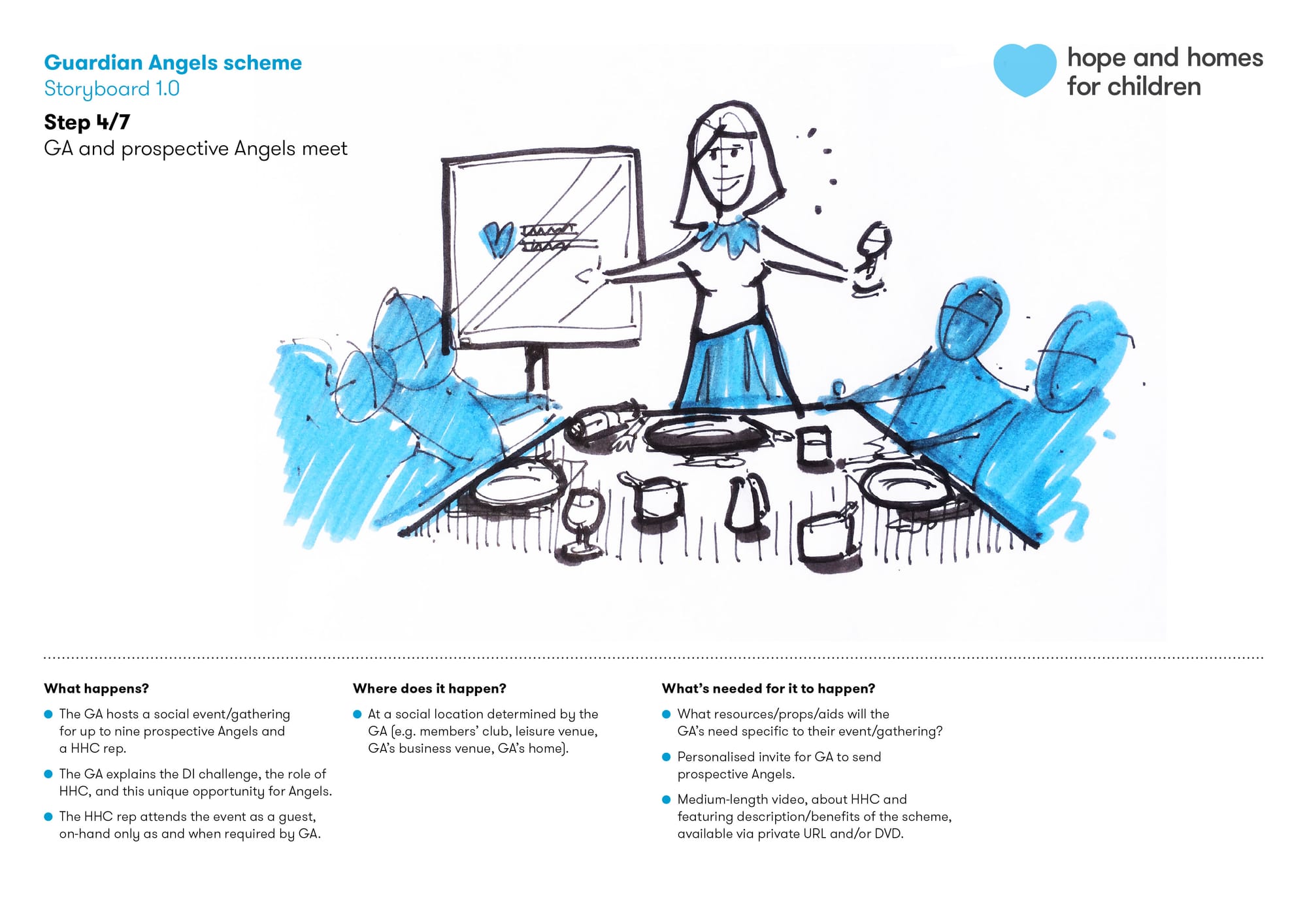
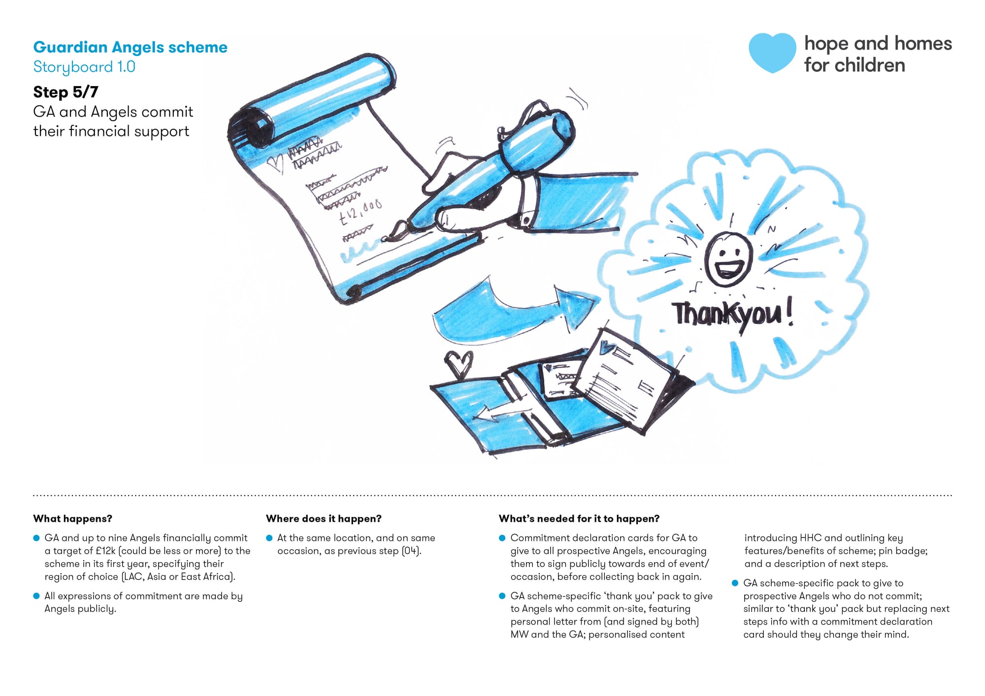
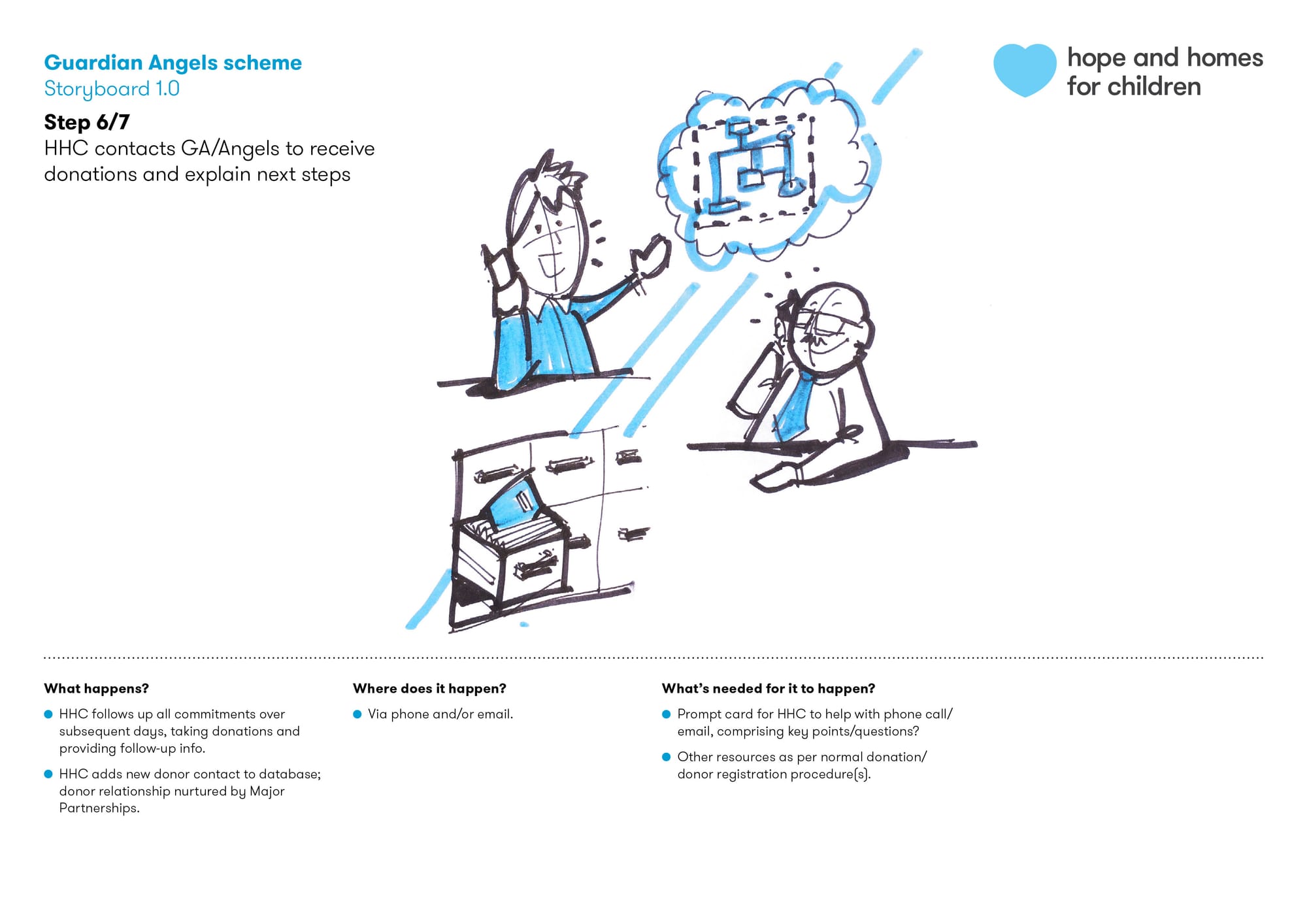
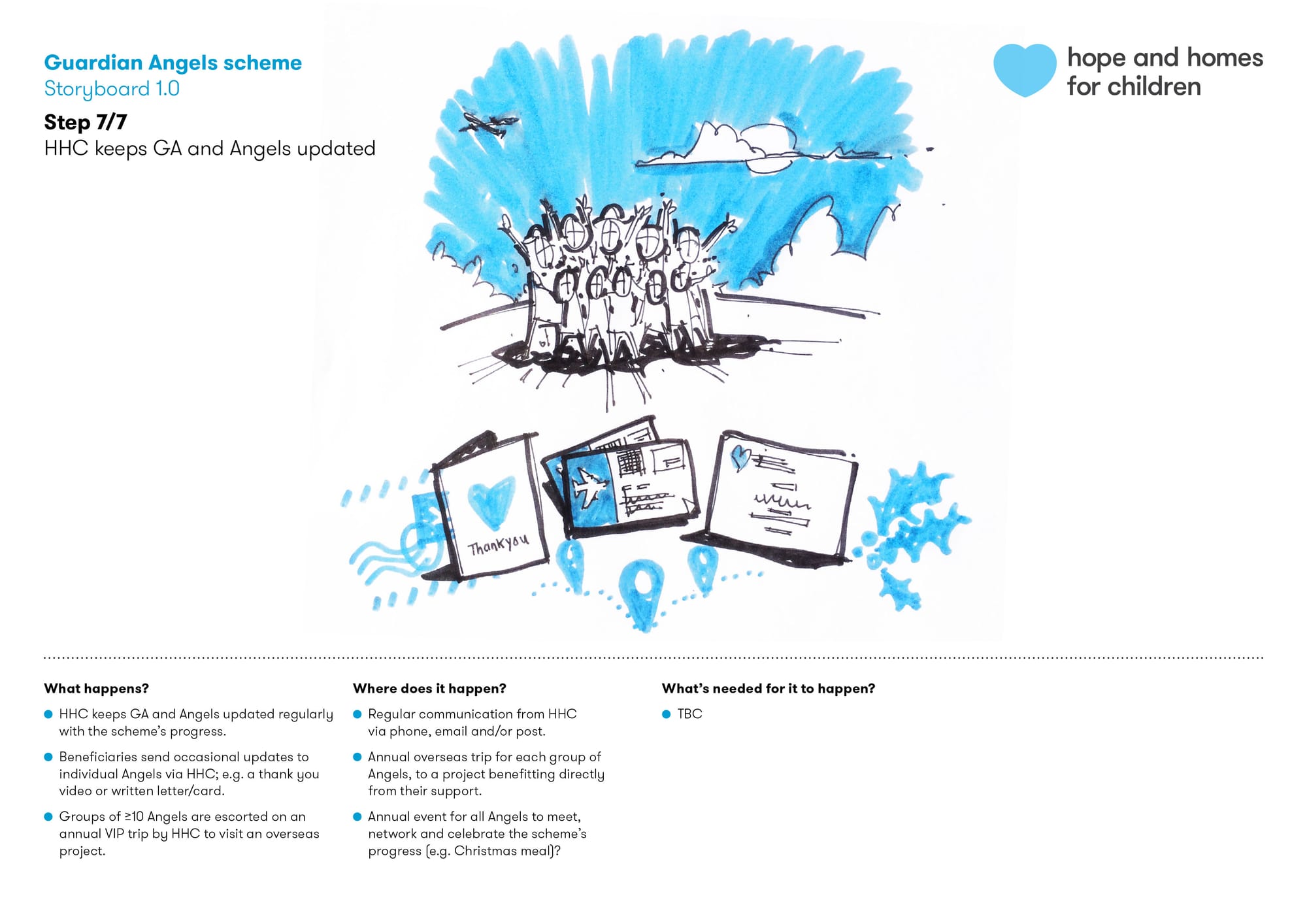
Guardian Angels
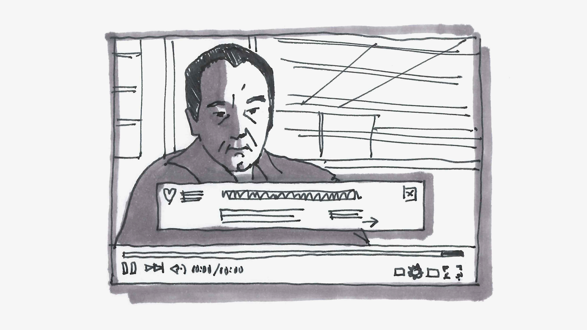
How do we bring major donors closer to our work—helping them be more emotionally invested in our success, and permitting us access to their personal networks?
To tackle this, I helped our Major Partnerships team imagine, plan and prototype a new high value donor acquisition scheme, working title ‘Guardian Angels’, by facilitating experience mapping, providing behavioural insights, and storyboarding the process.
Project credits
Design team Alex Brazier, Eleanor Butcher, Ben Cave, Kirsty Chapman, Matthew Holbrow, Peter Jordan
Wider team Chloë Amstein, Steve Coffey, Wayne Cornish, Isobel Eaton, Natalia Fricker, Alice Holloway, Julia Mazorodze, Angharad McKenzie, Joe Sutton, Elena Tognoni
Animation (The Family Marathon) Ross Phillips
Web development (Impact Report) Philip Abbott
Illustration Ruth Palmer (Christmas appeal), David Jesus Vignolli (Hope)
Photography (The Family Marathon) Jonathan Cherry, Col Morley